Building the Engagement Loop (Part two)
Among the difficulties of game development, dependencies is a tricky one; how to break down the design and the code into independent units that can work in unison? How to structure the project in a logical and efficient way to avoid both redundancy and rigidity? I was dusting off the 8 months old font and code used for my first forays into the Playdate, with the idea that the tactical chart needs to print text on screen. But thinking about the ships identification labels in the chart had me reminisce about the flow of the game as it relates to the exterior views.
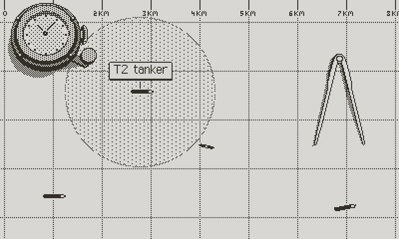
The tactical chart
In particular, I want both the bridge and the periscope views to serve a gameplay purpose, not just eye candy; like in real life, without visual contact, no tactical planning can be done. It’s the initial action on which everything else rests. As a reminder, this quote I already mentioned from the Kriegsmarine U-boat Commander’s Handbook: “He who sees first has won.”
As a kid, I remember tracking ships in Silent Service, with the naive notion that you had to aim at your target with the periscope crosshairs, like a gun. And to be fair, you do line up the target in a realistic setting. It’s what happens after that differs from ballistics. I forgot how the game handled torpedo firing solutions, but screenshots show target data like range, speed, and angle on bow, which suggests that the torpedo data computer was somehow simulated. I need to check this.

Silent Service
But it remains that people have a simplistic vision of how torpedos work, mainly due to films showing the captain, surrounded by the crew, launching torpedos from the command room through the observation periscope. In reality (on a German boat), he would have sat by himself at the attack periscope inside the cramped conning tower, or stood on the bridge (for surface attacks), acquiring target data with the bridge aiming column, or UZO (U-Boot-Ziel-Optik). I'll spare you the complex technical details, which I don't all understand myself. But the point is that reality sometimes makes for poor cinematic moments or less accessible gameplay, and that explains the artistic license.
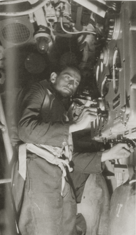
Inputing data into the torpedo data computer
However my view on historical and technical accuracy can be best summed up with a Mark Twain quote: “Get your facts first, then you can distort them as you please.” If Atlantic ‘41 must deviate from the facts, research allows me to better understand what I can leave out without betraying the essence of the real procedures.
In particular, torpedos, even from the WW2 era, were not shot from the hip. They were programmed based on a number of variables, like the target speed, angle on bow and draft, and the U-boat’s heading and speed. In fact, U-boats didn’t even need to face their target to fire torpedos, which didn’t travel in a straight line, but were equipped with gyroscopes, allowing them to steer toward their target. That is without mentioning the later introduction of acoustic torpedoes homing on propeller sounds.
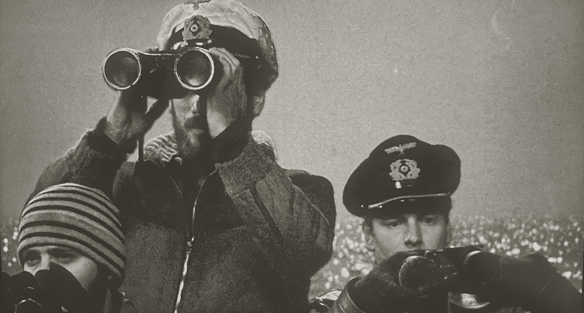
Das Boot gets it right depicting a night surface attack, with the 1st officer setting up the UZO (on the right)
Modern PC U-boat simulators take a realistic approach, in which the player uses carefully simulated instruments to measure these parameters, and input them into the torpedo data computer, which in turn calculates a firing solution. That solution translates into gyro settings that are physically set by the crew on the torpedo itself. That’s as historically accurate as it gets, at least to my knowledge.
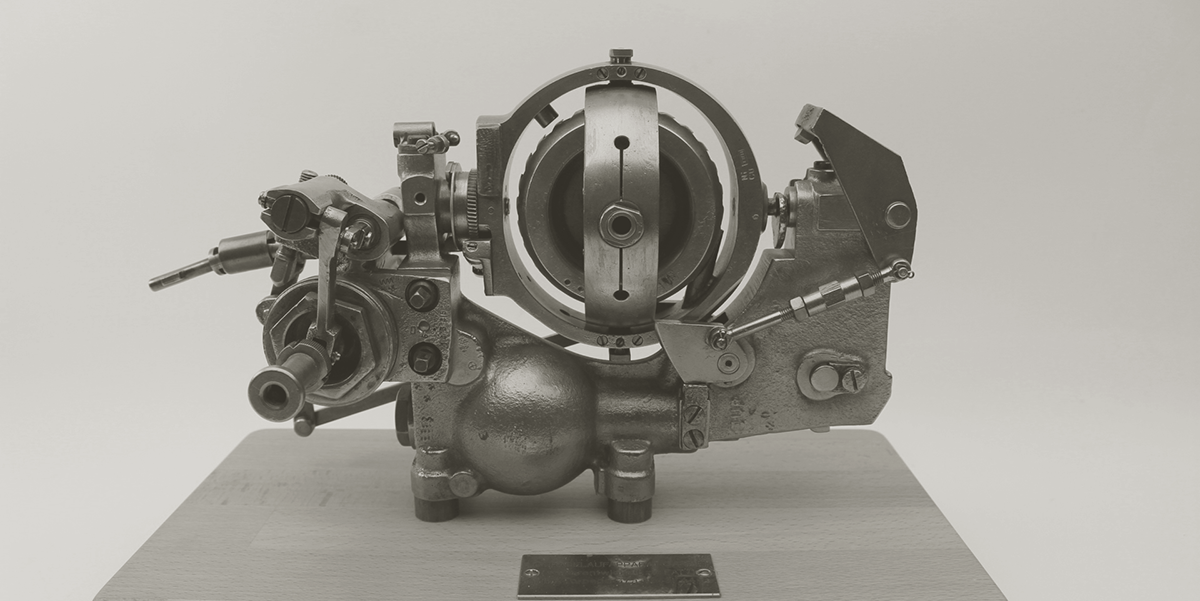
The gyroscope of a G7a torpedo
Atlantic ‘41 can’t compete with high end PC simulators, and it shouldn’t. No one wants to do all that on a Playdate. However, the game should convey realistic procedures at a high level, in particular the idea that torpedos can’t be fired without measurements taken from the attack periscope or the UZO. These stations are essential to the process, and I always wanted Atlantic ‘41 to reflect that aspect.
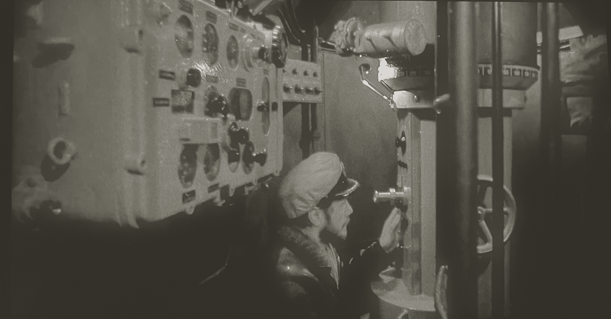
Two for two for Das Boot, with a correct depiction of the captain sitting at the attack periscope in the conning tower. On the left is the TDC
First Contact
I’ll cover in detail the Torpedo Data Computer next time. But here’s my idea for the exterior views. The player has to “tag” every ship from the bridge or the periscope. This simulates the action of taking the measurements required for the TDC. It would play like this: the player spots a ship, centers it on screen and presses A to identify and tag the ship (it will appear on the tactical map from now on, as long as it remains in visual range). A second press on A brings the chart centered on the selected ship. As much as possible I want to try and use the same controls, flow and logic in all tactical screens. That way, what’s learned in one carries to the others.
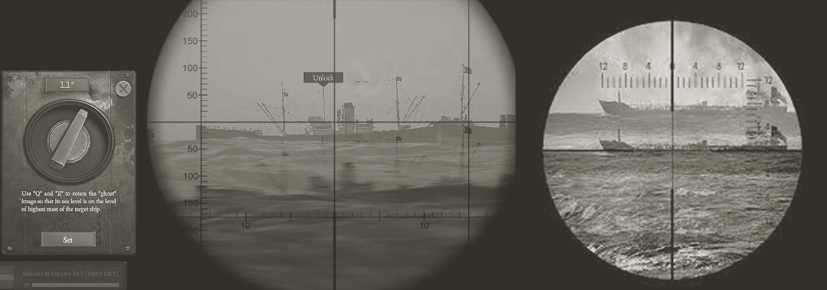
UBoat (on the left), simulates the stadimeter tool to calculate range.
This mechanic achieves two things: making the exterior views relevant, and involving the player in what at least feels like a realistic procedure, even if at a superficial level. I’ve talked in the past about limiting abstract UI, which goes against overlaying text on the action. However, identification labels may be a case where the comfort of the player supersedes the immersion.
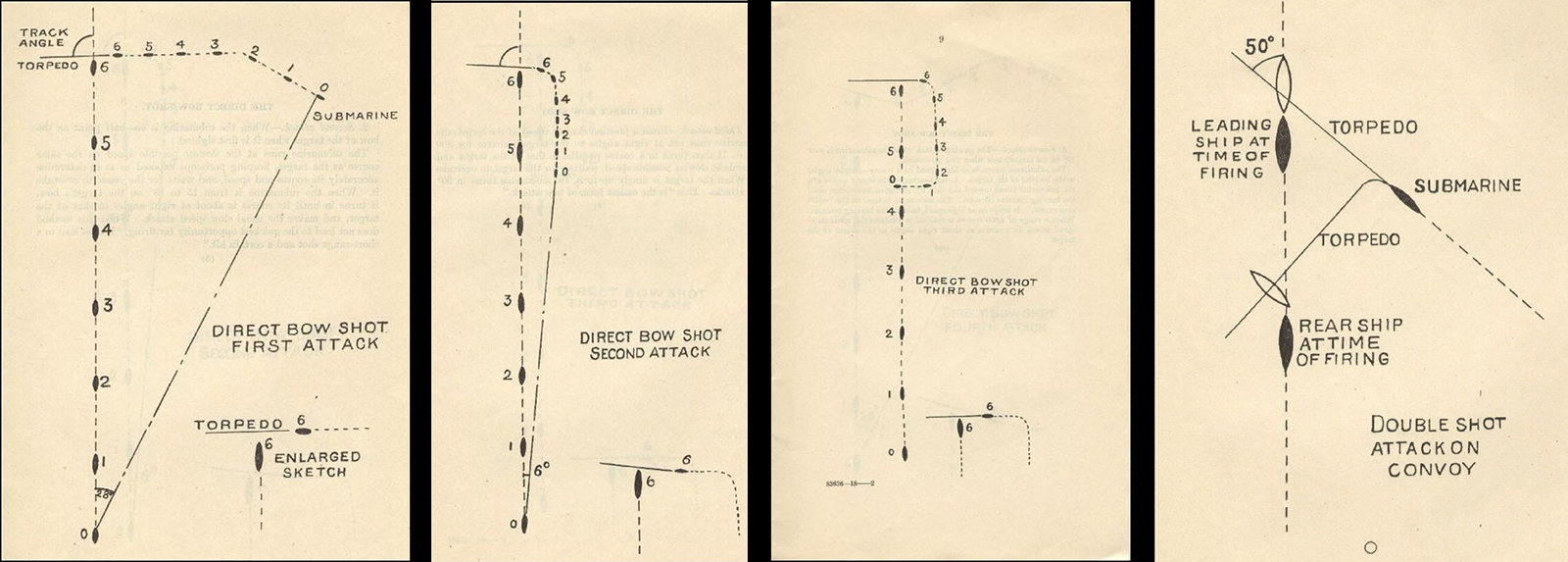
Attack patterns show torpedos steering toward the target
But I don’t want tags permanently attached. It would only remain visible as long as the ship is aimed at. This allows the player to scan through the horizon and know if a ship has been identified without having to stop panning and press A again. Whether this is a good solution will be answered in play testing.
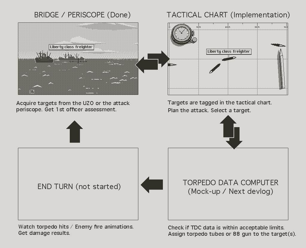
The engagement loop
Speaking of aiming, I overlaid sights in the bridge view, to help with targeting ships, and to suggest the use of the UZO. I also lowered the center line of the periscope overlay, so that it occludes less the ships. It also looks better, less mathematically perfect. The correct fix would be to raise the horizon, but that way is much easier. The cheat isn’t noticeable so it’ll do for now. I will adjust the code properly when I get to screen shake, which requires a flexible horizon height.
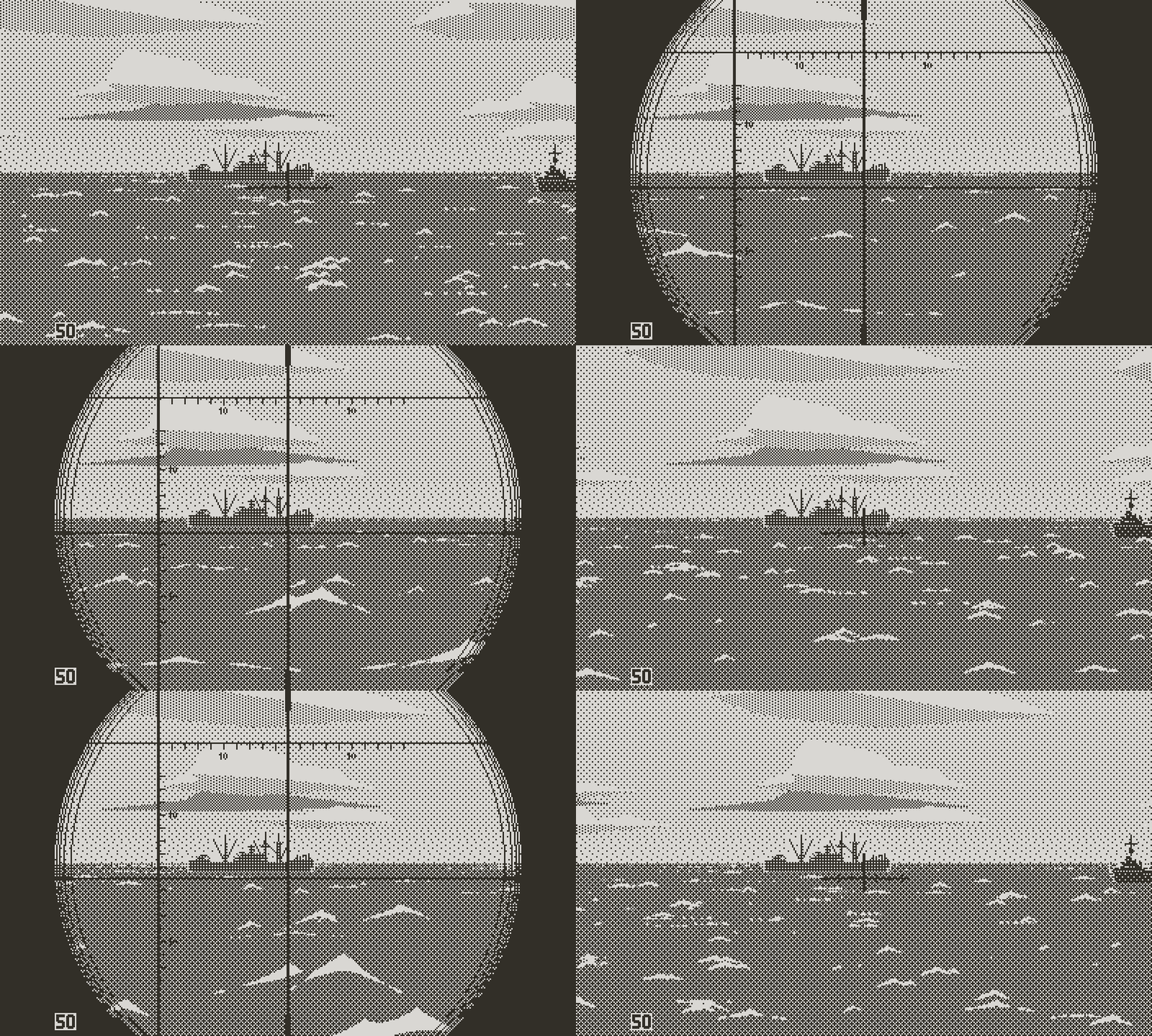
UZO sights and lower periscope center line
There’s a risk for the identification mechanic to become a chore. It’s possible that scanning the horizon for ships to tag becomes tedious, when all you want is maneuver the U-boat and fire torpedoes. The quick solution is to have all ships automatically tagged, but doing so could make the exterior views less relevant, and turn Atlantic ‘41 into a game that could be played in great part from the chart screen. I think it comes down to frequency and impact; the mechanic should work if the ocean isn’t filled with targets, and if the action feels satisfying, creates a sense of anticipation, or accomplishment.

Identification labels
The Human Experience
That said I try to imagine a mechanic, moment by moment, before implementing it. I see this silhouette on the horizon, center it (as a patronizing mentor likely ordered me to in the tutorial), and press A. Then what? A label is pinned on the ship with a little sound effect? That sounds underwhelming for a first contact. If the game has the guts to deliver on long days of empty ocean, spotting a target should feel like a small event. First hand testimonies of U-boat crew members all convey the excitement at the sight of a target after days, or even weeks of idle routine.
During the first patrol, our trusty tutor will give us a quick overview of the ship. Some context, What’s notable about our quarry, maybe advise us. But he won’t always be there. Unless he will? I may have touched in a previous log on my contempt for extended lore and exposition dialogue in games. However I don’t hate text when it serves character and immersion. Only when it harasses the player with scripted plot or hand holding.
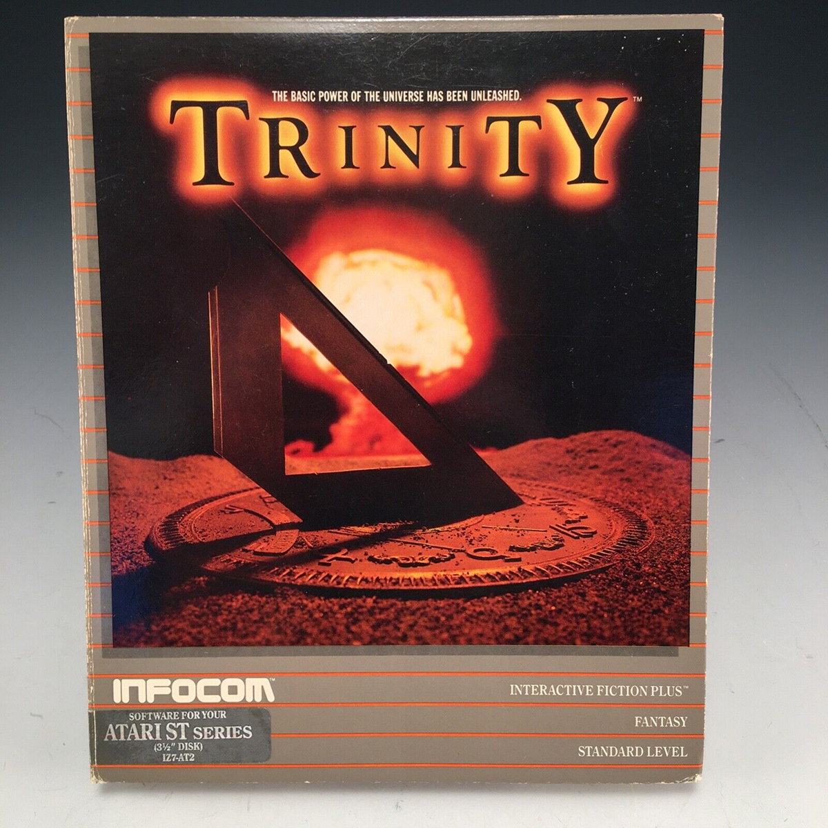
Favorite game ever
Now here, this may be the opportunity for building the idea of a crew of devoted officers. With that intent, I love small contextual interventions; a character sharing his sentiment about a situation, whether you asked for it or not. If short and phrased in character, it can be of great effect to build story in the player’s mind. Not story as a linear path of ineluctable event descriptions, but as occasional contextual remarks or journal entries. I think Uncharted did this the best; Drake’s out loud comments created a real connection with the character.

Into the Breach. Characters react differently to the same event
Of course I wouldn’t dream of getting even close to this level, but a few appropriate remarks from the crew could go a long way. In the case of tagging a ship, the 1st officer could sum up basic facts to his captain, as any competent officer would do. But maybe also for instance share his enthusiasm of seeing the target unprotected, or his concerns about the short range at which a destroyer is spotted for the first time. It’s the difference between the impersonal UI and a character. All information passed that way is useful and participates to the fantasy. It’s the game staying in character.
But this approach is risky; it’s hard to do well. Done wrong, it can be aggravating. There’s nothing worse than hearing a NPC make 20 times the same joke, or babble about stuff you already know. The last thing we need in Atlantic ‘41 is another Clippy. That said, I can think of a few ways to limit annoying sidekicks:
1. Tone down the flavor text; keep things generic enough so that repetition goes unnoticed, a bit like a good tiling texture without obvious patterns. This somewhat contradicts the goal of believable personas, but I think it can be done, by avoiding long sentences and flowery language.
2. Remain factual when possible, without frequent personal views. The military context helps, as the no nonsense, concise and efficient communication is preferred.
3. Only allow NPCs to speak at a limited frequency. In this case this will come for free, since ship identification only happens so often.

Building contextual dialogue
I have to try this (scope creep alert!). To my defense, in one of the early devlogs I was sharing my intent of making a simulation with humanity, the crew mainly, at its center. It’s the silly bond you develop with these crude digital people that make certain games so memorable. I still remember how bad I felt about not saving Ada on the bridge in Resident Evil 2. Or the joy of cleaning my Tamagotchi’s poo. Or the special relationship I had with the roadrunner in Trinity (that one is more obscure but no less powerful). It’s fair to say that I had always planned to do this in some form, which makes it less qualifiable as scope creep. Right?
Anyway I thought that having my first officer comment on every ship could be a lot of fun. At this point the system is focused on simple data. With time, a more elaborate tree of observations will humanize the monologue, but for now it’s broken down into a succession of short sentences: the ship’s class comes first, followed with range, heading, and speed. Within each category the program picks among a pool of predetermined sentences.
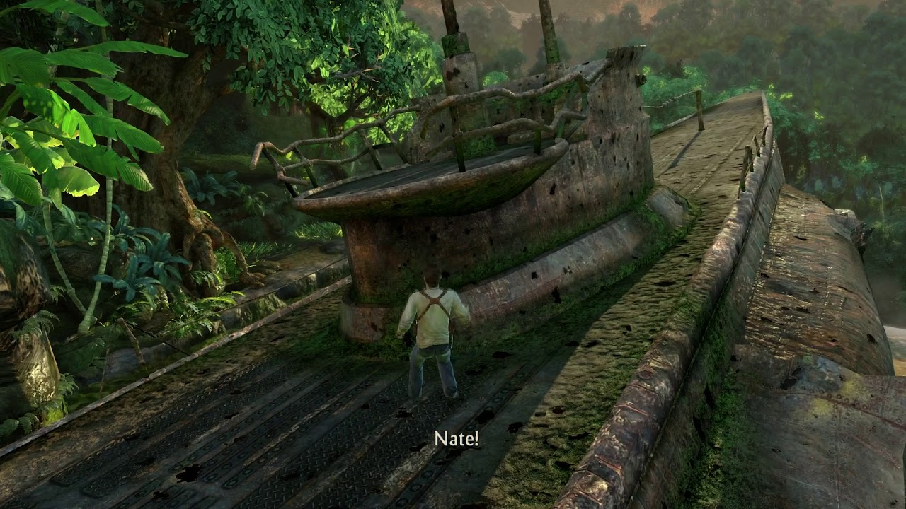
Uncharted has a submarine too
The last entry is more interesting; it attempts to raise the attention about any odd or significant fact about the target. For a merchant ship it could be a note about the presence of armaments. Or a comment about zigzagging, or sailing unusually fast or slow. He may worry about an escort ship heading toward the U-boat, or being within ASDIC range, or embarking aircrafts. If there’s nothing of interest about the target, he may bring up the weather or time, as pertaining to the situation. I want to make sure that remarks don’t always focus on risks, but point at opportunities and invite action as well, to reflect the aggressive nature and military zeal of U-boat crews.

Galatea, by Emily Short, features an innovate dialogue system
I fantasize about tailoring remarks to specific individuals, to create unique unlockable officers, but I almost certainly brought this further than reasonable. It’s the dangerous rabbit hole feature that only stops at the amount of time and resources allocated to it. Reason dictates to implement the minimum needed to emphasize the action of tagging ships, and move on. Much later on, if the game lacks crew interaction or character development, this will make one more available tool.
Form Follows Function
Judging assets in context and on the platform is always important, but it’s even more significant when developing for a small screen, in particular the unlit Playdate screen. I make regular use of the neat -Send bitmap to Playdate- feature of the simulator before implementing anything. But the old dialogue mock-ups I made months ago pre dated me owning the Playdate. And it’s hard to measure just how tiny the console is until you’ve experienced it first hand.
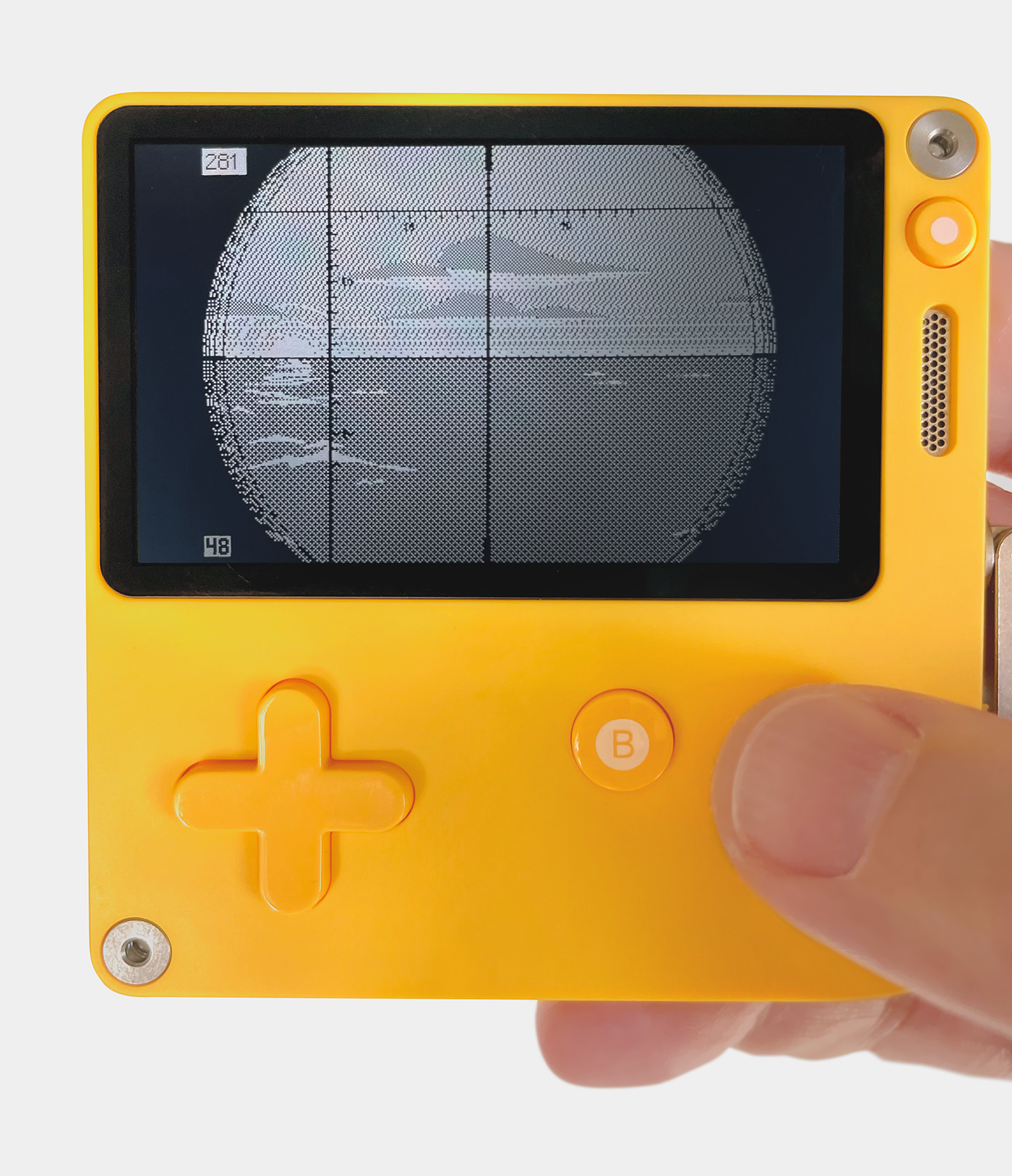
The Playdate isn't small, it's minuscule
To me there’s fundamental differences in how to present the information between desktop or portable platforms. On a large screen I’d want to use the space to my advantage; make all the relevant information accessible on one screen, and avoid menu diving. On a small screen readability prevails, even at the expense of ergonomics.
In most cases, dialogue, when it happens, becomes the focus of the game. Whatever else happens on screen at that moment is irrelevant. And the presentation should participate to this. I imagined that all character interactions would follow the same structure: the screen dims down, becoming a dark canvas for the character’s portrait and the dialogue box. However, I was concerned that overlaying the whole screen with a pattern may prove too much to handle for the Playdate. A test negated the issue, but the real problem is text, which destroys the frame rate.
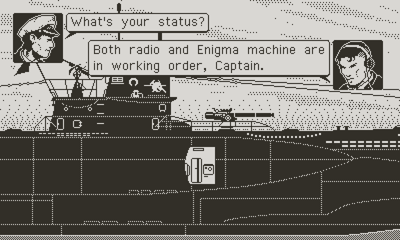
Former dialogue mock-up
The old pre caching trick came to the rescue, which, combined with other optimization shenanigans, allowed me mitigate the performance damage. During dialogue, frame rate drops from the average 45 fps to around 40 fps. It’s enough for controls to remain responsive. I’m glad to be able to maintain a solid frame rate because UI transitions, like fade outs, don’t look nearly as smooth at 30 fps. Sound is the last remaining unknown though, so I pray that it won’t degrade performance and force me to slow down fades and UI effects.
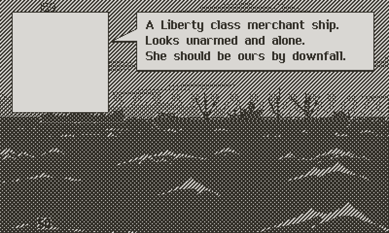
New dialogue mock-up
The old layout made clear that the font and the portraits didn’t take advantage of the space. I like my first font, based on Geneva, but it’s admittedly too thin and straining for the eye. A new version tries to retain the elegance of its heritage, while being bold enough to read. Typeface plays a significant part in the tone of a game, and I want Atlantic ‘41 feel like serious entertainment. Or I should say at least respectful of the subject matter. It should read like a WW2 novel rather than a comic book.

Bold font reads better
New Faces
I knew that my old tiny officers portraits wouldn’t cut it. But size wasn’t the sole issue, as a quick test proved. Redrawing one of the portraits four times larger, I became aware how cramped they felt. This tight framing around the face made sense at a small size, but the larger scale allowed me to extend the drawing down to the chest. I think these new portraits feel a lot more open and nice. And showing clothing is useful; I can have higher officers more tightly dressed, while lower ranks are more casual. I’m also glad to have enough space to draw faces with more realistic proportions, which is a better artistic fit.

Former portraits
With everything in place it was just a matter of programming, which turned out less than trivial. Code in itself is not difficult, but it’s trickier to get everything to flow together, in particular if you’re lazy like me and hard code everything, instead of building proper tools and classes. But it remains that subtle UI transitions and animations participate a great deal to the enjoyment of the game. It’s the effort put in getting the timing, responsiveness, proper effects, and satisfying sounds, that separate the average game from the polished ones. And small annoyances can add up. For instance, it could be me, but too short or too long key repeats in menus drives me nuts.

New framing feels less claustrophobic
Speaking of sounds, I think it’s time to get them in. I’m afraid of underestimating the memory and performance draw. Exterior views are advanced enough that adding sounds could give a good feel for the complete experience, at least for that part of the game. UI animations and transitions can’t be finalized without sound timing. And there’s a few ideas I want to try, like a low pass filter on ambient sounds in dialogue mode, giving the interaction a feeling of intimacy; the sense that you are focused on the interaction, while the world is receding into the background.
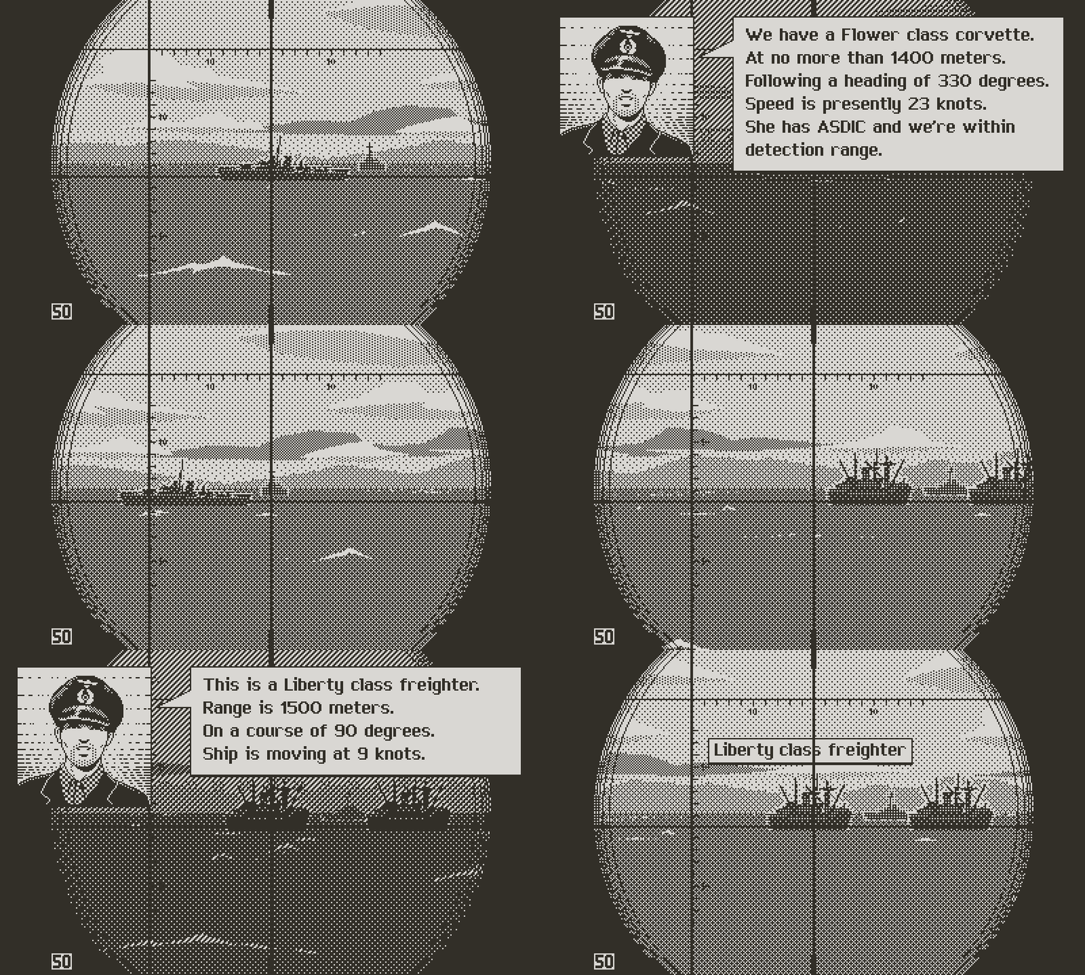
Everything put together
I realize that this log may feel like a lot of fuss for little progress, but a good chunk of the work was foundational. I hope that this pays off later and helps me build the game faster. Next time, I will update about any progress in implementing the tactical chart, maybe sound, and complete the explanation of the engagement gameplay loop with a detailed presentation of the torpedo data computer.
So as usual, more soon.

Checking targets
Atlantic '41
A WW2 U-boat Simulation for the Playdate
| Status | In development |
| Author | StephanRewind |
| Genre | Simulation |
| Tags | 1-bit, Pixel Art, Playdate, Turn-based Strategy, World War II |
More posts
- Upcoming log and Cranko! interview11 days ago
- Visual Upgrades55 days ago
- The Enemy (Part 2)Aug 31, 2025
- The Enemy (Part 1)Jul 15, 2025
- Los!May 29, 2025
- Preparing the FutureApr 07, 2025
- Project ResetApr 01, 2025
- Small BeginningsFeb 24, 2025
- Death by a Thousand ShellsDec 17, 2024
- Next devlog a bit delayedOct 13, 2024

Comments
Log in with itch.io to leave a comment.
Beautiful work all round.
The font has some similarities with Chicago from the classic Macintosh days.
Thank you! Yes I’m a big fan of Susan Kare’s work so I made a font that mixes my favorite Macintosh system fonts. The mid 80’s classic Macintosh system is the golden age to me. I love everything about it, from the fonts to the icons to the menus and windows.
Me, too! For me it’s still the greatest.
> I realize that this log may feel like a lot of fuss for little progress
Good thing then that's exactly what we're here for :)
Ah ah! Fair enough :)
Ahh cool stuff here! I can't wait to play It. It reminds me of when I played 688(I) Hunter/Killer and the funny sonar.
Significant update, as usual, keep going <3
Thank you for the kind support. You can be certain that there will be some intense sonar pings in Atlantic ‘41 as well ;)
First rate devlog as always!
I'm particularly intrigued by your dialogue system as I've created similar systems like that in some of my own projects. The branching paths has a nice and practical flow to it, but -- especially seeing how small the game is going to look on the Playdate -- I would suggest simplifying the dialogue:
Instead of:
"This is a Liberty class freighter. Range is 1500 meters. On a course of 90 degrees. Ship is moving at 9 knots."
I would simplify it to:
"Liberty class freighter. Range . . . 1500 meters. Course . . . 90 degrees. She's moving at 9 knots."
But because that then looks almost a bit too plain, you could make it both practical and interesting by adding a Reaction branch before your Class Branch. Examples:
"First target on our tour! Liberty class freighter. Range . . . 1500 meters. Course . . . 90 degrees. She's moving at 9 knots."
"Yet another one . . . . Liberty class freighter. Range . . . 1500 meters. Course . . . 90 degrees. She's moving at 9 knots."
"Apparently unprotected . . . . Liberty class freighter. Range . . . 1500 meters. Course . . . 90 degrees. She's moving at 9 knots."
Of course, to have authentic reactions like that, you'd have to check to see if certain conditions are met.
IF FirstTargetOnTour = TRUE THEN
Reaction$ = "First target on tour!"
ELSE
Reaction$ = "" (none or something else)
END IF
Thank you for the support as always. I really like your condensed version. It flows better. I still want to make sure that there’s minimal variation, but there’s a sweet spot somewhere. This will continue to evolve. I already have some conditions as I’ve shown in my exemples, but it’s a little more complicated than that because several condition can be true at the same time, so they need to be weighted.