An Important Milestone
We’ve reached an exciting moment in the development of Atlantic ’41. This update will develop how I implemented the interactive part of the TDC, allowing the player to manage torpedo tubes, and issue attack orders. With this done, the backbone of the player’s side of the combat loop is complete, and I’ll move on to the end of turn sequence.
Gazing at The Sky
It’s been an educative few weeks; the design of the TDC’s UI was full of valuable lessons. I think that what I learned will transpire throughout the rest of the game, in particular the idea that icons can deliver contextual information.
In hindsight, I may have underestimated the complexity of UI, in particular when dealing with a screen four times smaller than a postcard, and with the resolution of a 40 year old computer. But that’s the challenge, and one could say an integral part of the Playdate’s charm.
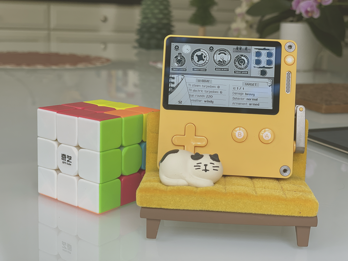
When I say small screen, I mean it
Early on I wanted for the TDC to feature the same multi layered wheel of commands than the tactical chart. Not only for consistency, but because I couldn’t come up with a better system. However the TDC is a different beast, and I immediately hit the first bump. As small as they are, the command icons occlude a generous part of the screen, which wasn’t an issue in the chart for two reasons:
First, regarding ships, icons in the chart conjure passive information, like detection range or projected course. They don’t require the player to make a decision. Second, the chart itself scrolls well beyond the screen’s borders, which creates a lot of breathing room. This lowers the probability of the icons masking important assets.
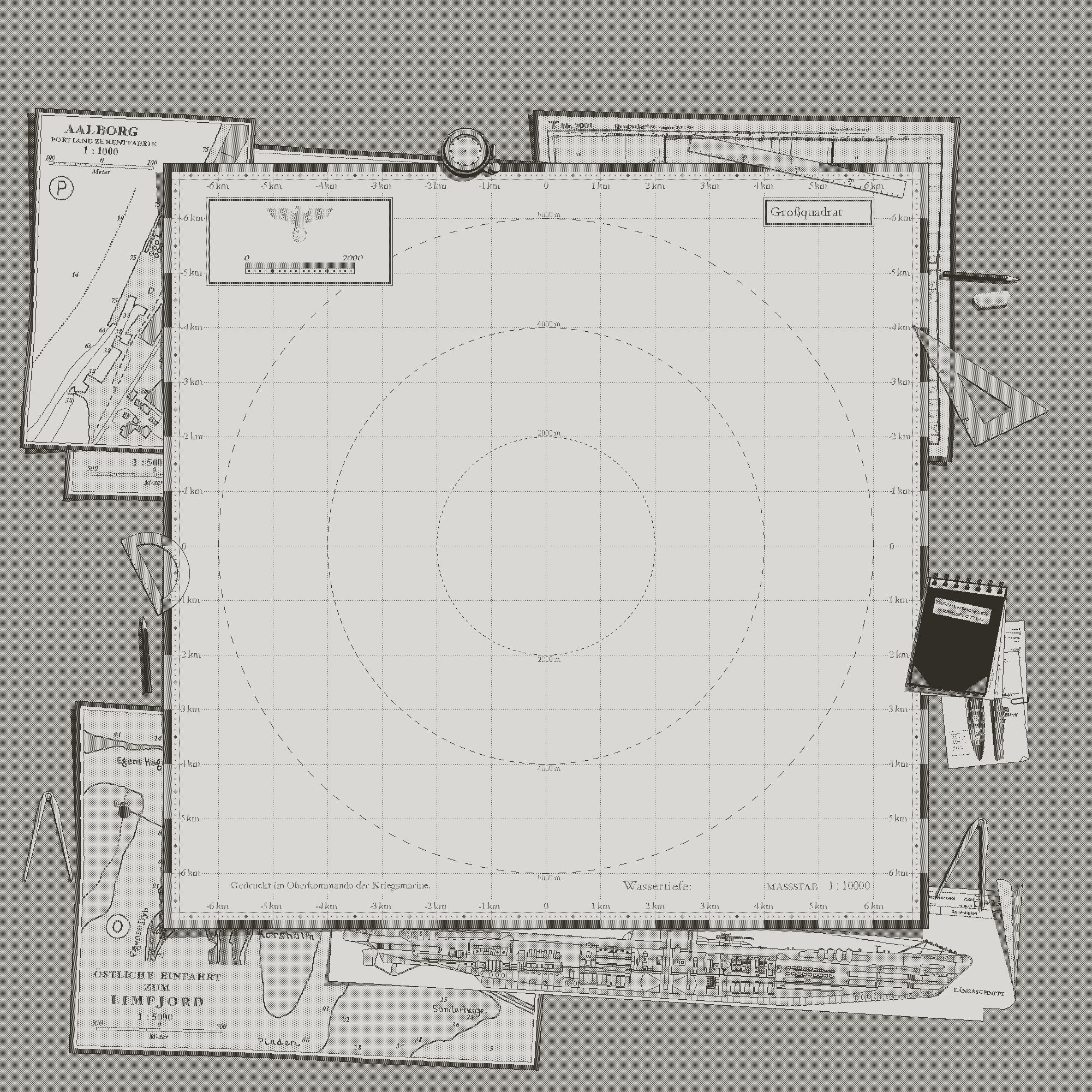
The tactical chart is 2000 pixels wide
Regarding the U-boat commands, like diving, or plotting a course, icons disappear when the command is triggered, leaving the screen clear of any obstruction while the player manipulates the token representing the boat.
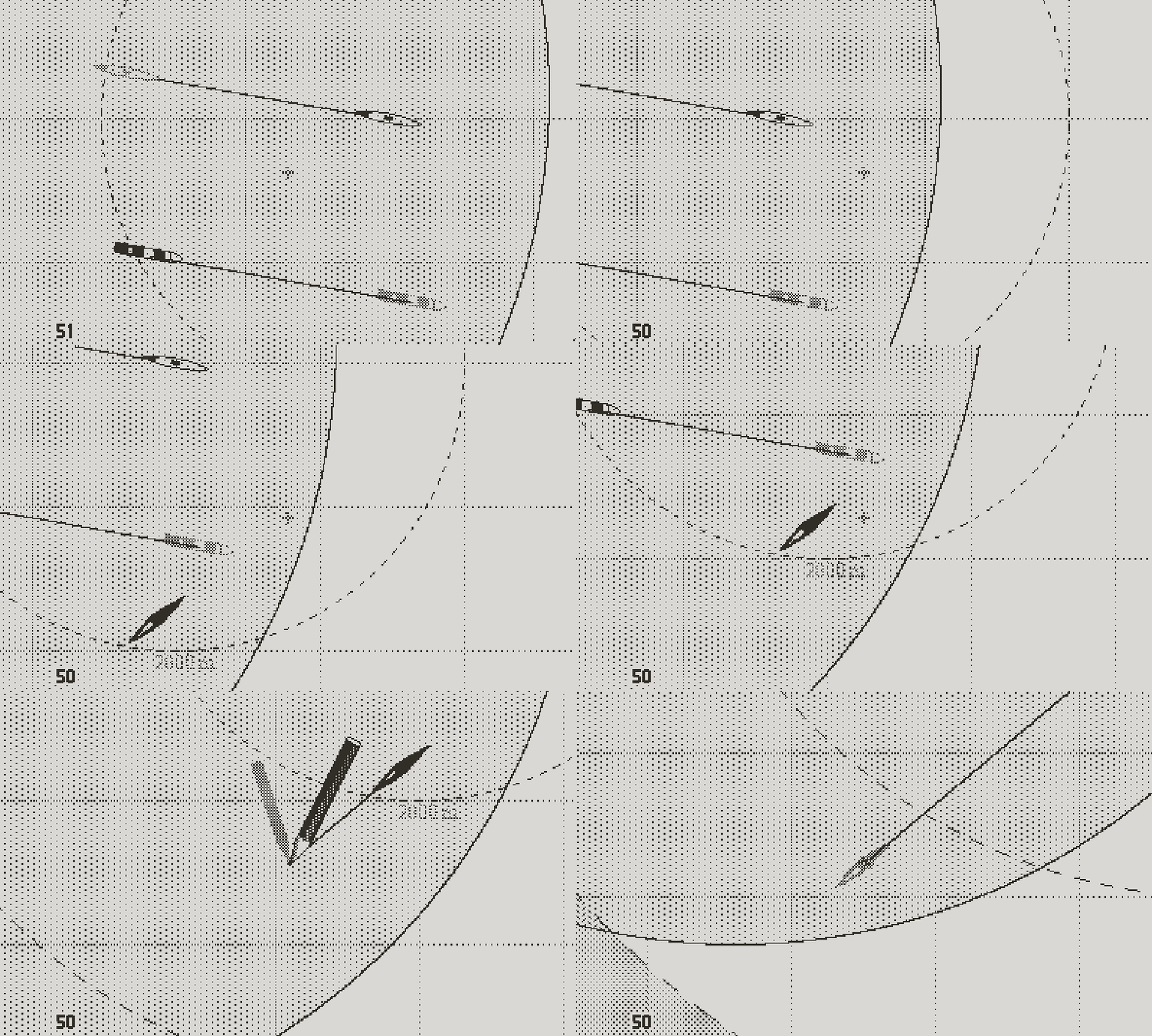
Once the command activated, the icon leaves the screen
Now if you think about the TDC, all the information is tightly packed on a single screen, leaving no space unused. And the icons require the player to make decisions which depend on various parameters related to the target or the environment (for instance how many tubes do you fire at the target?).
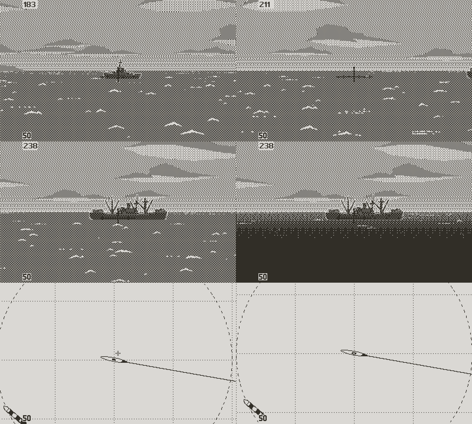
Without much hope, I went ahead and displayed a set of four icons right smack in the center of the screen in the vein of the tactical chart. And it wasn’t pretty.
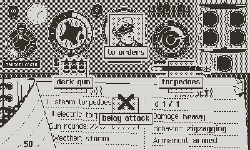
Confusing
In these situations, I like to put everything on pause and stay away from the computer. For a day or two (or longer if necessary), I try to visualize the flow of the problematic section of the game, step by step, without taking notes or drawing anything in the computer. I find that with enough habit, you can play simple portions of the game in your head, trying multiple designs that would take a long time to prototype or mock up. Gazing at the sky ends up more productive than scribbling or coding aimlessly.
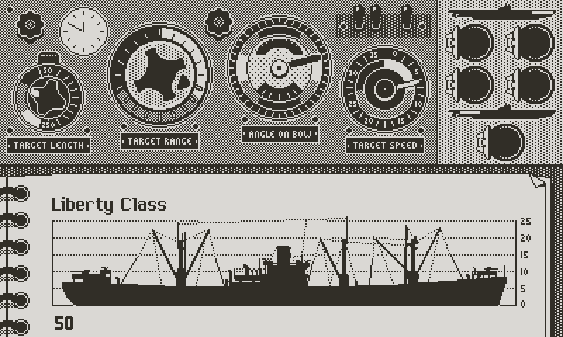
From this reflexion, a few observations:
. The gauges of the torpedo data computer deliver essential information early in the process of selecting a target. When that’s done, the rest of the decision making (selection of the type of torpedo, number of tubes fired...) relies more on the class and situation logs.
. The class log and situation log both contain information that the player needs to access as they set up the details of the attack.
. At all times, the player needs to get a clear overview of the planned attack for the turn and of the state of the torpedo tubes and the deck gun (which tubes are loaded, with what kind of torpedoes? How many turns before the loading is complete? Which tubes will be fired on which target on this turn etc)
. Considering the simulated time of a combat turn (10 minutes), and for simplicity, it won’t be possible to attack both with the deck gun and to fire torpedoes on the same turn.
. Similar to the tactical chart, the player should be able to back out from any decision at any given moment.
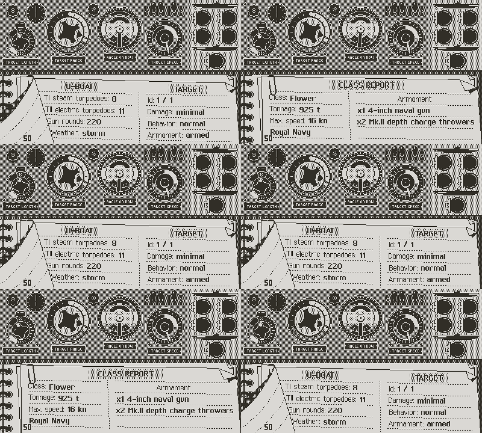
The ability to flip between the log pages must be maintained at all times
The first two points imply that command icons should be confined to the computer area, at the top of the screen. Once the player has tagged all the enemy ships, they browse through the available targets, either in the tactical chart or on the TDC screen. This is where the computer gauges are the most relevant, as they allow to sort out the best targets.
When a target has been selected, it’s fine to cover the computer. The occlusion is momentary, as we’ll see later. Point 2 means that as the player is giving commands, they should remain able to flip between class and situation log. Consequently, all navigation will be made with left, down and right on the pad, plus the two buttons, while up always flips the papers of the log.
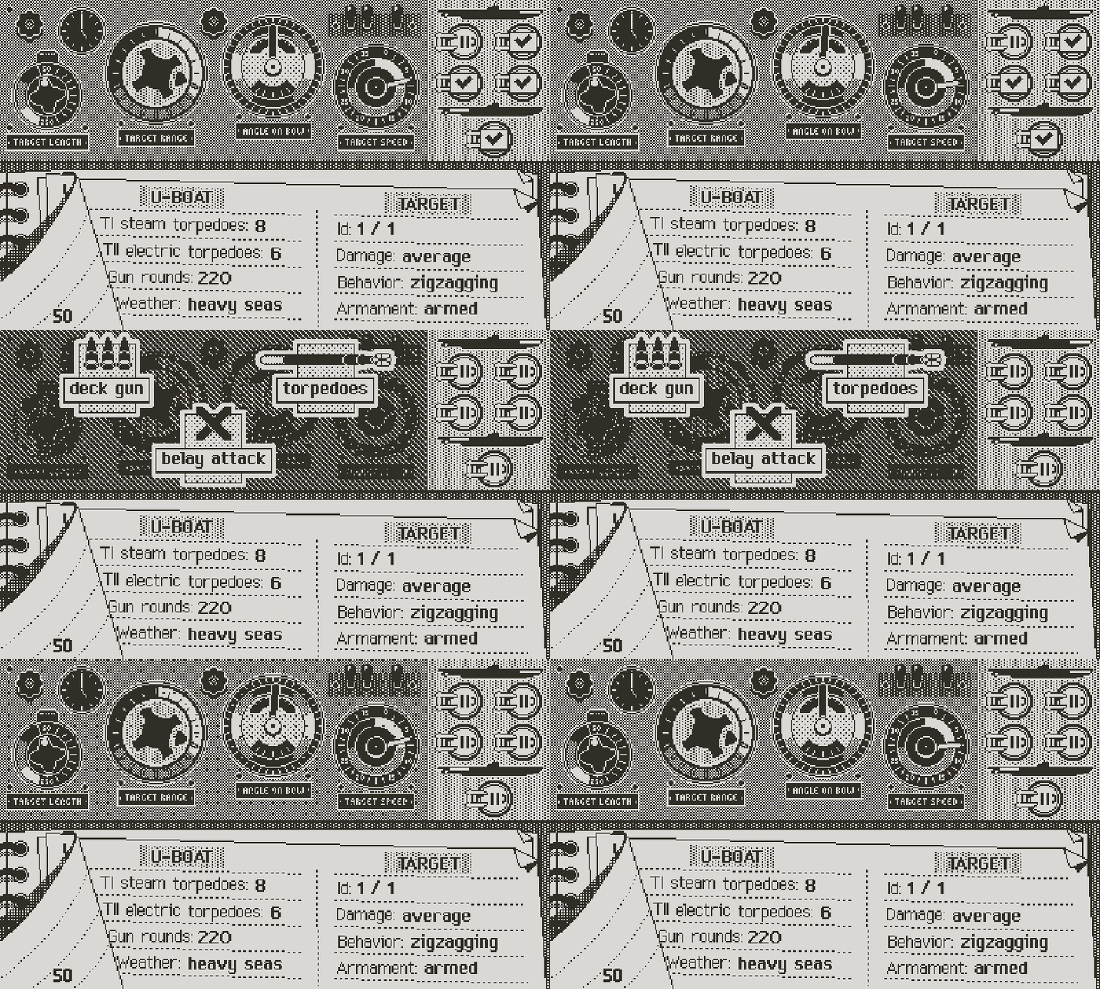
All icons remain in the TDC area
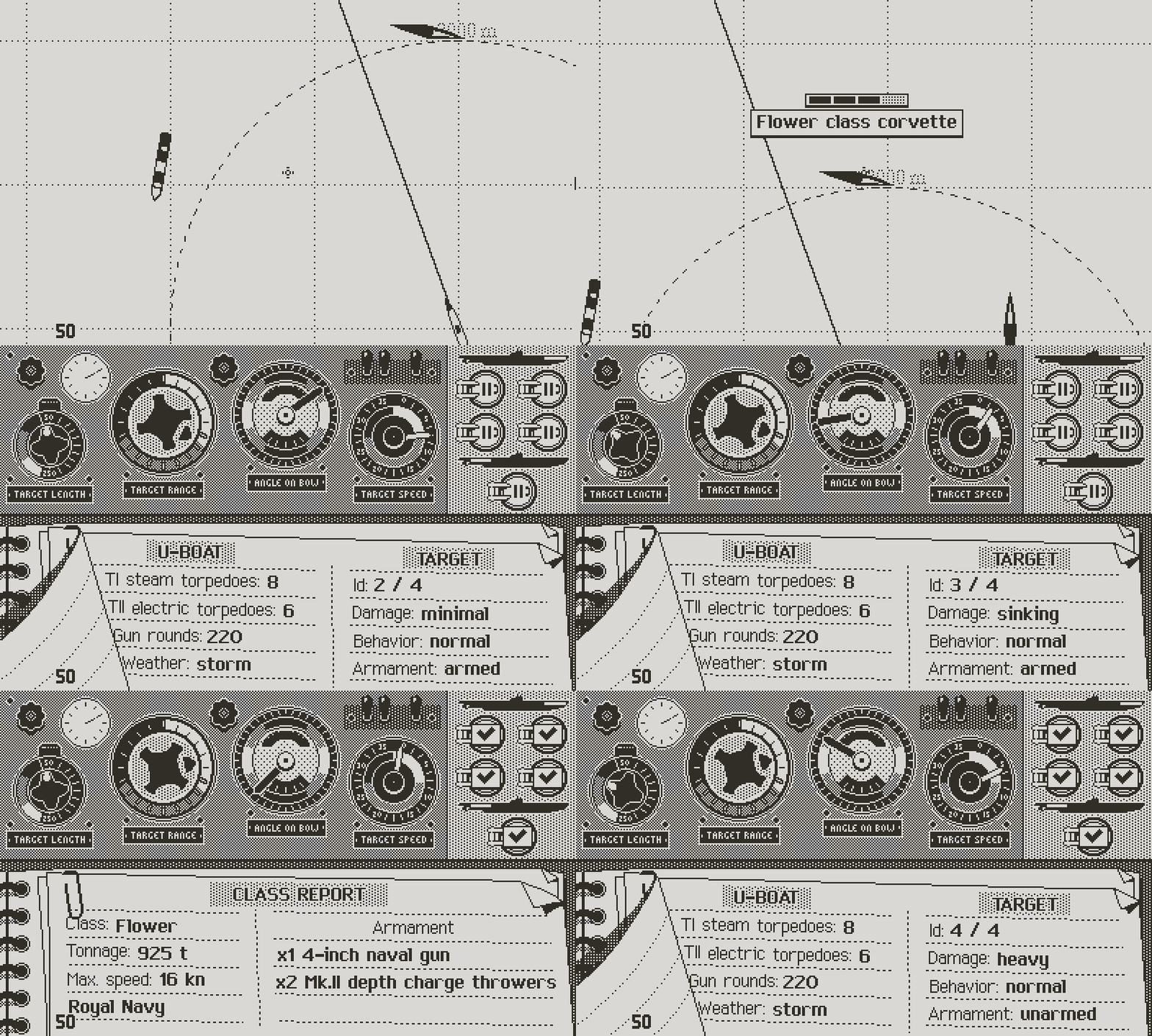
Given this, I made a first layer of commands, which the player calls with a press on the A button, similar to the tactical chart. I had to darken the background for the icons to read. The first layer of commands allows to decide whether to manage the deck gun or the torpedoes. The “Belay Attack” command cancels all attack orders, but doesn’t affect torpedo tubes loading orders. You’ll see later that loading of the tubes can be changed at any point with specific commands.
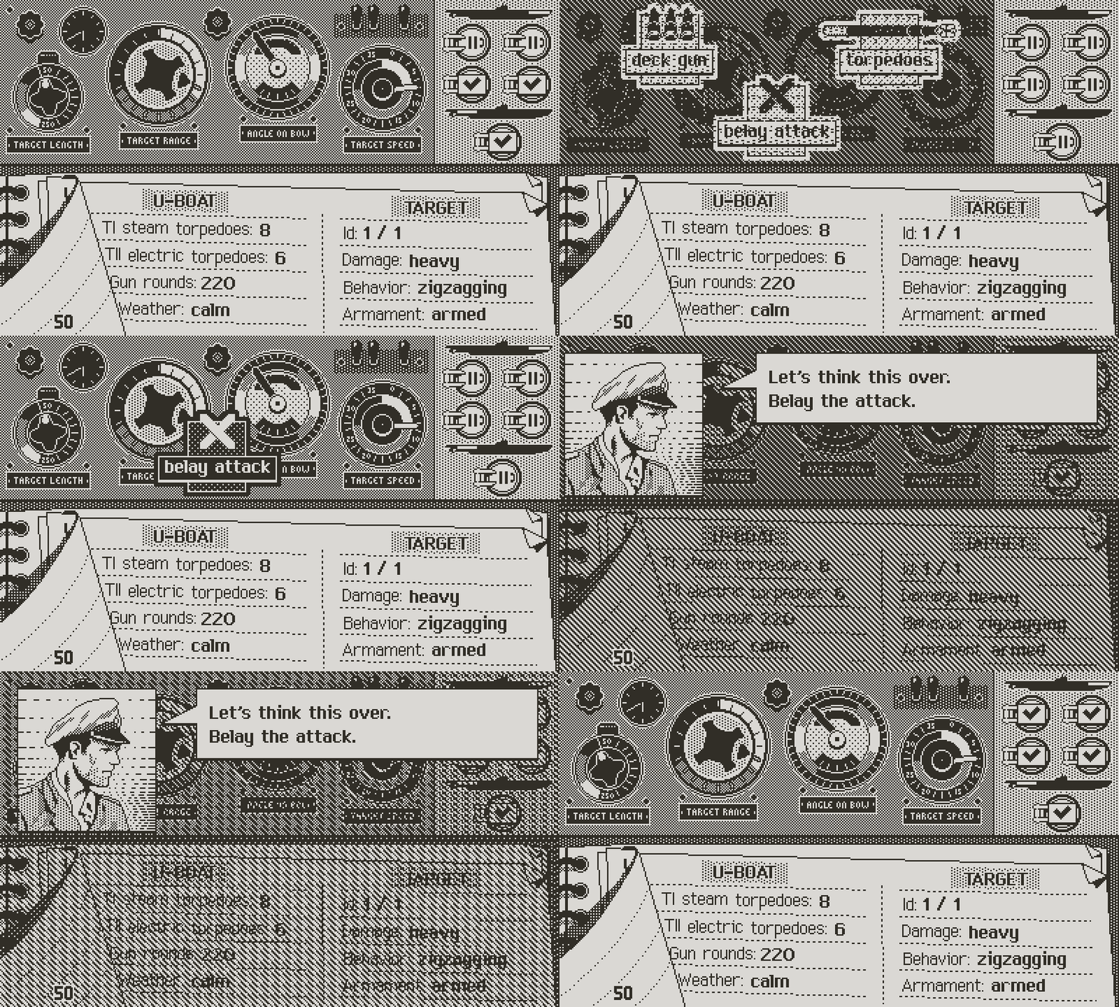
Belaying the attack makes the captain reconsider his options
The Gun attack command is simple; it orders the crew to fire on the selected target with the naval gun. During the end of turn gameplay, an interactive sequence will allow the captain to order successive salvos of 10 shells, with each round giving the opportunity to the enemy to respond. To avoid any ambiguity, a gun attack note comes in and covers the armament panel (where the torpedo tubes are displayed), as a reminder of the order, and of the fact that torpedoes can’t be fired. The appearance of the note informs on the selected target; a normal note means that the currently selected ship is the target. A grey note means a different target. To change the target, just select another ship and call the Gun attack command again.
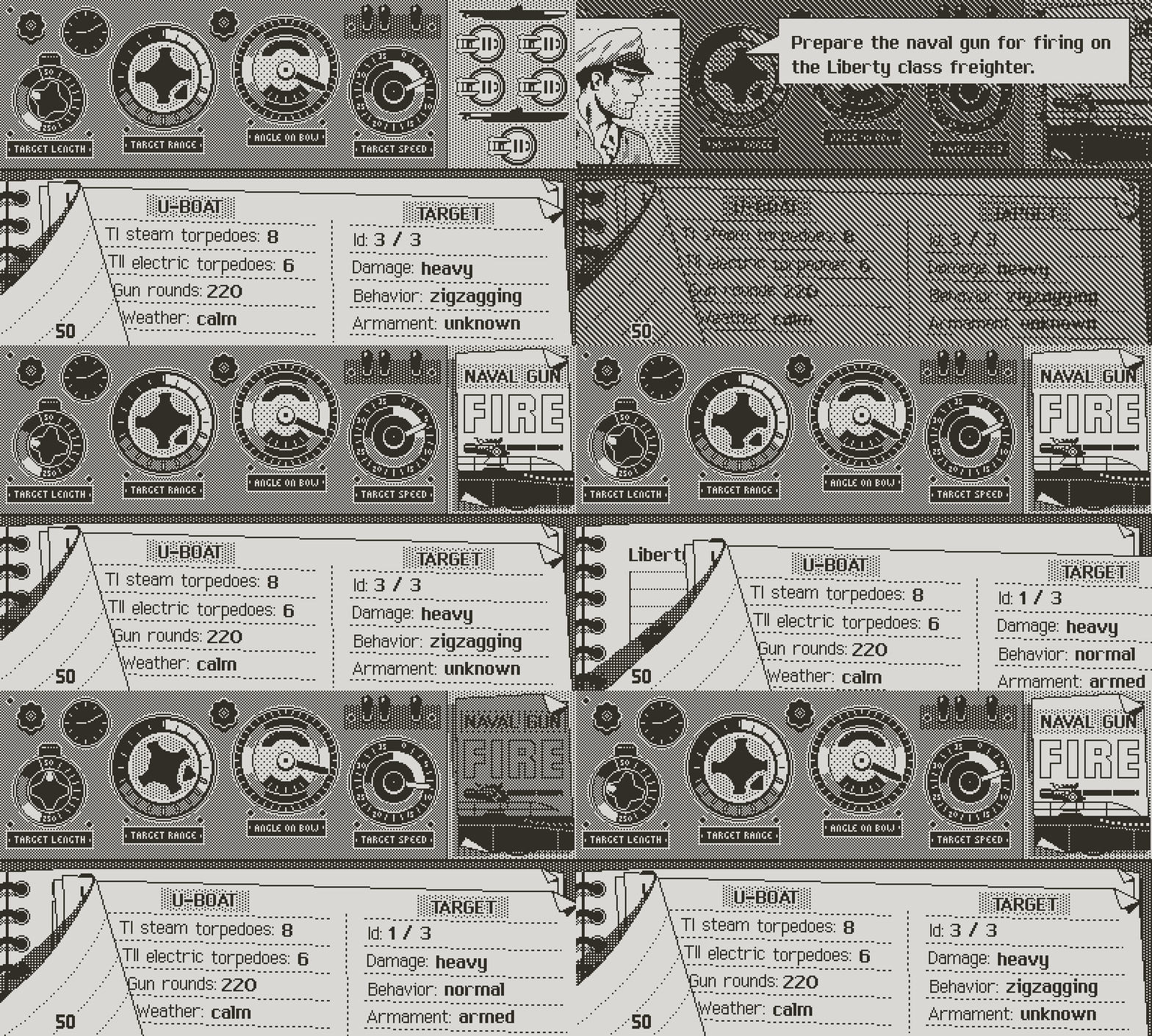
Ordering a naval gun attack
One Icon Can Hide Another
The naval gun command is the occasion to segue into another subject: how icons can serve double purpose. They allow to control the game, and can inform the player. This is particularly relevant on the Playdate, where screen space is a challenge. Think for a moment about the possible scenarios:
. You could be in command of a U-boat devoid of a deck gun. The small coastal Type II didn’t have one. Around 1943, the Kriegsmarine started phasing out deck guns on all U-boats, as all merchant ships were equipped with guns allowing them to return fire on the lightly armored, more vulnerable surfaced submarines.
. The deck gun could be damaged.
. You could have ran out of ammunition.
. The boat could be submerged, which obviously prevents firing the gun.
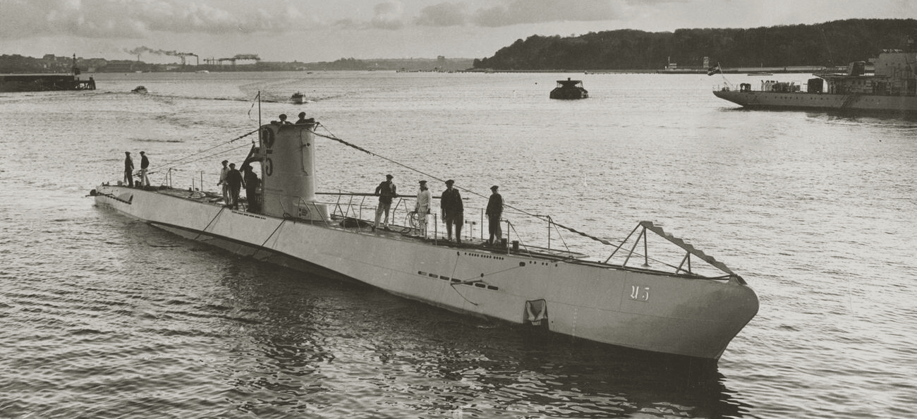
The Type II, which Atlantic '41 will feature, didn't have a naval gun
In all these situations, the player shouldn’t be able to order a gun attack. One way of doing this could be to mask the icon. But this could lead to confusion in the player’s mind. Why was this command available last turn but not anymore? Is this a bug? Not only that, but it leaves the player wondering what they must do to make the gun available again.
Of course the game communicates specific events with dialogue boxes. Something like “The deck gun has been damaged. It will remain inoperative until repaired.” But this is betting on the player’s memory of previous events, which could fail as pressure rises. Using the icon itself as a source of information seems like a good fix: whenever a command is temporarily disabled, have the icon, while inactive, visually inform the player of the issue.
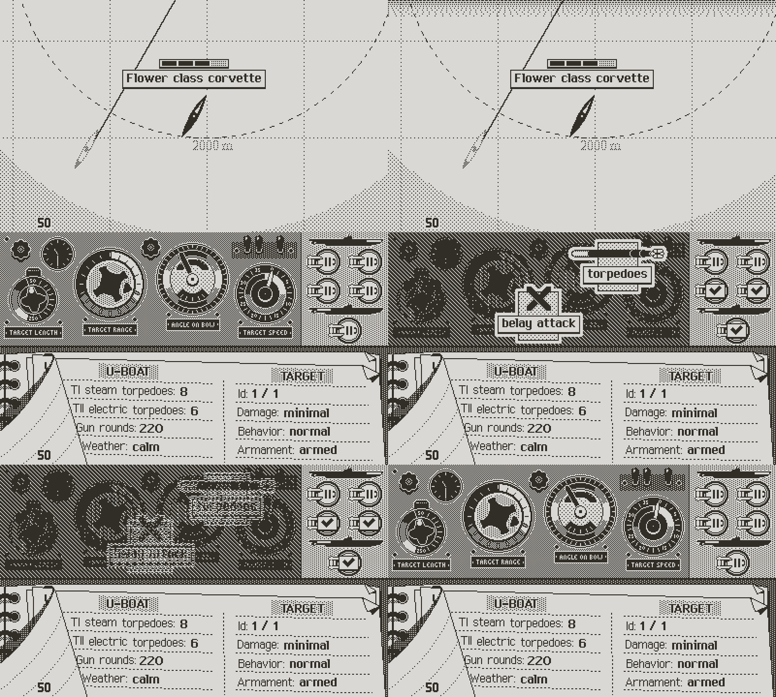
If there's no gun onboard, gun orders don't show
In this case I made three supplemental deck gun icons: one for the damaged gun, one for the gun out of ammo, and one reminding the player that they need to surface in order to use it. They all share the same greyed out aspect, signaling their inert state. Since I can’t display more than one, I’ll prioritize them by severity, with the most problematic always on top. Imagine a stack of problems to solve, with the most serious on top.
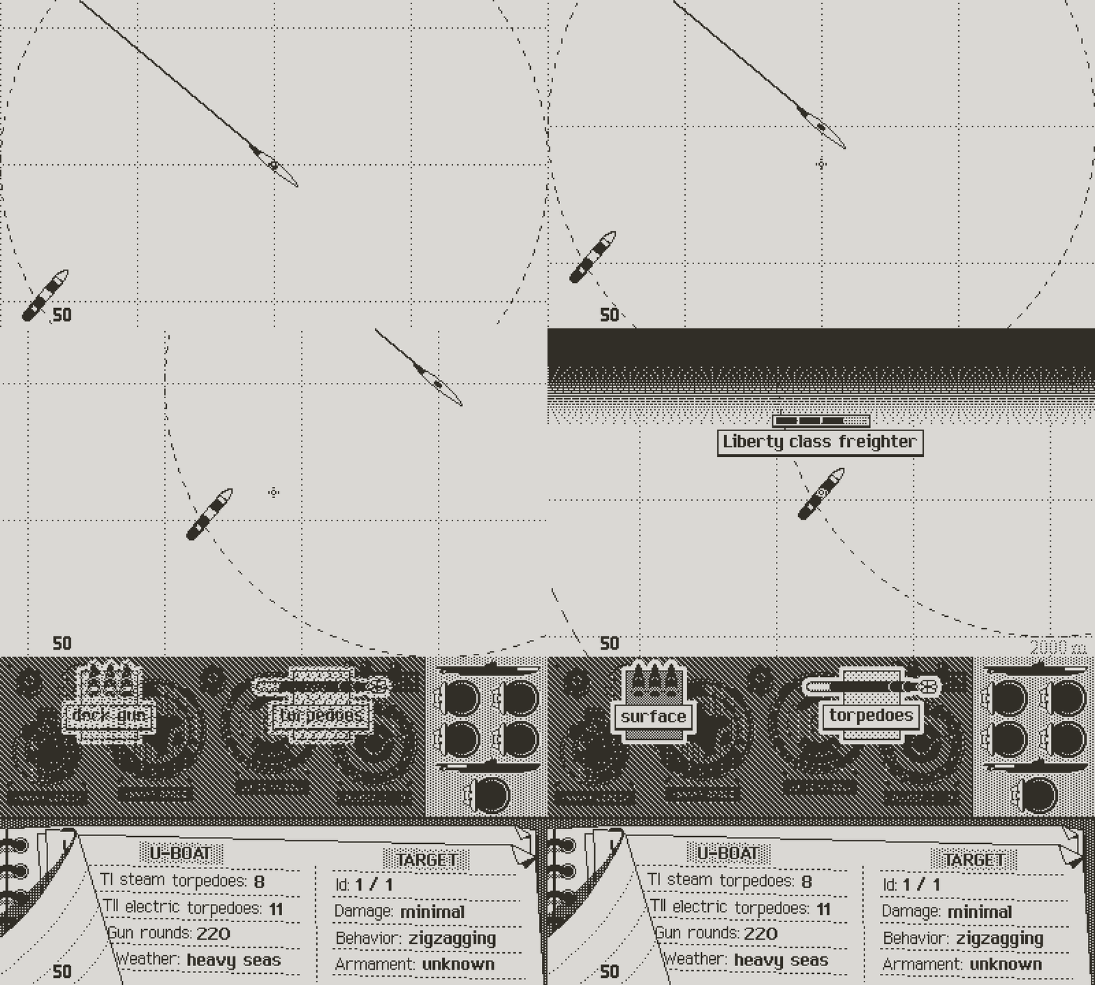
Here, the icon signals the player they need to surface to fire the gun
Consider a situation where the boat is submerged, and the gun is damaged. If the surface icon has priority, the player may surface to then learn that the gun is damaged. If I display the damaged icon on top, then the player must tackle the most serious issue first, which prevents wasting time on partially solvable issues.
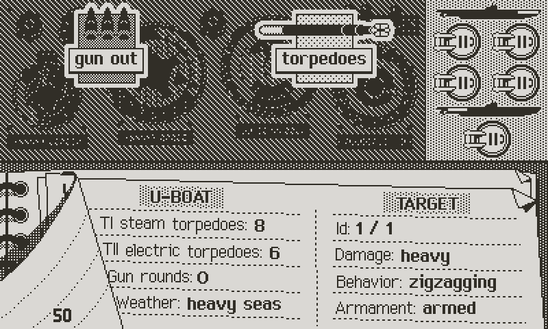
In this case, the gun is out of ammunition
As a rule, the only case where an icon goes invisible is when the command has already been called. For instance, order a deck gun attack on a target, then the command will only be visible for any other target than the one picked. This avoids wasting time by calling the same order twice. I already applied this principle in the tactical chart, where the player can’t request information that is already displayed.
Torpedo Tubes 101
Now back to the rest of the commands, in particular the torpedo attacks. This is more complex, as the UI must keep track of multiple bits of information, and allow to issue orders, like loading tubes and firing on various targets, with the option to revert any command.
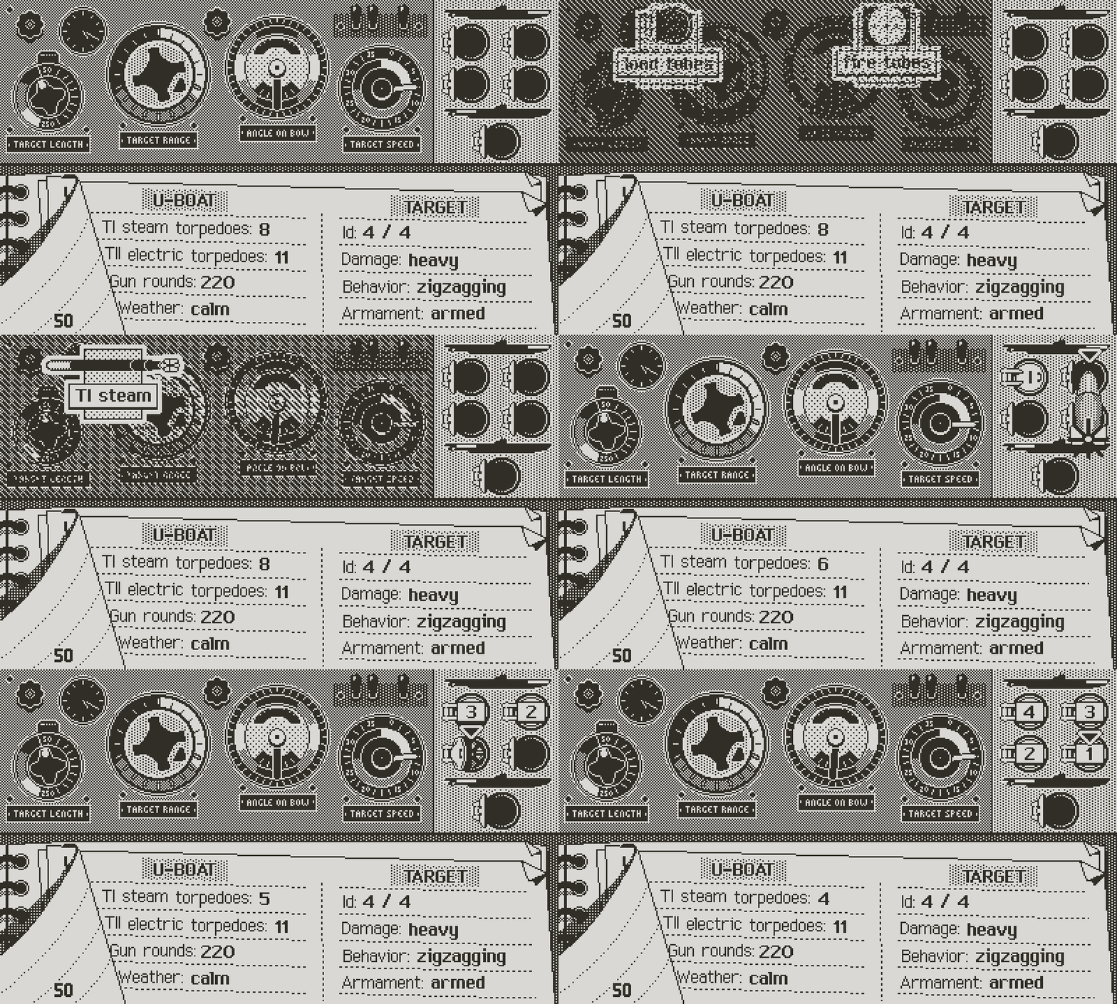
Loading tubes
The most logical approach seems to separate the management of the tubes (loading and unloading torpedoes) from the targeting, even though both work in a similar way. After deciding to load torpedoes or fire tubes, the interface focuses on the armament panel, the icons leaving the screen free of any obstruction. In the armament panel, you browse through the available tubes with the left and right directions, and select with A. Once done, B confirms and the captain’s dialogue pops up, summing up the order. The A button works as a toggle, for instance loading an empty tube, or unloading a full one. The Up direction is unused in the process, so that flipping the pages between situation and class log remains functional.
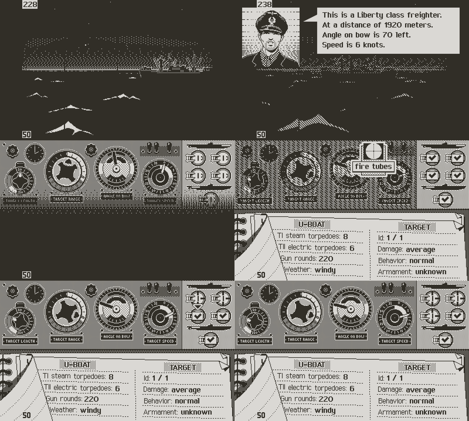
The captain's order is contextual to the number of torpedoes fired
In this screen like in the chart, nothing happens until the player decides to advance time. As for everything else, these are instructions waiting for the “advance turn” command to take place. Nothing prevents you from changing your mind about which tubes to fire, or to pick a different target, or even to cancel it all and attack with the gun instead, providing that you’ve ordered the boat to surface.
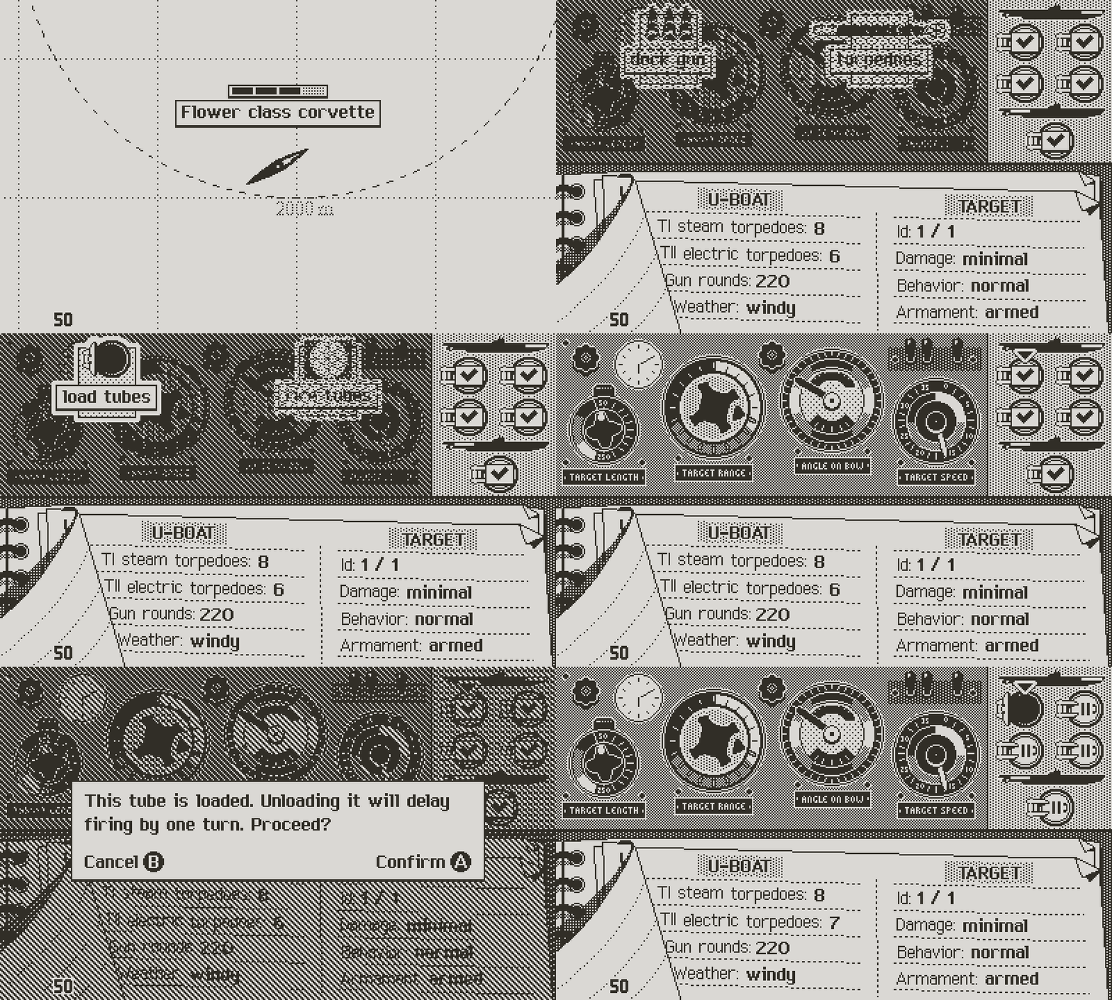
If a tube is ready to fire. Unloading it triggers a confirmation
This may read complicated, but in practice it’s straightforward. It’s also error proof, since nothing is ever set, except for unloading a tube that is ready to fire. That deserves an explanation:
Remember from last log that a tube takes one turn to load. A turn being 10 minutes, it’s a bit faster than reality, where loading would most likely take 15, and even up to 30 minutes in bad weather (testing will tell if this duration needs adjusted). For simplicity, unloading a tube, unlike loading it, is instantaneous. This means that when a tube is loaded and ready, unloading it would make it unavailable until the next turn. However, in this case, since the command is irreversible, the game asks for confirmation.
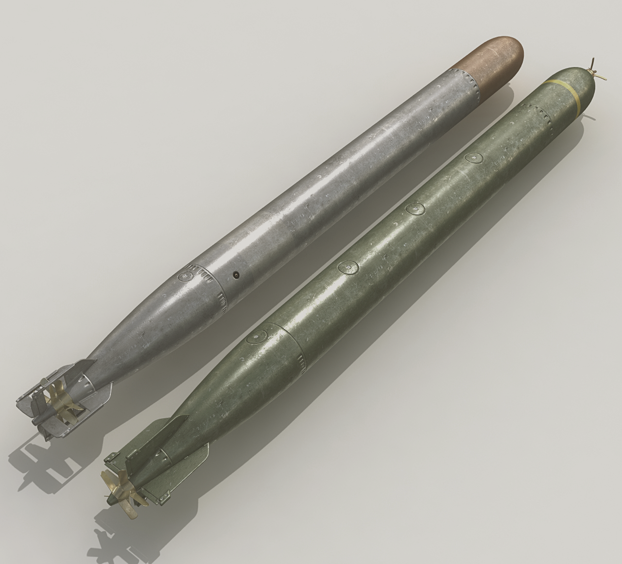
Top: G7a steam torpedo. Bottom: G7e electric torpedo
It’s a rare occurrence. The only purpose of unloading a tube is to change the type of torpedo. Steam torpedoes are faster and more efficient, but they leave a stream of bubbles, which can give away the U-boat’s location. For this reason they were almost only ever used at night. A situation could occur where the sun rises during the engagement, forcing the captain to unload steam torpedoes.
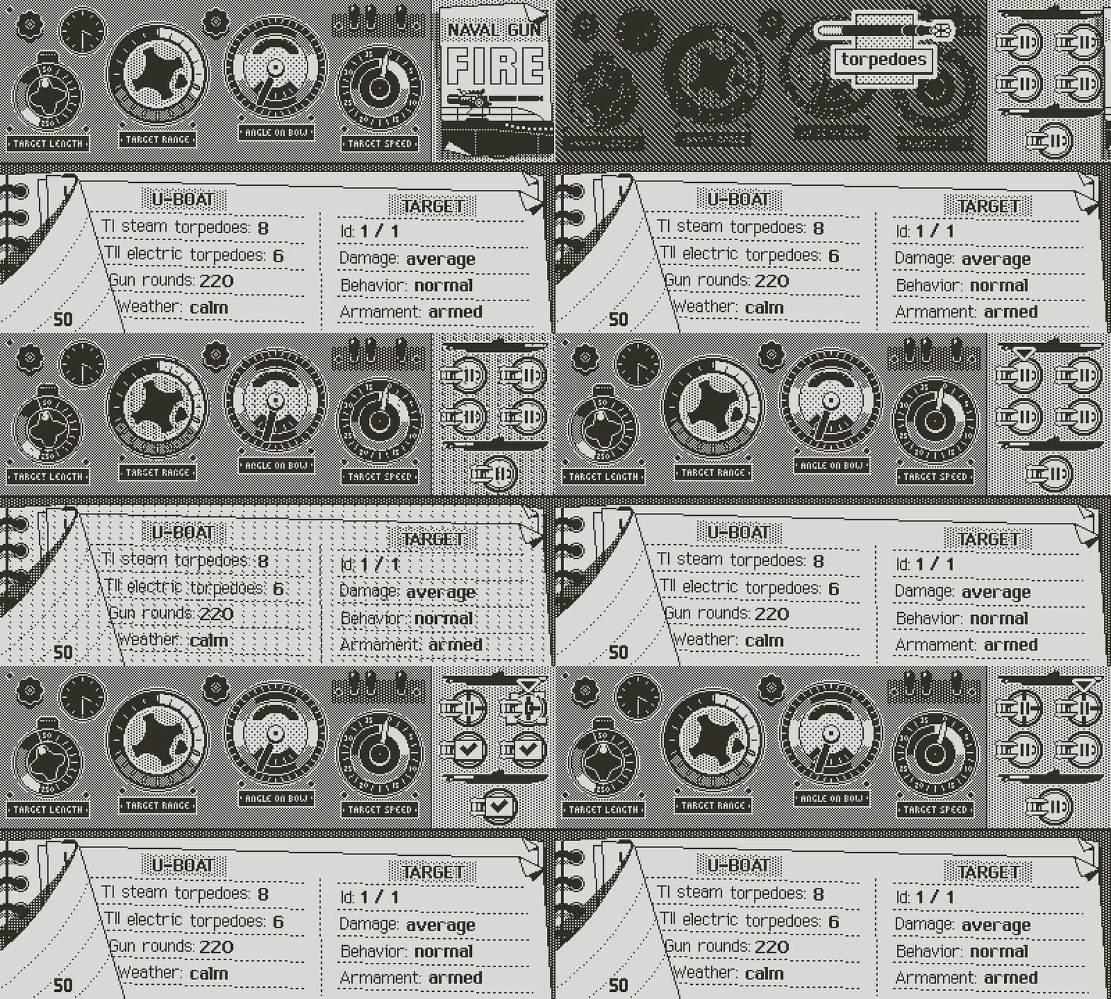
It's either gun or torpedo attack during the same turn
But how do you remember which torpedo was ordered to load in any given tube, and how many turns before it’s ready to fire? With sometimes up to 6 tubes on a boat, it’s impossible to keep in mind their individual state, let alone in which order they’ll be ready to fire and when. I considered having a command that would sum up all that information, but I dislike the idea of windows or menus. They slow down the game and break the all analog rule that I set early on.
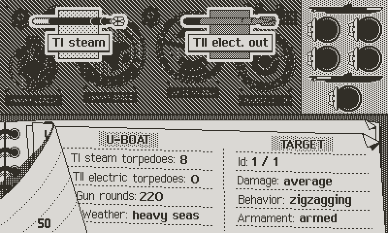
The stock of electric torpedoes is depleted
Instead, everything should be directly visible on the main TDC, right there on the armament panel. After some trial and error I came up with the following:
. An open tube means a free tube, with no planed loading.
. When the order is given to load a tube, it closes, with a mention on the hatch itself of the type of torpedo to load: TI is the steam torpedo. TII is electric.
. During loading, a timer blinks over the tube’s hatch, with the number of turns before the tube is effectively loaded. The first tube selected will have a 1 turn timer, the second 2, then 3 etc...since each tube takes one turn to load. The timer blinks on and off, allowing the torpedo type to remain visible underneath. The blinking timers aren’t the most elegant or immersive, but they’re acceptable, given the constraints I have to work with.
. When a tube is ready to fire, a check mark replaces the loading timer. The captain can then assign that tube to be fired on a target.
. When the tube has been assigned a target, the check mark goes away, simply showing a closed hatch with a target. Similarly to the deck gun note, the appearance of the tube indicates the target: a normal appearance means that the currently selected ship is the target. A greyed out tube means that it will fire on a different target. Simply browse ships until the tube shows in its normal state to see which one it targets. At any point, any loaded tube can be re assigned to any target.
. Finally, a dark tube signifies that it’s damaged. It can’t fire or receive a torpedo.
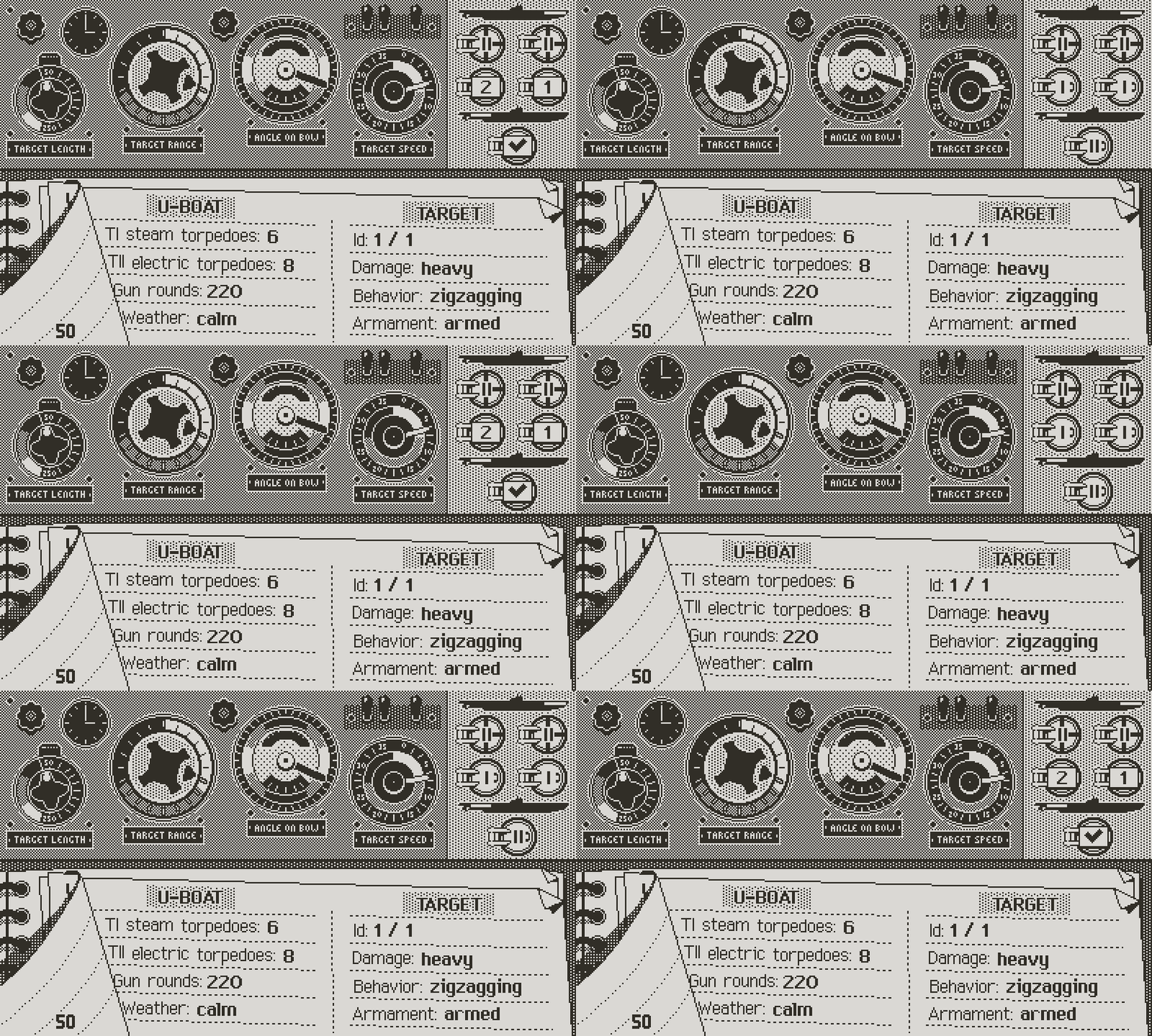
Forward tubes 1 and 2 will be fired at the target, with electric torpedoes. Tubes 3 and 4 will be loaded with steam torpedoes in 2 and 1 turns. The aft tube is ready to fire with an electric torpedo
I hope that this system is simple and logic enough for anyone to be able to get a complete assessment of the situation with one glance, and focus on the strategy. Like every system, it may require getting used to, but in any case this will have to pass the user’s test. I like that it covers all the situations with a minimal amount of commands, and no menu diving.
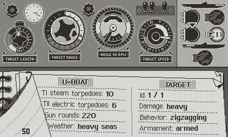
Forward tube 2 and Aft tube are damaged
Note that some of these options may change contextually to the mission and the type of u-boat. For instance, mine laying missions replace the torpedo commands with mines, since mine layers didn’t embark torpedoes in order to make room for the mines.
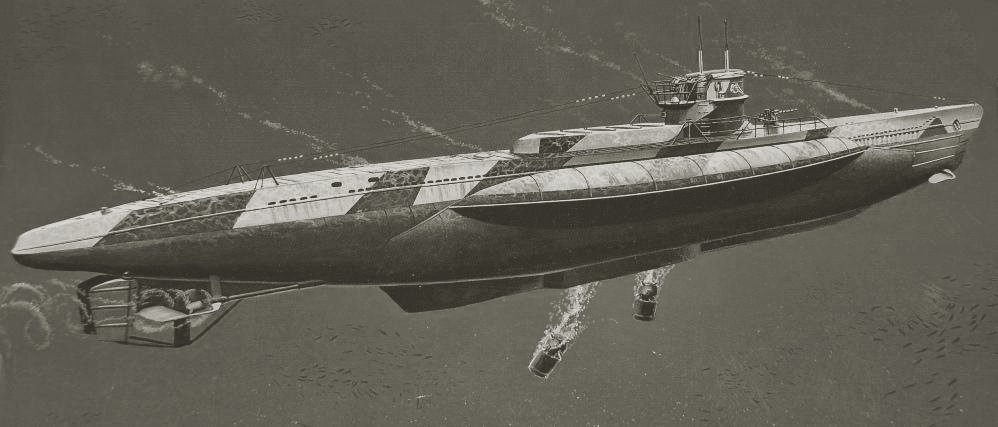
The Type VII D mine layer u-boat
As usual, any command is validated by the captain issuing orders, which serves as an additional sum up of the tactical decisions. For now I limited the system to a generic sentence, but I hope to be able to implement variations, for flavor, but also as tips for the attentive player.
For instance, firing both forward and aft torpedoes on the same turn comes at a penalty to hit applied to the aft tubes. So in that case I’ll have the captain lament about the necessity of risking a poor shot from the aft tubes, or something of that nature.
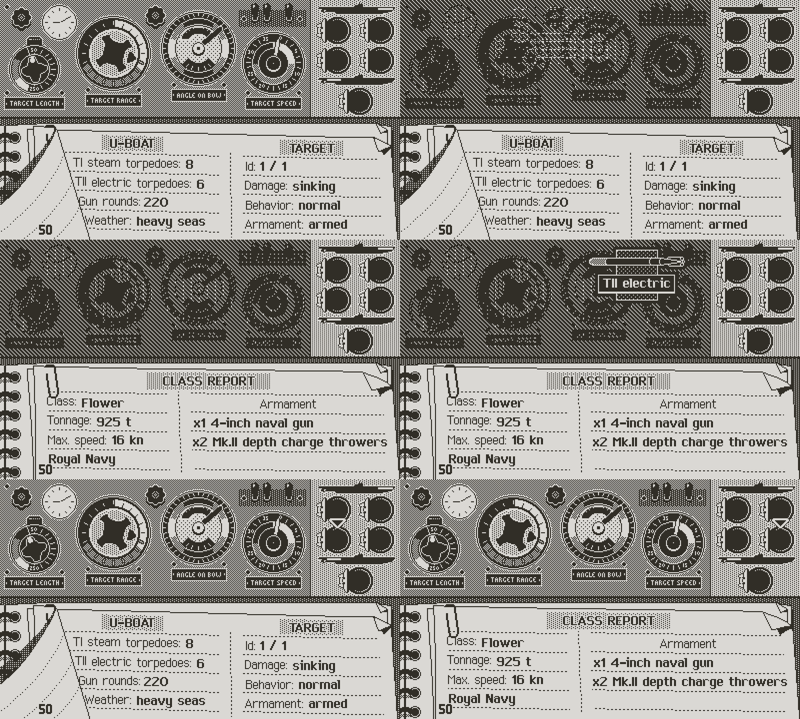
Both situation and class logs are accessible while managing torpedo tubes
In fact, I like the idea of distilling tips and tutorials over time through dialogue and out loud remarks of the various crew members, rather than overwhelming the player with walls of instructions reading like a rule book. For now, best to focus on making a bare bones functional loop, as many of these rules and gameplay features may change. Once the game has a solid foundation, I’ll go over the entire game in multiple passes, adding all the subtle touches which, I hope, will give character to the experience.
Make It Flow
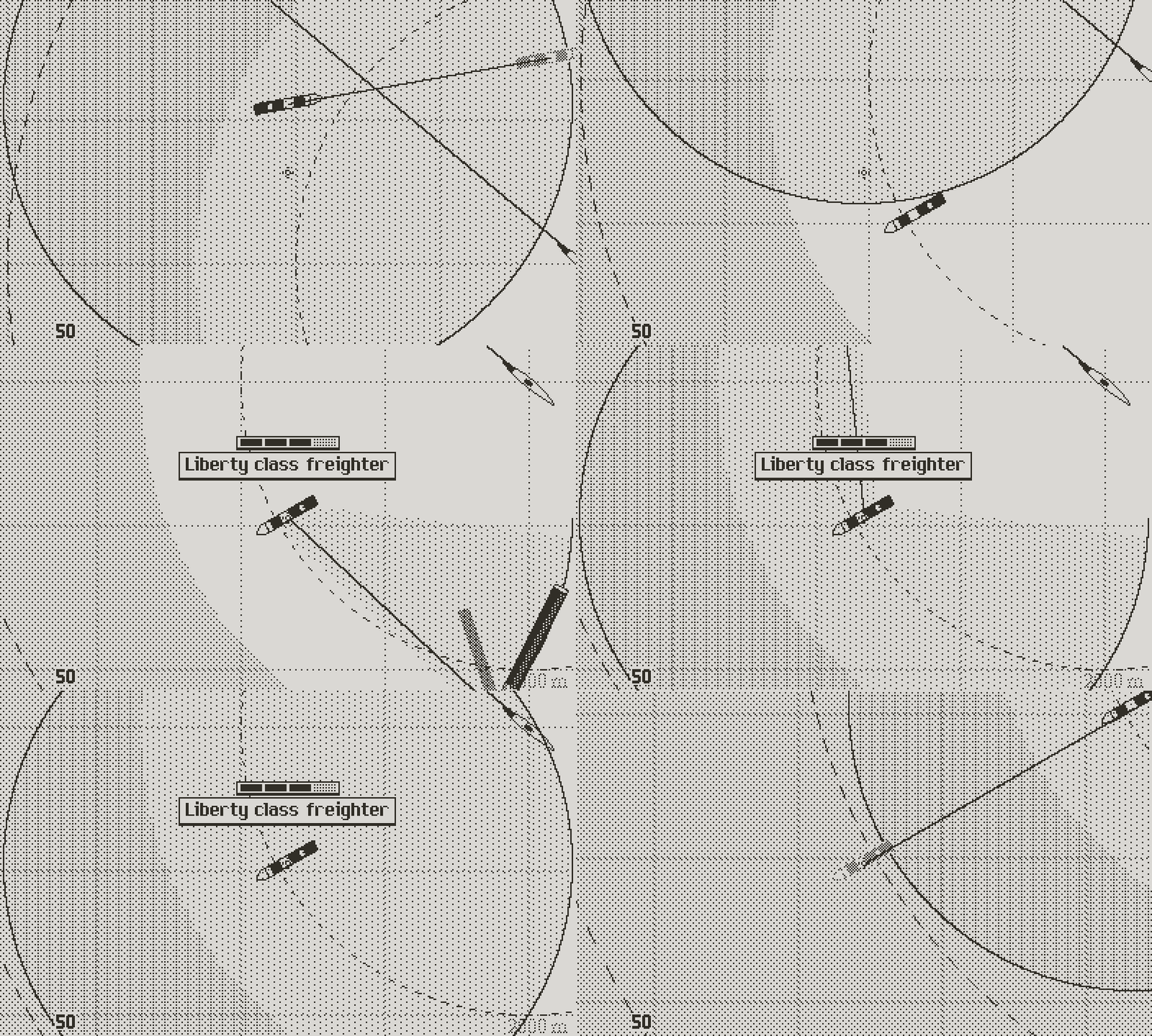
One final note before I end here: believe it or not I tuned the UI again. I’m one of the weirdos who can’t bear the slightest hiccup in system interfaces. Every millisecond lag on a command inflicts excruciating pain on my little ocd brain (the laggy PS4 system will remain a painful memory). Skips are crucial too. In Atlantic ‘41, every menu or command can be canceled (or sped up) at (almost) any moment; there’s few things more aggravating to me than suffering long reveal or transition UI animations for nothing.
Commands can be instantly canceled
On the other hand, some instances require that the UI makes a statement, to give proper feedback and validation to the player. For example, something new: executing a command now blinks the icon first, and then executes the order. It’s a tiny bit longer, but that short, essential pause gives weight to the action. If you play fighting games or hack and slashes, you know how the brief time pause reinforces the heavy blows, and make them a joy to dish.
UI works in a similar way. The proper timing and animation, combined with the right sound, can make a virtual button as satisfying to click as a physical button. Now I know this sounds obsessive (and it might be), but clicking icons makes for the bulk of the interaction in a game like Atlantic ‘41, and these thousands of button presses can participate to the enjoyment just as they can ruin it.
Delayed action after the command is activated.
In fact, since my latest fine tuning, the game feels much more enjoyable to navigate through. Older versions feel clunky and heavy in comparison.
A slightly shorter update, but it marks a significant milestone in the game, as I’m about to start designing and mocking up the next section of the main gameplay loop. This will cover a lot of new ground. Among the many exciting things to tackle: the interactive sequences showing the result of the orders given during the turn; from diving, to firing the deck gun, to launching torpedoes. This will be my focus over the next few weeks, with the enemy actions and AI to follow.
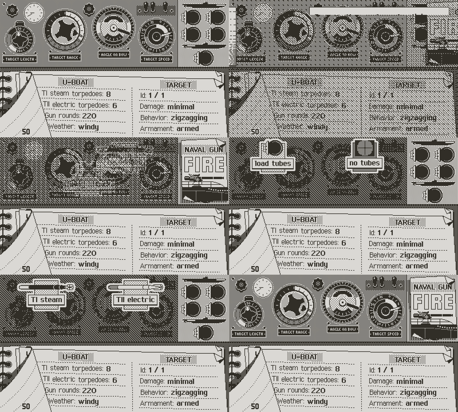
Transitions between icon layers flow better
One thing though: life decided to get in the way. In a few days I’ll undergo surgery. Not dangerous, but I must expect a long and painful recovery, which will likely leave me incapable of working for weeks. It pains me to pause Atlantic’41, but I’ll make the best of my time off the computer if I can, by catching up on all the reading and historical research.
So, again, more soon(ish).
Atlantic '41
A WW2 U-boat Simulation for the Playdate
| Status | In development |
| Author | StephanRewind |
| Genre | Simulation |
| Tags | 1-bit, Pixel Art, Playdate, Turn-based Strategy, World War II |
More posts
- The Enemy (Part 1)3 days ago
- Los!50 days ago
- Preparing the FutureApr 07, 2025
- Project ResetApr 01, 2025
- Small BeginningsFeb 24, 2025
- Death by a Thousand ShellsDec 17, 2024
- Next devlog a bit delayedOct 13, 2024
- First BloodAug 28, 2024
- Peril or SalvationJul 12, 2024

Comments
Log in with itch.io to leave a comment.
Great, the gun shells don’t look like torpedoes anymore. Great progress on all these things!
Thank you. Yes I agree that the icon works better now.
I just wanted to thank everyone for the kind words of support regarding my upcoming operation. I'm still actively working on the game until the last minute, with a suspenseful diving gameplay sequence that I hope you guys will enjoy. And I'll try to keep my normal log update schedule if I can.
Amazing! Best graphics ever!!
Agreed, it looks beautiful. This is such an achievement with 2 colors and a 400 x 240 resolution.
Thank you both. It means a lot :)
Another fascinating glimpse into the endless challenges of design. I really enjoy these devlogs, though I can't wait for the game to be released.
FYI, I don't think "gun out" is as clear as it could be. "No ammo" might be better.
Personally, I think "Reload" might be the most clear option since No Ammo could also imply that the player is completely out of ammunition for the weapon instead of just needing to load from reserves.
Thank you both for the feedback. In truth, no ammo makes more sense, because you never actually “reload”. It’s not like torpedoes that need to be micro managed by the captain. The gun crew fetches shells to feed the gun as long as they’re available. This will make more sense when I’ll show the gun attack sequence.
The only way to get ammo when you’re out is to meet with a Type XIV re supply U-boat.
I already changed the icon.
Ahh, ok. That makes sense.
Thanks for all of the details on these, they are always a joy to read through!
Oh, and another thing - it's really cool to see the tactical chart in one giant image. If Atlantic '41 were released in the 90s, a physically printed version would have made a great pack-in item :D
Maybe in the modern day it could make it into some promotional images.
In fact, I already plan to have a printed map for a physical version of the game. However it will be the global navigation map, divided into sectors. What the German navy called Marinequadratkarte.
The tactical chart doesn’t really make sense on its own, since it’s only relevant in the context of each specific encounter.
The map I’m thinking of printing will be similar to this, hopefully just a little bit more fancy.
Fantastic! I resonate so hard with "there’s few things more aggravating to me than suffering long reveal or transition UI animations for nothing".
Also love the meaningful icon behavior, and the idea of using dialogue instead of direct instruction.
One small bit of feedback - the "Naval Gun FIRE" image looks a little out of place to me. Almost everything in the UI is a physical item that exists on the boat, but this looks a little like a movie poster. Is it meant to be a piece of paper that might exist on the boat? Did you consider any other options?
Thank you. I’m with you on the gun note. I did several variants and liked none of them. For now, let’s consider it a placeholder. Maybe inspiration will come. In fact I already replaced it with another one below, which I like better, without being crazy about. The problem is that obviously there was never a written order for something like this. The captain would just order the attack and the 2nd watch officer would take care of it.
It comes down to making something that kinda fits with the theme, and you’re right that what I did so far didn’t. This new one looks like some kind of official military letter, so I think it does a better job. I could also have some kind of fake panel with a lever or something, this wouldn’t have any historical reality either, but maybe it’s something to consider.
I “think” that Marinegeschütz means naval gun, but I’ll have to ask confirmation to my German teacher/translator.
Yes, "Marinegeschütz" ("gun of the navy") seems correct, another term would be "Deckgeschütz" ("deck gun"). Marinegeschütz is a bit more official (perfect for the used official military letter), colloquially just "Geschütz" ("gun") or maybe "Kanone" ("cannon") would be used.
As always thank you for the great dev log – your attention to detail is awesome!
I wish you a speedy recovery!
Very good! Thank you for the translation. I'll leave it as is and please anyone share any idea you might have.
Thanks for the update and best wishes for a speedy recovery. Also, I now NEED a mini sofa stand for my Playdate.
Isn't it cute? Here’s the Amazon link:
https://www.amazon.com/dp/B0C2YTDDDM/ref=twister_B08F2BCXJ5?_encoding=UTF8&psc=1
Thank you 🤩
Wow! The details time and research you put into the game! As a new play date dev I can only applaud with deepest respect… hope you recover soon, good luck and can’t wait to get my fingers on your game!
Thank you very much!
Wishing you a recovery as quick as possible! I’m always so happy to see a new A41 devlog.
Thank you for the kind thoughts.
Greatest devlog ever
Thanks!