Atlantic '41
Small Beginnings
Before moving on to the torpedo firing sequence, I had planned to dedicate this episode to the various small improvements made over the past few months, in parallel to the main development schedule. The combination of these details amount to something, but they’ll make for a dull read. It might be best to distill them over several updates, as they relate to more important topics.
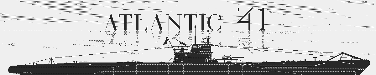
Firing the gun at sunset
At this point, I would rather show my plans for the introduction of the game. I’ve thought about it for some time, and it’s at a stage worth sharing, at least in its current mockup form. I realize how out of order this is. As I mentioned in the past, I like to follow my inspiration, rather than sticking to a plan, at least to a certain extent. As long as it’s not throw away work, I don’t see this as a huge problem. And I tend to be better when focusing on what’s exciting on the moment.
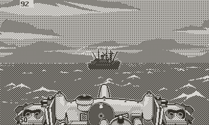
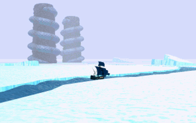
A clear night
Because I’m so slow at building the game, I’ve had ample time to reflect on how it should begin. But couldn’t form a clear picture until recently. I find that the best is to forget about the result, and instead to try and answer high level questions.Doing this helped me to isolating a few objectives that the introduction should achieve, and what to avoid. But before that, there’s a new UI feature I developed recently, which is somewhat related to the intro: the events messages.
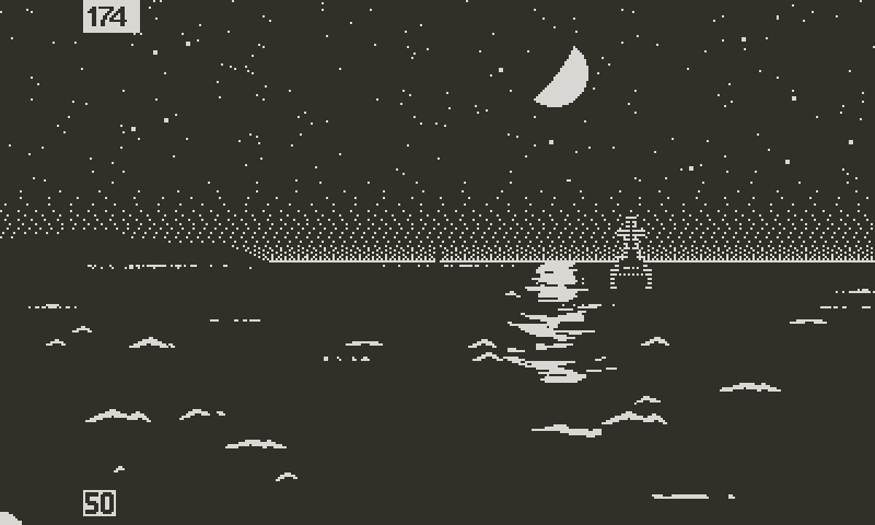
Game Over
A few years ago(!) I had more limited ambitions for the game. In particular regarding UI and presentation. Until recently, it had not occurred to me that the game over screen felt unfinished. I saw it as clean, efficient, and serious looking. But as other parts of the game visually improved, the white text on black screen resembled a placeholder, and not a proper way to end a campaign, if there ever was one.
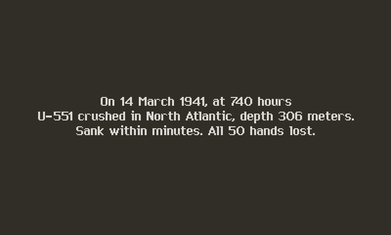
The old game over screen was dry
The direction I was considering for conveying the historical context got me thinking. Since the major events of the war were going to be told through press clippings, I was looking for a way to maintain that vintage/analog way of communicating information to the player.
War telegrams, or cables, as they used to say, seemed the obvious choice; it makes sense in context, since it’s the way information and orders were exchanged throughout the conflict. And because they were transcribed on paper, that also fit with the direction of the game.
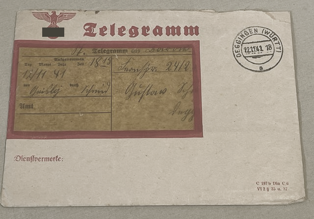
A war time German telegram envelope
My limited Google skills didn’t help me find any good examples of real WW2 cables, let alone German ones. I suspect that most of them were nothing more than hand scribbled lines on a sheet of paper. The more important communications, destined to brass, might have been typed on letterhead paper.
Given the lack of available reference, I feel allowed to take liberties for the sake of visual interest. I used a few German telegrams from the era as basis on which to elaborate. The game over screen served as starting point, but keeping the layout versatile enough to cover all messages, from specific mission orders to headquarters general communiqués.
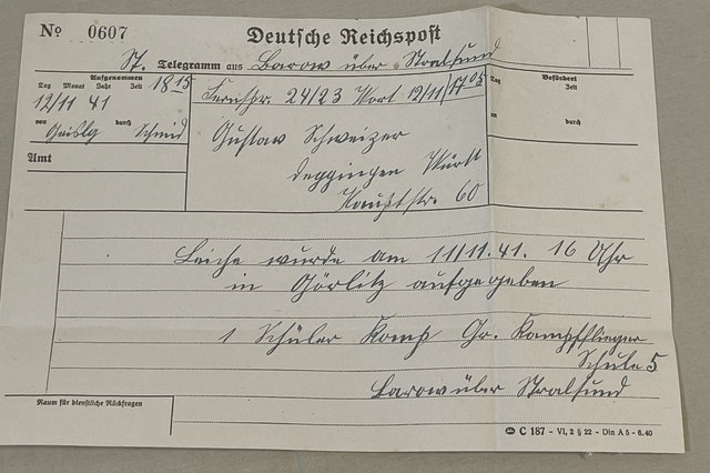
The reference I used for my game telegram
Dividing the page into a few unlabeled boxes allows for more flexibility. For instance, the location box for the game over message might hold the topic for other kinds of messages.
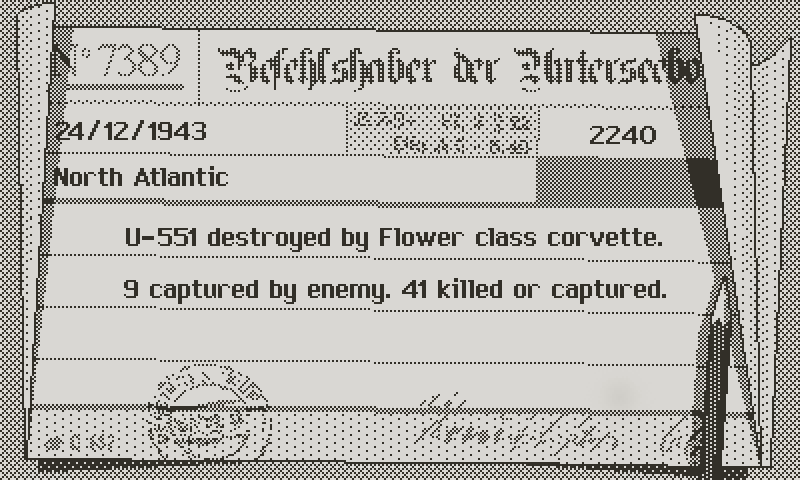
A couple of points: first the font. I was hoping to get away with the one I use for the character’s dialogue, but it wasn’t a good match. It’s reminiscent of Apple system fonts on purpose, to play on the vintage Macintosh nostalgia. It’s neutral and readable for character dialogue, and small enough to fit text heavy moments. But the cable needs something that conforms to the WW2 theme. Too many different styles can hurt the UI cohesion, but there wasn’t any choice there. A script typeface is out of the question at that size, so the only choice left was a typewriter emulation.
In progress cable with the regular dialogue font
The other observation is about contrast, in particular the importance of dithering all the flavor text, to focus on the important information. On such a small screen, the eye tends to wander around, looking for the relevant text. So I reserved pure black for the essential information, like time, date, location, and reason for the loss of the boat. Everything else blends into the page. With that said, let’s go to the intro.
Final cable implemented with new typewriter font
What Does It Say?
I was mentioning key objectives. First, the intro should set the stage. That’s its defining function: to put the player into the mood. There’s several ways to accomplish that. Arcade and action oriented games often showcase exciting gameplay. Role playing or adventure games may have a more narrative approach. But it’s the same intent of setting the imagination of the player in motion even before the tutorial starts. It can also give the player a glimpse at what the game has to offer.
I remember the strong impression that the minimalistic introduction of “Ultima 7” made on me
Many games put story, or more often plot, at the center of their intro. I’ve explained in previous logs my contentious relationship with story in videogames, let alone lore. That’s not to say that Atlantic ‘41 won’t tell one. I’m thinking about ways of supporting the campaign with a loose plot, but hopefully the gameplay twists and turns can help the player to making up their how own narrative.
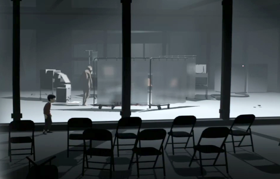
Playdead’s “Inside”. No lore. All story
That doesn’t prevent the intro from establishing a context. WW2 in itself is a drama of epic proportions, and sets a better stage than anything I could ever come up with. But such a vast topic could be told from many different perspectives, at many different scales. From the intimate point of view of a U-boat captain, to the more elevated perspective of the DbU (the U-boat task force), to an ever more detached view on the battle of the Atlantic, or even the entire conflict.
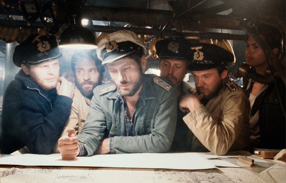
“Das Boot” macroscopic perspective. A single crew and a single patrol
My feeling is that the war itself makes for a better subject than the story of a specific soldier. In particular because the player will have the opportunity to play different captains. But regardless of individuals, the history of the war, and its defining moments, will weave a common thread throughout the game. Accounts from U-boat crew members remind us that these men were not in isolation. Refit and rest periods between patrols kept them aware of the evolution of the conflict, and of the increasing burden put on them to achieve the blockade of shipping lanes from the U.S. And so if the war makes a canvas for the game, it’s only logical that the introduction follows the same idea.
Lucas Pope’s “Return of the Obra Dinn”. The clever and efficient intro amounts to a few lines of text, before throwing you right into the game, with a heavy suitcase and a grumpy sailor
To sum up: setting the stage up, getting the player to measure the dramatic context, and reminding them of the historical background.
How Does It Look?
There’s many ways to go about the intro for the game, but the choice largely depends on resources. Since I’m the resources, the options narrow down significantly.
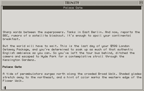
“Trinity” by Brian Moriarty. The entire intro of an only-text game in three short paragraphs. That’s economy for you
At one end of the spectrum, there’s text. Text is fine. It’s a quick, easy, versatile, and efficient way to set the scene. As a fan of interactive fiction and someone who views Brian Moriarty’s Trinity by Infocom as one of the best games ever made, I love text. Again, not to mistake appreciating the writing medium with liking chatty games. I think that the hard memory limit that old Inform (the interactive fiction engine invented by Infocom) games were subjected to may have been at the core of their success; each word had to be weighted, and even what they called the “verbose” mode was economical enough to let the player’s fill in the blanks.
Here’s an idea
However, text isn’t the most visually exciting. And there’s the danger of setting wrong expectations. I set out to make Atlantic ‘41 fairly graphics intensive, at least considering the platform. And the intro should make an attempt at selling that idea.
Music and sound will help. There’s also ways to present the text in a more appealing, or dynamic fashion. Device6 did this brilliantly. But coming up with a clever presentation is a tough challenge, and the work involved then amounts to making a more traditional animated sequence, with diminishing returns.
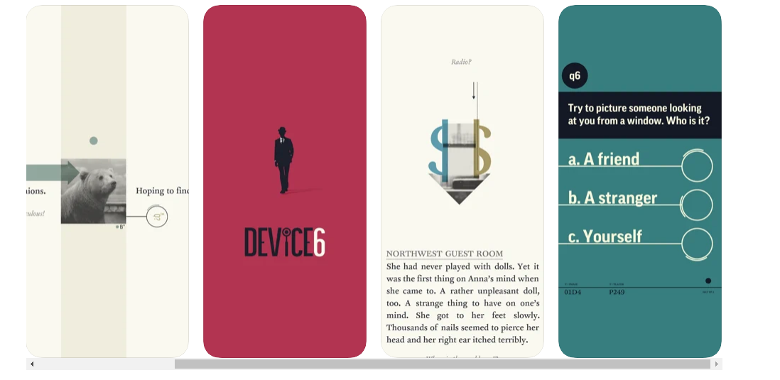
A few screens of the beautiful and unique “Device6”
One final concern with animated/FX heavy text intros is how modern they feel. Because the rest of the game has few digital, modern abstractions in its presentation, there’s again the risk of treading outside the direction established for the game. With that said, text is a viable option, which was always on my mind, at least as part of the solution. But I’ll come back to this.
The absolutely bonkers introduction movie of “Armored Core V”
Jumping to the opposite end of the spectrum, there’s your good old full blown pre rendered animated/live action short film. I’m not doing that. The majority of players will only ever watch the intro once. It’s still important, as a first impression, but not to the point of wasting weeks modeling and animating assets. Plus, I can’t picture a good way of translating the scope of the war into a short cg sequence.
“Homeworld 2” made great usage of still images augmented by smart parallax, panning and zooming
In between these extremes, many small indie projects opt for sequences of illustrations, often supported by animated transitions. Something akin to a digital visual novel. It has many upsides, in particular feasibility. Like text though, a bland succession of static images can look cheap or unrefined. Presentation would require at the minimum proper pacing, and preferably some effects and transitions. The visual novel approach faces a few of the same challenges as the animated sequence, like how to translate the scope of WW2 with a few black and white images.
The intro must follow the direction established at this point
The final key point is that it must conform to the aesthetics of the game. A significant portion of the visuals is already done, and hopefully a direction has emerged. If you’ve been with me since the beginning, you’ve seen that it holds on two main pillars:
/ Grounded visuals, with realistic proportions and shapes, supported by light stylization.
/ An all analog, physical approach, with as few abstractions and video games tropes as possible.
Be Respectful
Now here’s the tricky one. Regardless of what the intro tells, and how it looks like, it should treat the subject matter with respect. That goes for every part of the game, but in particular for the intro, as it sets the initial tone.
I won’t write a long pretentious thesis about WW2, but everyone can agree on how dramatic and transformative it’s been. It affected almost everyone on the planet in one way or another, even to this day.
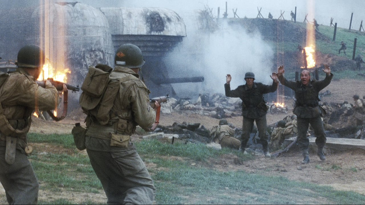
“Saving Private Ryan” uncompromising view on WW2. Here, rangers gunning down surrendering soldiers.
It would be hypocritical to pretend that I hate tanks and airplanes, battles and action. But acknowledging that fact doesn’t mean that I would be making light of the people who fought and suffered. I must reconcile with the inherent conflicted nature of the game; putting a world scale horror at the center of a form of entertainment. I guess the same could be said about any piece of WW2 fiction, from Saving Private Ryan to Das Boot.
And even if it shouldn’t shy away from the reality it depicts, I think it would be of poor taste to use the intro as a showcase of military might, acts of valor, and spectacular pyrotechnics. Before anything else, it’s the opportunity to remind the player of the evil that spread throughout the world in the early 30’s, and pay homage to the people who were impacted.
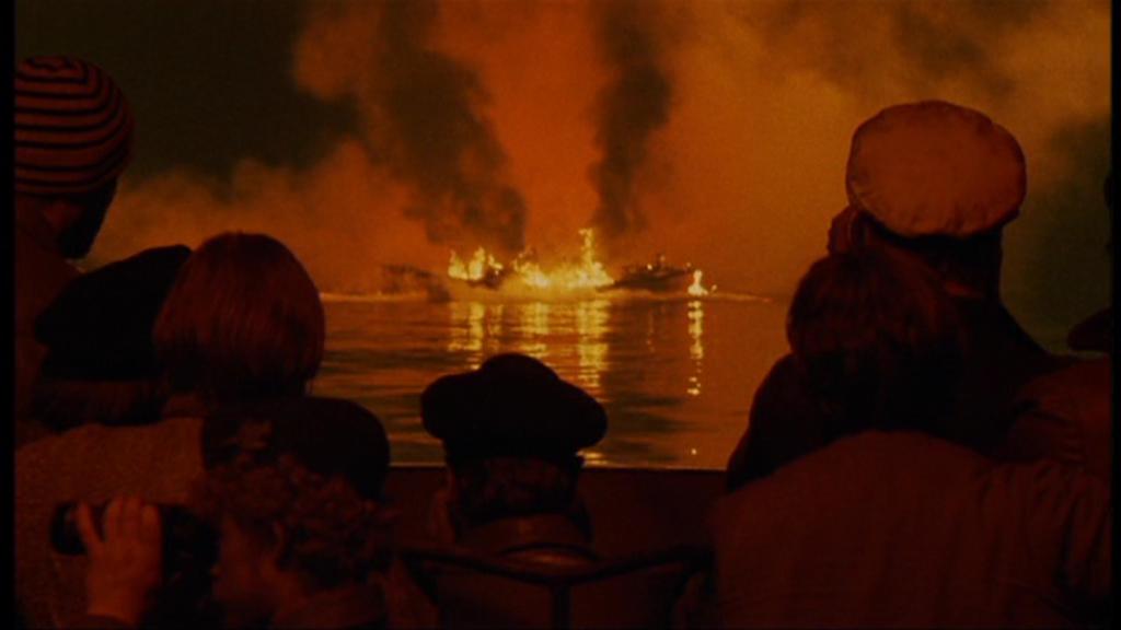
“Das Boot” original TV version lingers on the scene where the captain of U-96 abandons torpedoed survivors.
Even though the game is played from the perspective of the German side, for reasons I have detailed in previous logs, I think the intro should be neutral, and not solely focused on U-boats, out of respect for all the people caught into the firestorm.
The game is about experiencing the war through the life aboard a U-boat, with all its darkness, not passing judgment, nor taking sides. I imagine it like a virtual, interactive documentary about U-boat warfare. To try and convey the experience of a captain, the problems to solve, the decisions to make, the weight of responsibility, and the suffering men both endured and inflicted.
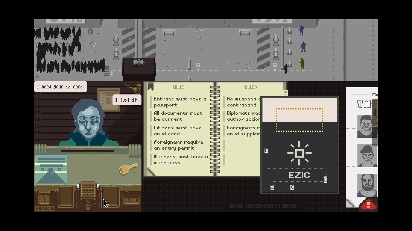
Lucas Pope’s “Papers, Please”. The dilemma of helping EZIC at the risk of your own virtual family, and a game over
Just like in Lucas Pope’s Papers, Please, where you can help the people in their fight against the government, or be a willing agent of the state, Atlantic ‘41 shouldn’t steer the player in either direction. If compassion isn’t always rewarded, and evil not always punished, then the player can better reflect on the realities of WW2.
But I digress again. The point is that the intro should tread carefully, and the tone be somber and neutral, rather than partisan and excited.
News of the World
From all this emerged the idea that, I think, conforms to the requirements; introducing the game by summing up the major geopolitical events that led to WW2 with the use of newspapers headlines. From a thematic standpoint, it makes sense to me, as the introduction to the game becomes the introduction to the conflict itself.
As to the form, I’ve always loved newspapers front pages. There’s beauty in the way single column articles frame large font headlines. I love the creative layouts and the old advertisements.
Even without animation, the newspapers double pages look attractive and dynamic. The big, high contrast black and white titles are ideal for the Playdate screen. The concept fits the vintage analog direction of the game and respects historical accuracy, even if I had to make a few changes to adapt the various pages to the specific needs of the intro.
I could have chosen to illustrate the main events of the war, but I want to save them for the campaign. I like the idea that the game starts with all the headlines leading up to the start of the conflict. Then, as the game campaign progresses, the player is kept informed of the world’s events through more headlines. Not only does this make a consistent theme throughout the game, but it also gives it additional educative value.

I hope that this can also help players who don’t know WW2 history to better understand their place, as U-boat commanders, in the grand scheme of things. And to make more sense of the increasing difficulties they’ll face, for instance with the introduction of the U.S into the conflict.
For easier transition and pacing, I decided to make all the pages exactly the same size, roughly covering two screens. The newspapers scroll at a constant speed, right to left, while fading into one another. That motion conforms to the natural western language reading direction.
Transition test
I don’t know much about movies, but I’m aware that it’s recommended to have all shots panning in the same direction. For instance, a left to right motion will cut, or fade poorly into an opposite direction. A skilled director would come up with tight pacing and multiple compatible camera motions, but given my limited skills and resources, it’s best to stick to a consistent, reliable system. Plus, panning and fading need to be programmed in game, which means that the more complex the edit, the harder to replicate it at run time.
This layout is too difficult to read on the Playdate
Even with that simplification, making the assets turned out to be more effort than anticipated. First, I realized that no real headline would ever fit my needs without moderate to significant changes. Sometimes, the layout didn’t work with the screen aspect ratio. Other times, the size or type of font for the title would prove too difficult to read for the few seconds it lasts on screen.
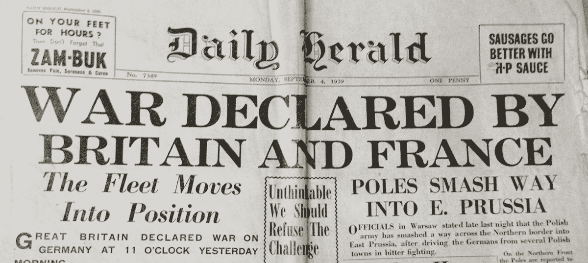
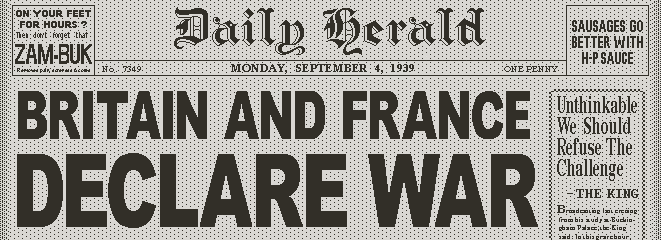
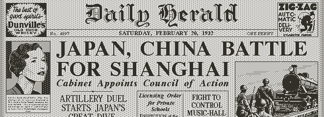
The original page of the Daily Herald announcing the declaration of war
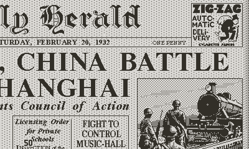
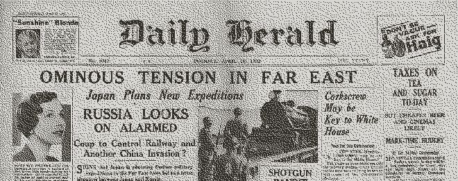
In some cases, I was concerned by potentially misleading titles for readers unfamiliar with the historical context. For instance, in 1931, Japan launched a campaign to invade the Chinese province of Manchuria. This was followed by a battle for Shanghai in 1932 and a full scale war in 1937. As part of the early events that led to WW2, I picked the front page of the Daily Herald of 1932. But the title “Battle for Shanghai Begins” was vague on its own, not mentioning the two actors of the conflict. So I changed it for “Japan, China battle for Shanghai”.
The game version. A more legible font and rearranged layout
From a technical standpoint, I tried various ways to convert at least portions of the pages into 1-bit images for the Playdate, using a combination of threshold or diffusion algorithms. Unfortunately, in part because of the scaling down, the results looked like bad Xerox, which could pass for an artistic style, if the rest of the game didn’t look so different.
Straight rescale and diffusion conversion
In the end, each one of the two page spreads will be rebuilt from scratch, using custom pixel fonts. For photographs, the automatic conversion didn’t work either. I’m not a fan of the 1-bit diffusion look; a few algorithms make a decent job at gradients and values, but outlines are always lost, which affect legibility of overlapping subjects.
I came up with an hybrid workflow. First, applying a custom threshold to the photograph gives me 60% to 80% of the blockout. Then a first hand drawn pass at recreating outlines. At that point I have what would be the inking pass for a comic book page. Then, a shading pass, using the same technique of masked patterns I explained in the diving devlog, which isn’t dissimilar to the half-tone printing process of vintage pulps. A full two page spread involved a decent amount of work, which I won’t pretend not enjoying.
Hand drawn in game adaptation of the same page
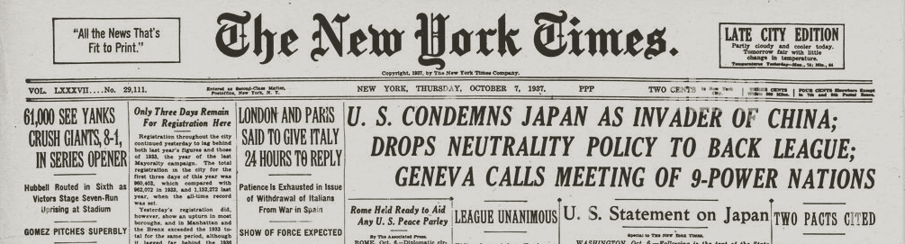
In total, I have 10 double page spreads, coming from both European and American newspapers. They are mostly accurately reproduced, at least in terms of the date and the topic of the headline. Here’s the main events covered:
1. Battle for Shanghai.
2. Adolf Hitler rises to power
3. German troops enter Rhineland
4. Japan invades China
5. Germans annex Austria
6. Munich Agreement
7. Germans in Prague
8. Poland invaded
9. France, Britain declare war on Germany
10. WAR

The polygon approach maintains graphical integrity when zooming into the word
The last page is a zoom on the previous page. The idea is to use the word WAR as a transition to the second phase of the intro, by zooming into the center of the A. I’ll have the word drawn in polygons, which allows a perfect zoom, because as the polygons scale up, they make use of the full available resolution. Once the screen is all white, the intro displays the game’s title, which marks the beginning of the second phase of the intro.
Straight Into the Game
Even before I began thinking about the intro, I wanted a seamless sequence from first loading to gameplay, without any pause, menus, or prompts. On subsequent loadings, the game will open to the main menu. But the first time is a special opportunity to ease the player into the game, in particular if going into a short introductory tutorial.
Now to bridge the gap between newspapers sequence and gameplay, not only visually but also from a narration standpoint. I don’t like the idea of using other kinds of illustrations for that, as it introduces an additional abstraction of the world. Newspapers don’t need any other justification for their existence, no explanation as to how they relate to the real world or the game’s world. Everybody understands what they see and how newspapers live in their own space. From that point, I wanted to introduce the game’s world from a third perspective, as a link between the high level context and the actual gameplay, seen from the point of view of the player.
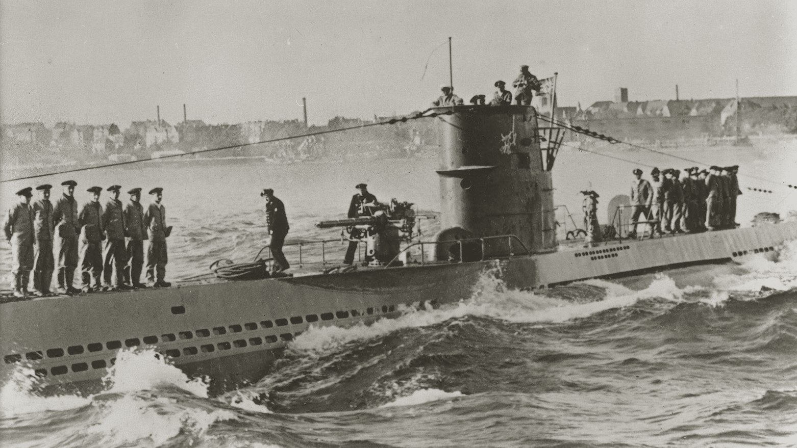
My first attempt at drawing the Type VII for the original mockup
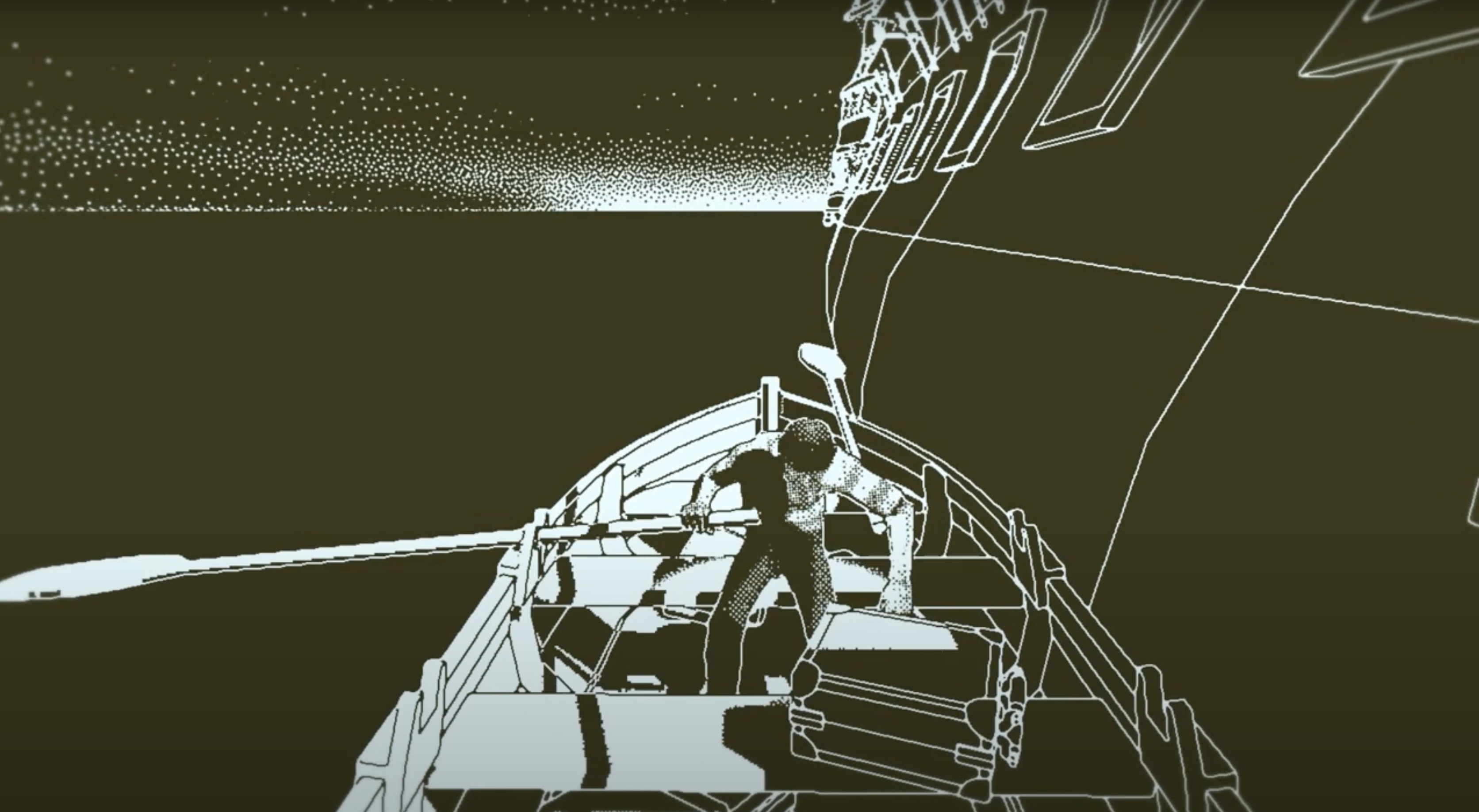
A simple and effective transition seems a panning shot of the U-boat, with small animations, like the flag in the wind.
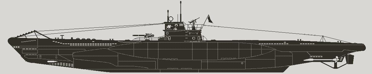
To avoid any visual discontinuity, I thought that the best would be to borrow assets from regular gameplay. I already have animated sky and ocean. The only missing piece is a side view of the U-boat. I had already drawn the type VII for the schematic damage and systems view (which I’ll implement in the future). But that was a long time ago, when I didn’t have much experience with 1-bit dithering. I kept the silhouette but improved the shading, to look on par with the rest of the environment.
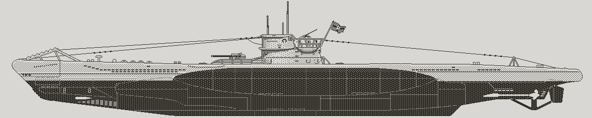
Rework of the Type VII for the game intro
Having the same sky and ocean as the game’s periscope view grounds that sequence into the game’s world with minimal work, except for easy logic code. For the player, it’s simple and logical; they understand that once in first person view, they stand in the command room, looking through the periscope of the boat they saw sailing in third person.
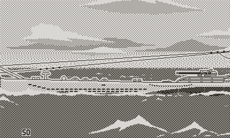
A peek at the U-boat shot for the intro. I ditched characters animation, as it was impossible to see on the Playdate screen
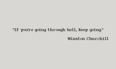
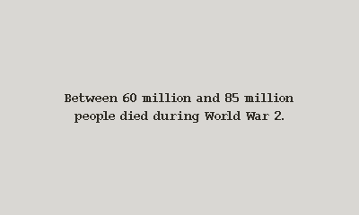
Finally, a few text cards serve as glue between the newspapers, game title, U-boat shot and gameplay view. Something worth noting for those: I inverted the usual combination of white text on black background, for two reasons. First, it prevents a jarring contrast when cutting to the newspapers and gameplay periscope view, which are both predominantly light. Second, I associate black text on white background with old Macintosh games running system 6, which I’m very fond of.
Among the text cards; the date and time, a brief word about U-boats sent to enforce a blockade, and my favorite quote by Winston Churchill. I think it brilliantly describes the state of mind required to survive the war. And it’s said with perfect British sense of humour. After the initial startup, every campaign’s intro will draw the quote from a pool of famous ones by the great characters of WW2.
So to sum up the entire flow of the intro:
First we learn about the major geopolitical events that shape the world, how tensions rise both in Asia and Europe, up to the breaking point with the invasion of Poland. It’s, quite literally, an introduction, not only to the game, but to WW2. And it’s told from a high level, impersonal perspective through the press headlines.
Then comes the title, which signals that from now on we shift to the game’s thematic. It’s confirmed by a brief text and a U-boat sailing, presumably early into the patrol. The focus narrows to U-boat warfare. Then we jump right into the game, from the player’s perspective; the view cuts to the game’s periscope camera, and the game gives control to the player, who’s now an active participant.
The first text card at game launch is a necessary reminder
A final quick word about sound. I still have to figure things out regarding music, but I want to apply the same approach for the intro and the rest of the game; instead of traditional looping background music, rely on short tailored contextual jingles, supported by ambient sound. Repetition always gets on my nerves. And I dislike music stuck in my head after hours of play.
Film shows us how it should be done: the soundtrack supports the visuals and the story as needed, with specific themes. No one imagines watching a film with the same constant looping three minutes of music, regardless of what happens on screen. The comparison is not entirely fair. Certain genres, like puzzles, may have a consistent tone, which allows for the same music to never feel out of place. But that still doesn’t solve the problem of repetition.
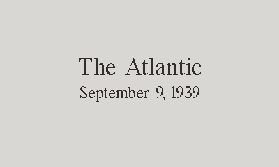
Setting the date and location
Now I think the looping game music is in part a legacy from a time when games were simpler, less story driven, and hardware was too limited to store anything more than a few minutes of sound. And in that regard, the Playdate suffers from similar, if not as drastic, limitations, with 16 mb of memory. That excludes long samples, both in RAM and on storage. But it’s not a concern, since I don’t have the resources to produce an hour long soundtrack.
My idea is to trigger short musical cues to enhance important moments or support transitions, and have background ambient sound effects taking care of moment to moment gameplay; you could imagine a few seconds of “suspense” music coming in an out when the U-boat is on the run, with the hum of the diesel motors and ASDIC pings for ambience. Or a short hopeful jingle to start a patrol before transitioning to ocean sound ambience.
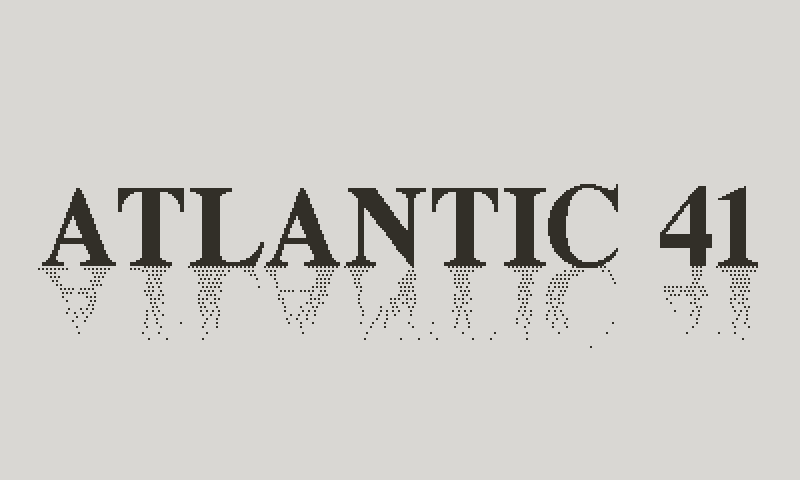
A tentative title page. Will most likely change
That seems a more manageable approach, and solves the issues of memory and music repetition, as well as tonal dichotomy between visuals and sound. There’s one downside to that method though, as it requires proper timing of the music to the action and more complex interactions between sound effects and music.
For the intro, I imagine the soundtrack in two distinct phases.
The first part is sound only, no music. As the newspapers come in, we hear a soft mix of vintage wartime news radio programs and speeches. Then, as we get closer to the declaration of war, sound becomes louder, busier. Sounds of planes, troops, are added to the mix. Then combat noises, bombing sirens, to reach peak as the camera zooms into WAR. Then cut to silence.
The second phase starts with the title and introduces the main theme music that plays for the rest of the intro, until we cut to gameplay periscope view, and the U-boat ambient sound effects kick in. It’s nothing revolutionary, but this may already be more than I can manage, so we’ll see how it turns out.
Forgive me for only showing fixed screenshots or incomplete animations. There’s still work to do, in particular regarding sound. I would hate spoiling the intro for future players. It will be best viewed in its totality and on the Playdate.
Next time we’ll go back to the game itself, and finally shoot some torpedoes. This will be one more step toward having everything needed for a complete combat loop.
So you know it, more soon.
Comments
Log in with itch.io to leave a comment.
been following along for a while. Everything looks wonderful! Please keep it up. It looks like a real labor of love.
It is! Thank you :)
The newspaper headline montage feels like it could be an entire game itself. Possibly involving a plucky Belgian reporter. Great stuff.
Thank you! Funny enough, I’m a fan of Tintin. And last time I was thinking about what I would do after Atlantic ‘41, and I was toying with the idea of a game putting you in charge of a daily newspaper.
The way you handled the newspaper rasterization looks great, with the clean monochrome and hand-tweaked art.
I’m not sure the crease marks are necessary when they’re scrolling by sideways, perfectly lined up. The animation reminds me of similar effects in movies, where the newspapers are from microfilm or otherwise synthetically clean.
Maybe if they were presented in other contexts, like a diner, newsstand, or somebody’s hands? I’m not sure that would make sense for the game, but a crease wouldn’t feel out of place there.
Or maybe if the newspapers had varying angles and some overlap, so it looked a little more haphazard like a camera panning over a library table.
Love these posts!
Agreed, fixed, and updated :) Thank you for the feedback and support.
I like the reflection on the title page as it gives a subtle indication of what the graphic style will be like (at least for the water effects). The game is looking fantastic!
Thank you. I like the idea of the reflection, but I'm not sure about the execution. I can probably find a better logo too. Hard to find the balance between elegant and boring, in particular at low resolution. But there's time to think about it.