The Midnight Hour
Sunset palette
After the daytime and twilight environments, I had to figure out nighttime, equally important and accounting for close to 50% of the in-game time. However on the Playdate, there are good reasons to be afraid of the dark. By essence, 1-bit is the most unforgiving palette, with two colors sitting at the opposite ends of the spectrum (assuming they’re black and white, which is likely the case). But night is about low contrast, with the values compressed in the low portion of the histogram.
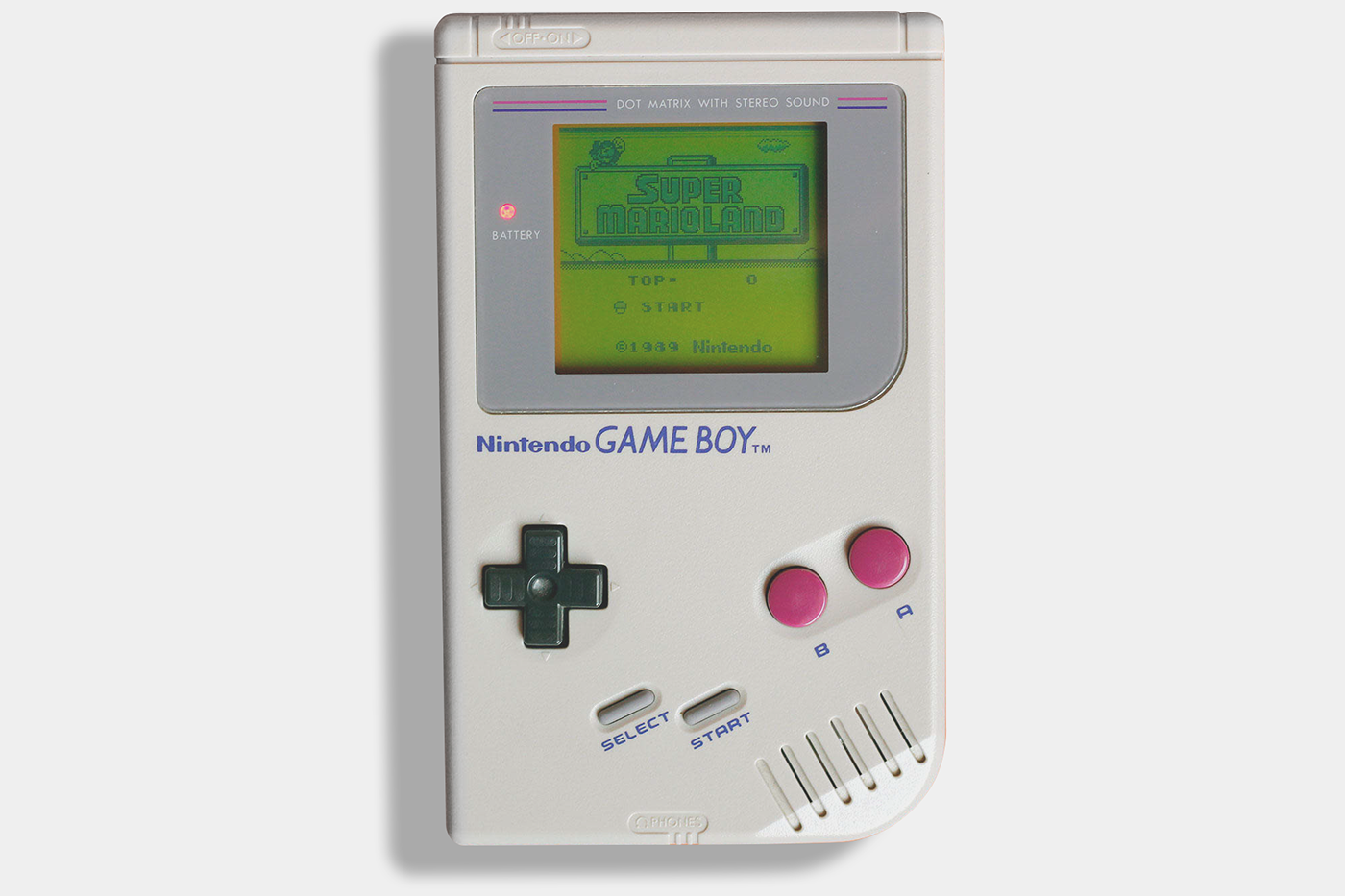
The sickly green screen of the original Gameboy
The Playdate is reminiscent of the first Gameboy. But the vintage console featured a crude liquid-crystal screen. Even though the Playdate doesn’t have backlighting either, its brighter background screen, deep blacks, and high resolution insure better readability. The increased image quality has a consequence: its precision and clarity are less forgiving, and tend to favor high contrast. The sharper the pixels, the less dithered patterns blur into a median value. And the deeper the blacks, the further away they sit from the screen value.
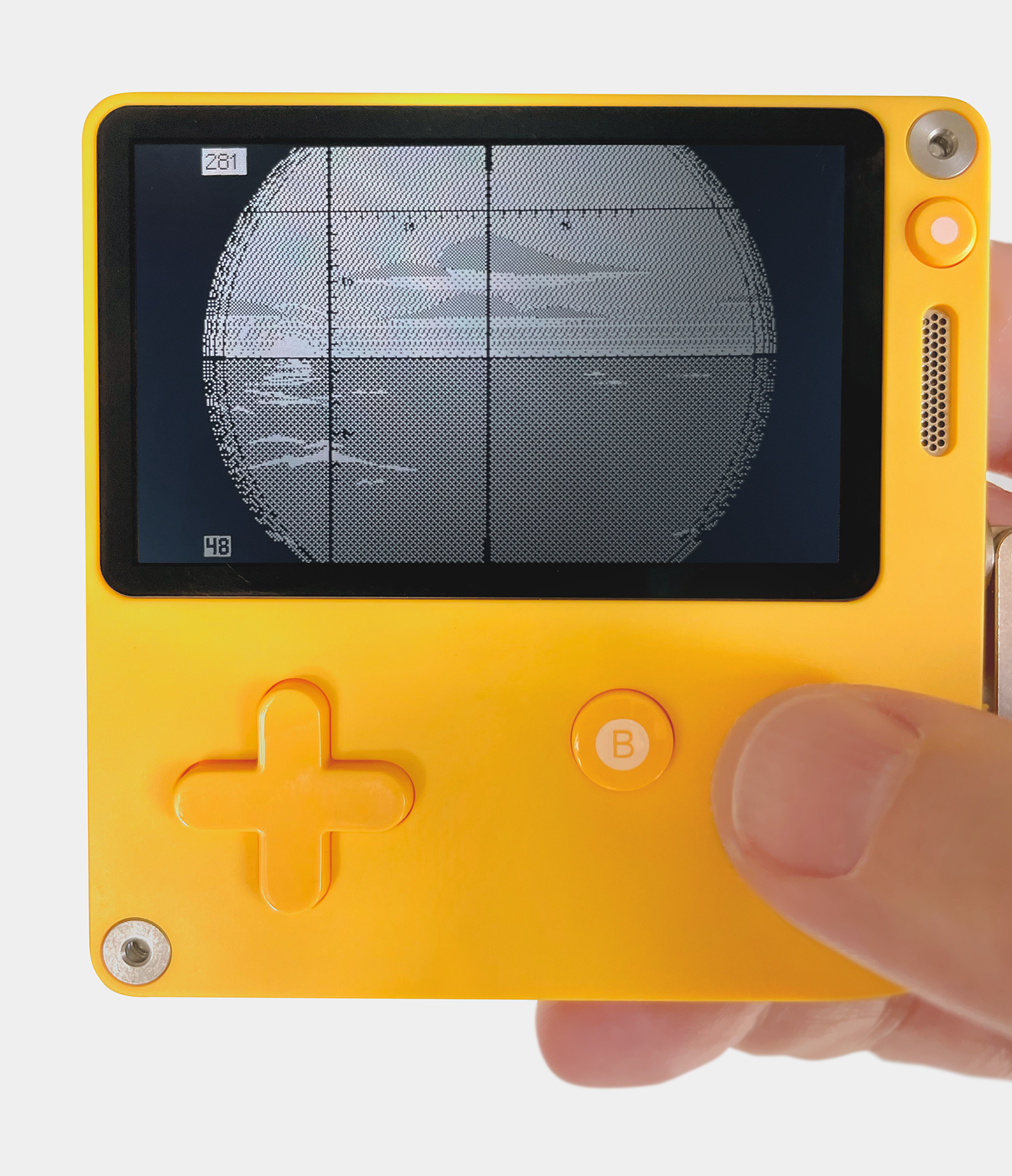
The Playdate: crisp and contrasted
1-Bit Impressionism
With this in mind, back to the usual: compiling references. They confirmed the issue; that night is inherently empty and featureless. My first few mock-ups didn’t get me close to a solution. That’s when my favorite game came to the rescue. “Return of the Obra Dinn”, by Lucas Pope, is in my view the most beautiful 1-bit game ever made (“World of Horror” coming close second). And it happens that it takes place at night.
The obvious challenge of night
In one of his excellent development post-mortem, Lucas Pope mentioned the challenges of 1-bit, in particular in conjunction with the relative low resolution of his game. He made the most valuable observation to me: "Ultimately, the most important part of using dithering was to use it as little as possible." That intent is obvious when looking at Obra Dinn, but by extension I see a strong commitment to the intrinsic contrast of 1-bit images. With this, the breakthrough I needed: don’t fight the contrast of the medium but embrace it. Same goes for the characteristic void of night.
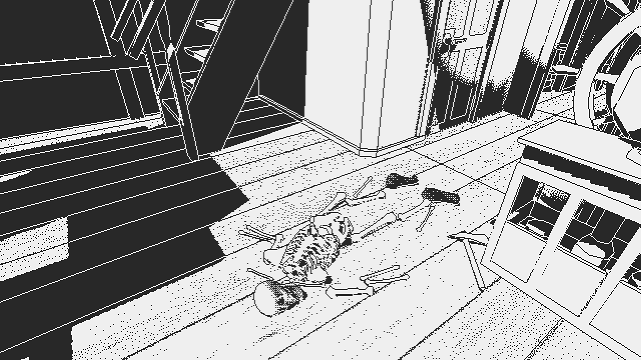
Full commitment to contrast in "Return of the Obra Dinn"
Everyone likes a star field, so I started with this, scored an easy win. Bye bye clouds. I’ll deal with you later. White stars and waves on a pitch black canvas. No dithering, not much on screen at all, and yet to my surprise that stark contrast and simplicity looked better than anything I had attempted to this point. An encouraging start, but for a couple of issues: coastlines, and weather.
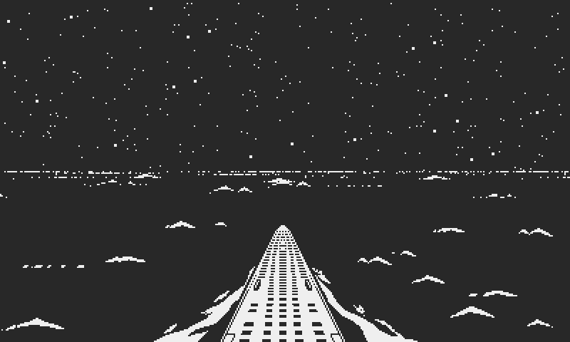
The simplest is often the best
First came the idea of suggesting land with windows and street lights, which I abandoned for two reasons. Number one, without color, and at that distance, lights would look no different than stars. Second, it didn’t make sense from a historical point of view. This was a greater concern. Bombings were a major threat during WW2. Wave after wave of heavy bombers from both sides dropped millions of tons of ordnance all over Europe, driving entire populations underground.
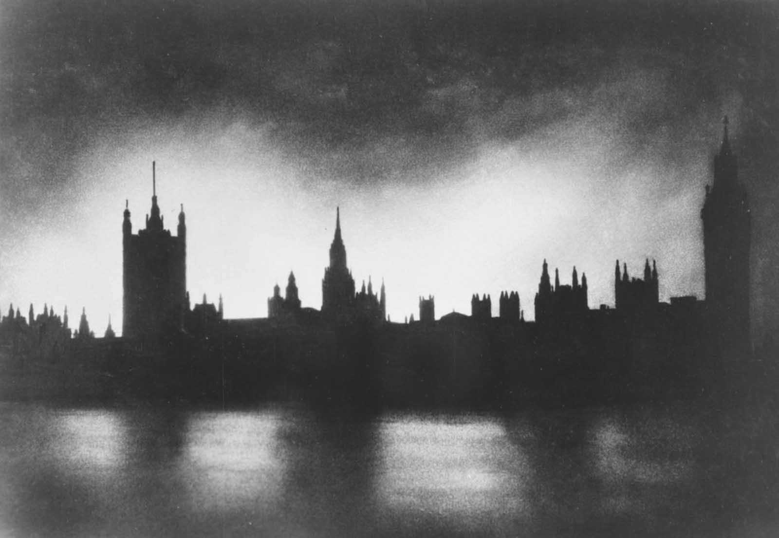
London in the dark during the Battle of Britain
Many of these raids occurred at night, in the hope of evading AA guns and fighters. This led authorities to enforce strict curfews after sundown, to make visual navigation and target reconnaissance harder for bomber crews. Every night, the continent was plunged in total darkness. Even car headlights were partly blinded. Coastlines weren’t the bright strips of light we see today, but dark silhouettes under the stars.
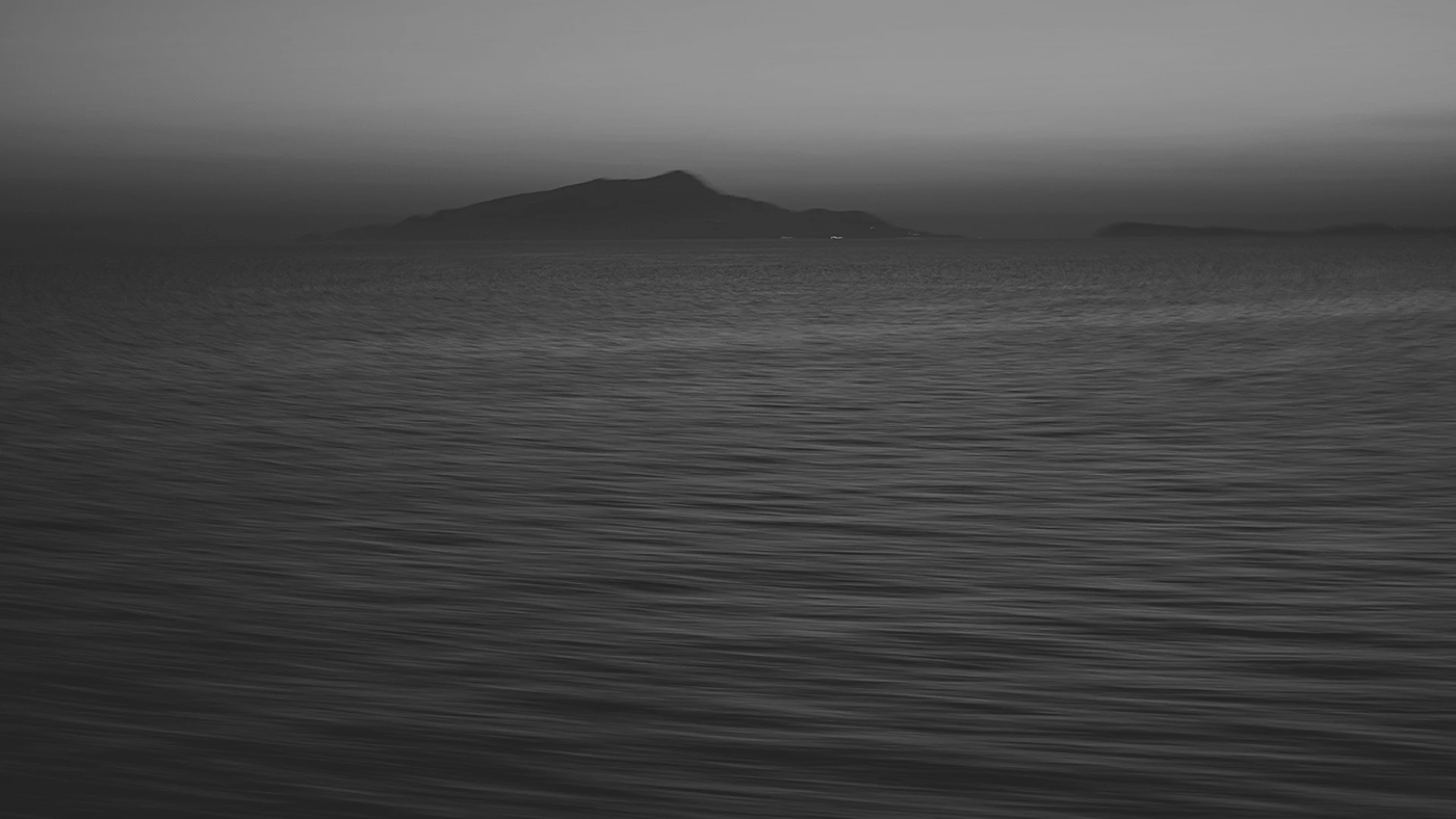
Probably heavily brightened but it's still an inspiring night image
A few of my night references showed light fog banks over the ocean. I added a dithered gradient above the horizon, similar to the daytime one, but inverted. In light of the discovery that high contrast was welcome, I resisted the urge of pursuing natural values (which was impossible regardless), the goal being a convincing interpretation of night, not a literal representation. From a stylistic standpoint, that gradient wasn’t further from reality than the angular shapes of my clouds. As crude as it was, the coastline now evoked the same feeling of loneliness as the reference, which is all I could hope for.
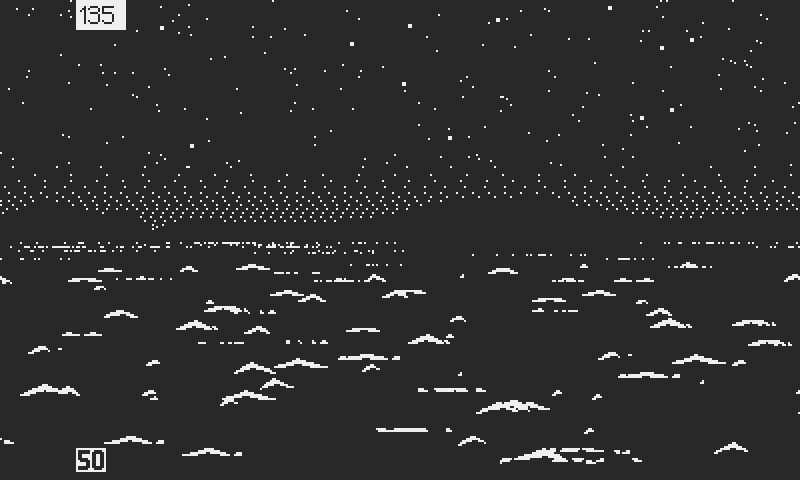
Land as a silhouette
It's Just a Phase
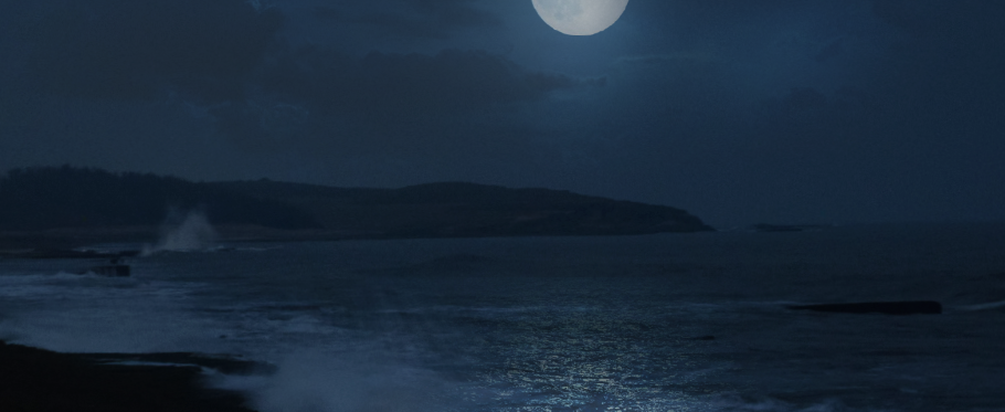
The moon is an important visual feature at night, and I was eager to get to it. Research is one of my favorite aspects of game development. Every step is an opportunity for learning and discovery, and not always in obvious fields like coding or art. In that case I wanted to know more about astronomy. Even a casual reading about the moon’s phases and orbit opened my eyes on the complex calculations involved in predicting its behavior. It could be done, but realism, like every other aspect of the game, must respond to a need.
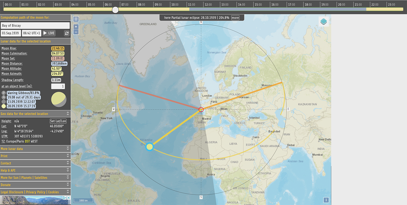
How the moon looked like in the Bay of Biscay, on the morning of September 3rd, 1939
I've always had conflictual feelings about systems complexity. On one hand, I won't touch a non study level flight simulator, and I'm an avid player of hardcore tabletop wargames. On the other hand, I've recently had more fun with “Into the Breach” than any other game, for the elegance and the effectiveness of its design, and I have the fondest memories of Silent Service II, which is a simple game by today’s standards.
I think that both complex and simple games can be compelling for different reasons; the traditional simulations hope to recreate a situation at the most granular level, even at the expense of game flow and entertainment value. The enjoyment comes from the immersion, the historical fidelity, the technical intricacy. It’s more learning and experiencing than playing. The complexity takes integral part in this. “Simpler” games like “Into the Breach” work on a different level. The context takes the backseat, and fun comes from mastering the system. Not just beating the game but exploiting the mechanics, discovering tricks or synergies. But to work they need simple and predictable rules. The more consistent and transparent they are, the easier it is for the player to assess the situation and make and informed decision.
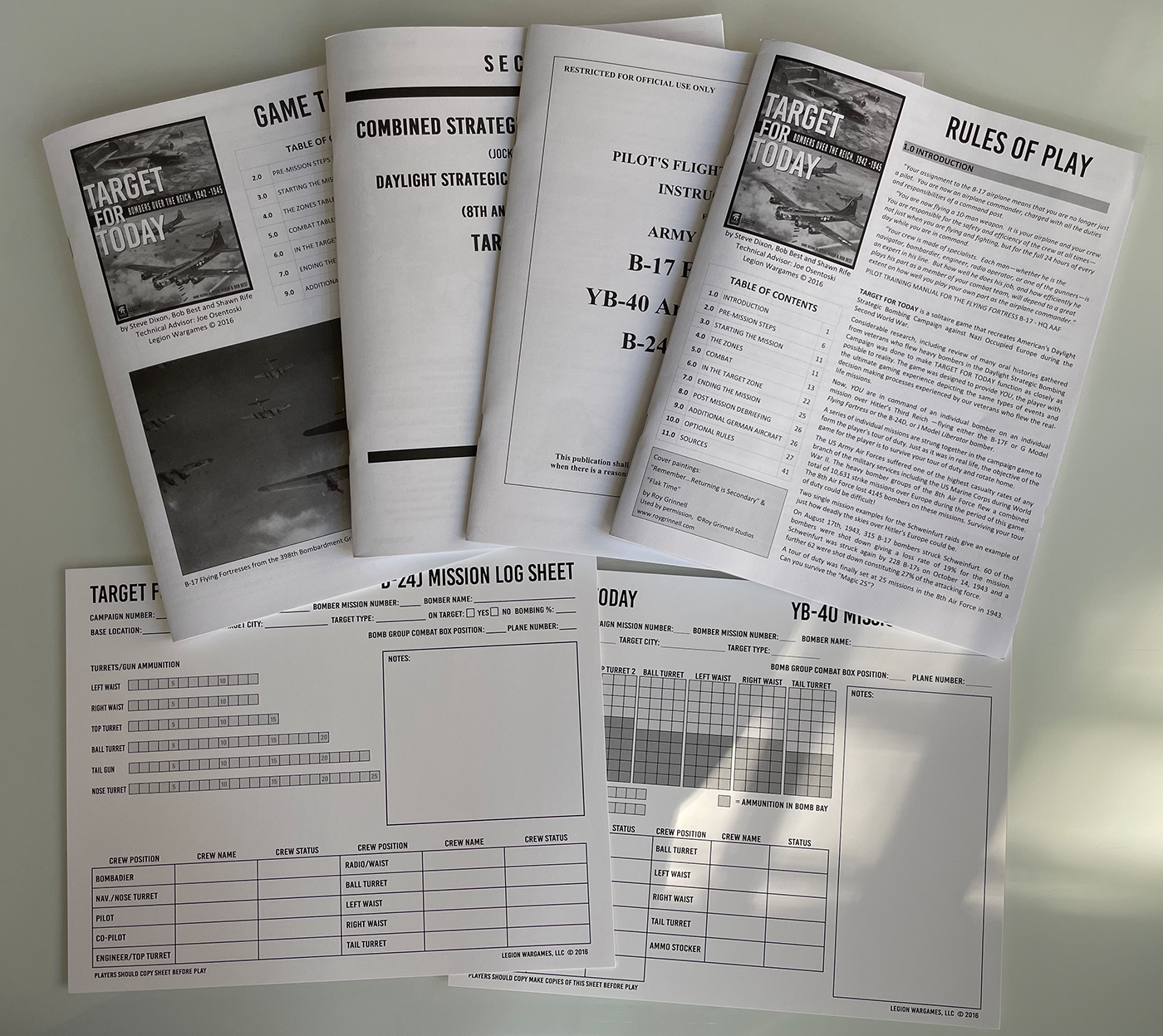
That's how many booklets you must refer to while playing "Target for Today"
Atlantic ‘41 needs the right balance; a game that, given the platform, could be played with minimal reading, simple graphics and limited controls. But also a high level simulation deep enough to offer satisfying intellectual stimulation and emotional immersion, without getting into every little technical and historical detail.
Aiming for maximum realism is an easy measure of success (that is easy to measure, not to achieve). But the unchecked pursuit of realism can work against the gameplay. Unless the impact of the moon and the sun on the game are understandable and predictable, they lose tactical relevance. I must also consider them as the starting point of a set of rules that will grow more complex with new features. As the developer, familiarity with the design makes it easy to lose perspective.
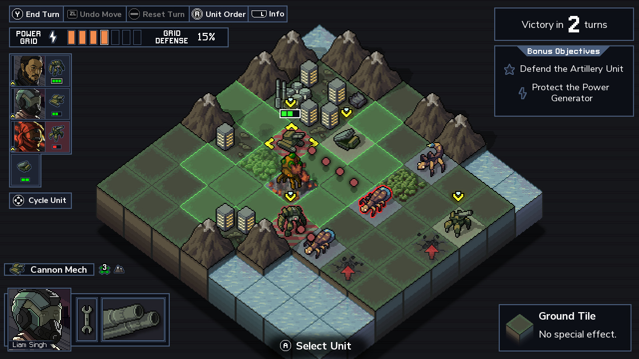
"Into the Breach"
Let’s be practical: suppose that the player knows that they can get their U-boat close to the target under the cover of a moonless night. It offers them widows of opportunity. But if the moon is realistic then it’s a lot harder to predict when this will happen and take advantage of it. If the sunrise is dangerous, but the time it occurs at keeps changing realistically, that information is less relevant, because the player can’t plan when to dive or pull out. They can only react to the situation, but never anticipate. So sacrificing realism in favor of gameplay is at times legitimate.
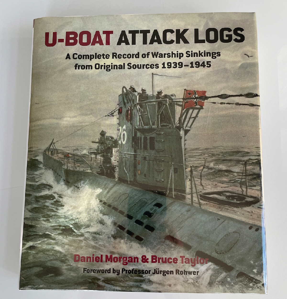
Authentic U-boat logs demonstrate the tactical importance of moon phases
For now I decided that eight lunar phases, changing every four days, would cover my needs. The moon will always rise at sunset, remain in a fixed spot, and set at sunrise, regardless of seasons and location. Each phase will have a direct effect on the chances of the submarine to be spotted, proportional to its brightness. It’s a logical, effective rule that any player can grasp and use to their advantage.
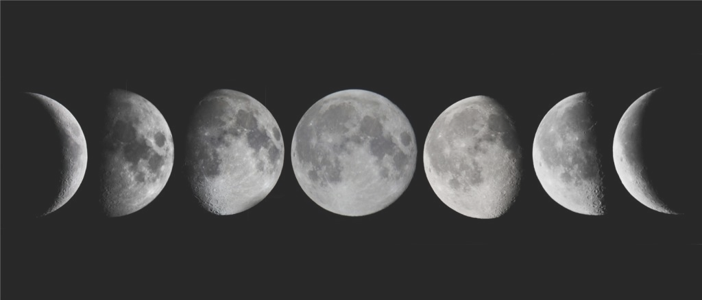
Eight phases, counting the new moon
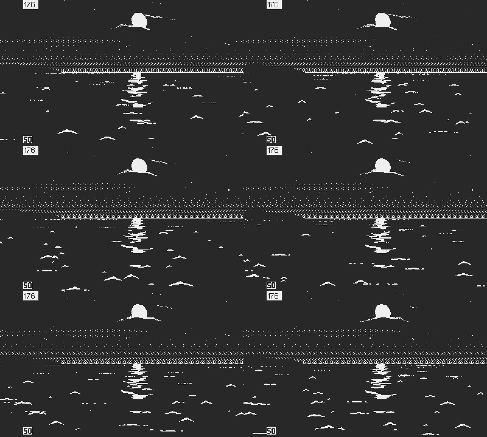
The picture wouldn't be complete without the moon's reflection on water. I found a nice video reference, which I was able to turn into a 15 frames 1-bit loop with some touch up. Then skewing the reflection and additional touch up to adapt it to the lower point of view over the water in periscope view. The result was superior to what I had done for the sun, so I ditched its old reflection for that new one.
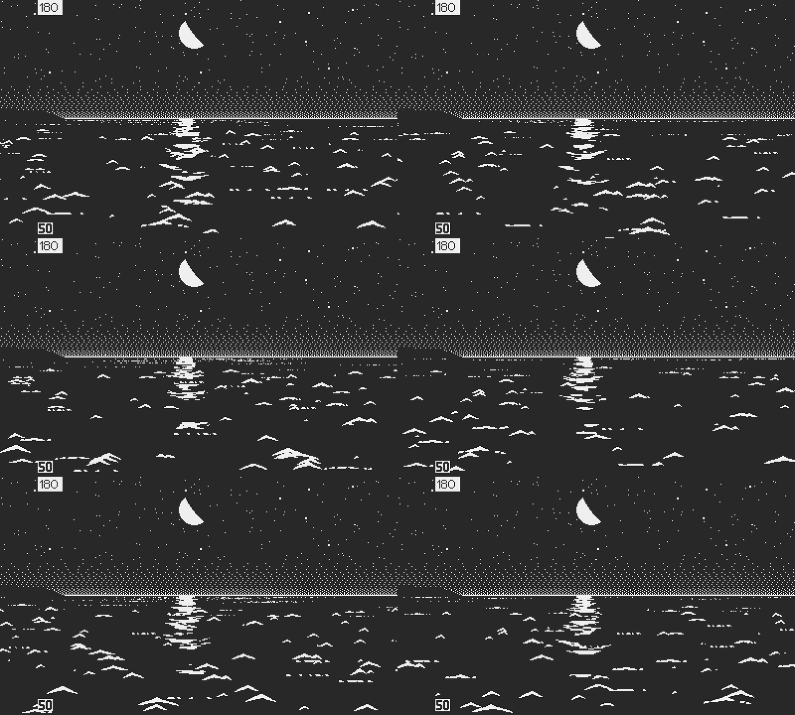
And there it is
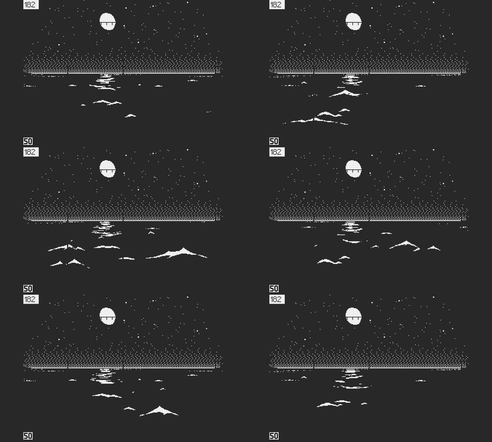
Adjusted reflection's perspective in periscope view
Speaking of the sun, it will follow a similarly simplified behavior, which I will detail when we’ll get into gameplay. In past projects I’ve been caught compounding strategic depth and sheer complexity, and it’s a mistake I want to avoid this time. Start simple, and it’s always possible to layer in more complexity later.
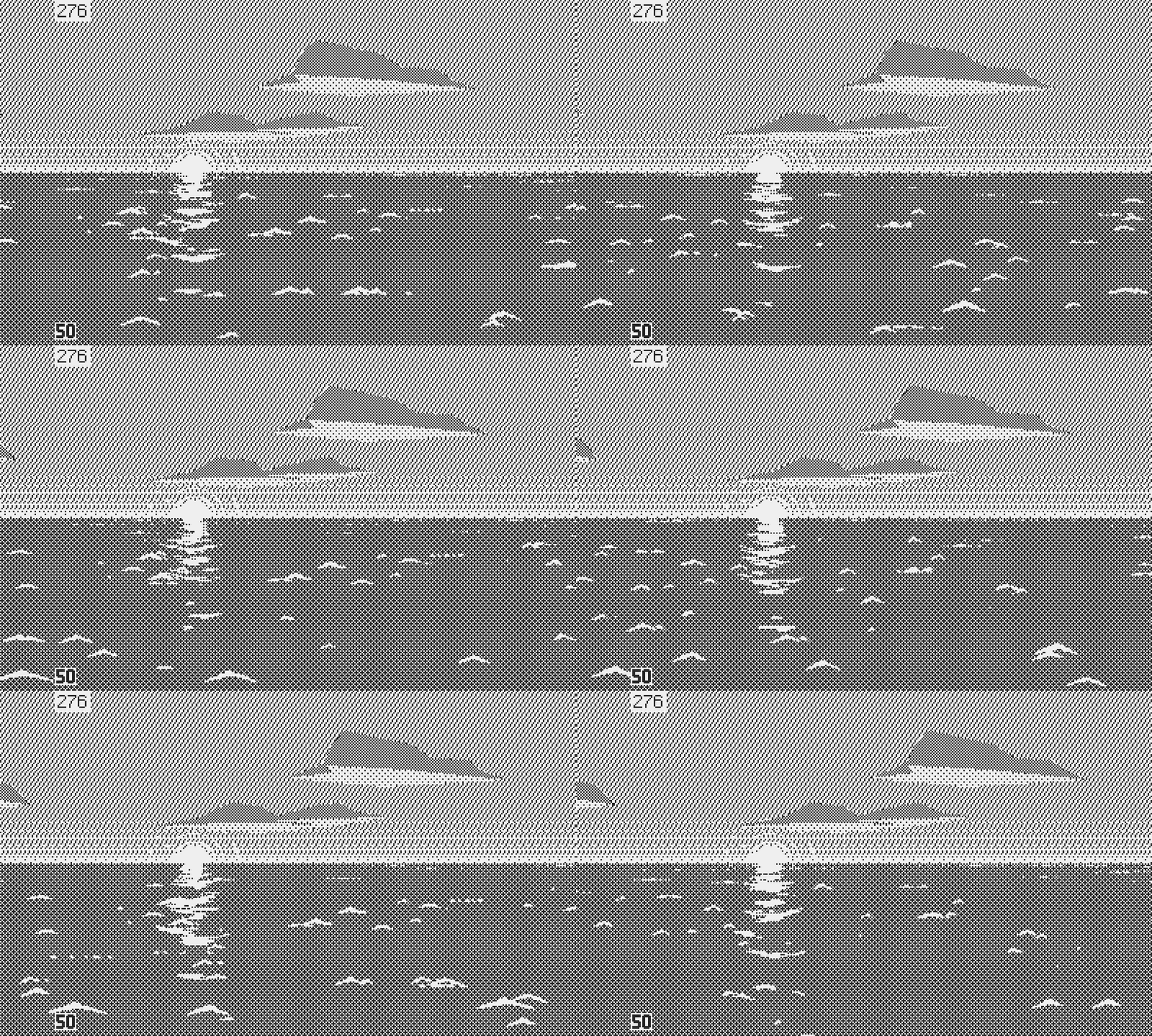
The sun gets an updated reflection
The Perfect Storm
At this point, nighttime was made of a few basic assets; a black background for ocean and sky, a tiling star field, a sprite for the moon, and a horizon gradient to silhouette ships and land.
I contemplated dimming the u-boat bow and stern to a darker shade, but this comes with complications; applying a dithered pattern to the boat would in part destroy its surface details and impact performance. I could have mitigated the problem with a full new set of pre rotated sprites for night, but this would have come at the expense of storage space. Regardless, dithered patterns dim or flicker in motion. This is why I chose polygons over bitmaps when possible, since their patterns remain fixed. But beyond that I wanted to embrace the stylistic choice of contrast, and make the U-boat a clear, stable visual anchor for the player.
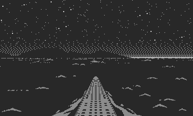
Dithering doesn't always work
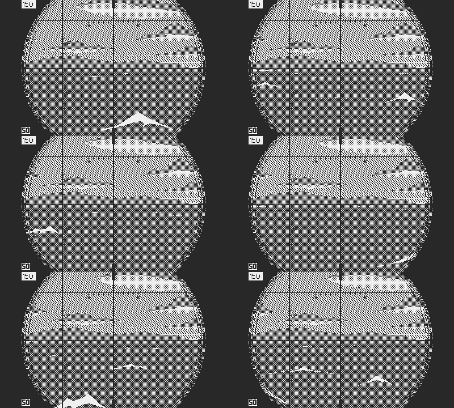
As we've seen, it's not all clear skies in the North Atlantic. But how to show clouds at night? Everyone has seen these horror movies where wispy clouds drift over the moon. That felt like a decent starting point. I like trying ideas in Photoshop, which was useful in that case. It helped me to figuring out a trick to reveal the clouds in the moonlight. To suggest the presence of clouds everywhere else I changed the background for a sparser star field. A few elongated shapes above the horizon tied the gradient with the upper portion of the sky, suggesting low clouds.
Clouds drifting by the moon

How it's done
For the stormy weather, I had an idea to exploit contrast even more: lightning. I loved how the whole sky lit in the video references, and figured it was easy to do in theory. Programming didn’t take long but the timing took some finesse. In animation timing is everything. Lightning has a unique staccato. It feels both chaotic and rhythmic. Nothing happens for a while, then you get a burst of lightning strikes, a pause, then a few isolated ones. They also vary in intensity and speed. Some turn on instantly like a bulb, some seem to rise and fall.
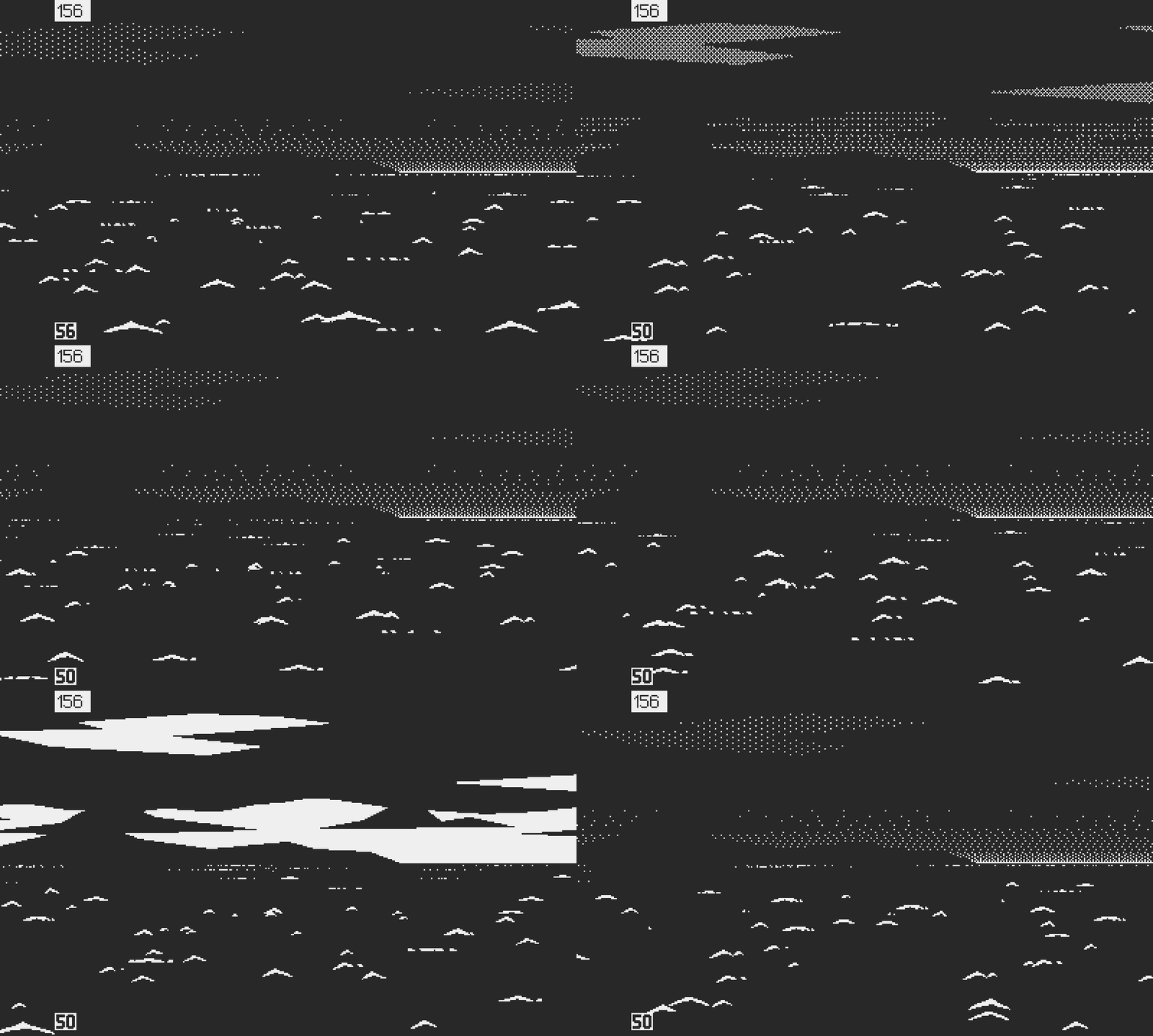
Lightning illuminates the sky
The effect was worth the time though. It livens up nighttime, gives it character. I completed the look with small animated lighting bolts. There was a valuable lesson in all this: dithering isn’t always necessary, and it’s possible to achieve a mood even with a highly contrasted picture. Right at the end I added lightning to the daytime and twilight scenarios, but with less success, because, interestingly, of the lack of contrast.
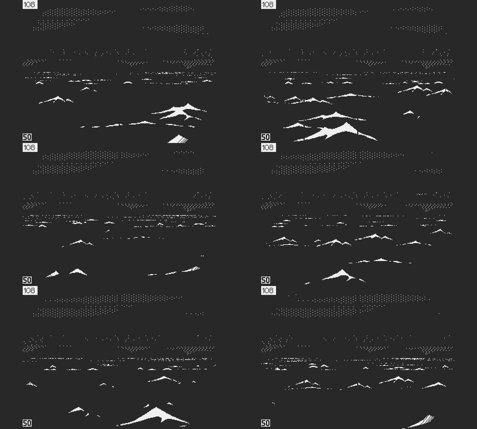
Lightning bolts
What Now?
Now is a good time to look back at the past year, even though it may be best not to think about how long it took to get there. What matters is: the environment is done. We now have functional conning tower and periscope views, with variable time and weather. I’ll add ships, aircraft, and other assets as the need comes up. I sometimes wonder if it may not have been the best approach. If I should have jumped right into gameplay with place holder art, rather than spending months animating waves and drawing clouds? But several reasons led me to this:
First I needed to learn the Playdate and the SDK, and it felt like tackling the technically challenging part was a good way to acquire confidence. Now apart from sound, I think that I have a decent grasp on the hardware and the software, which should help speed up future development.
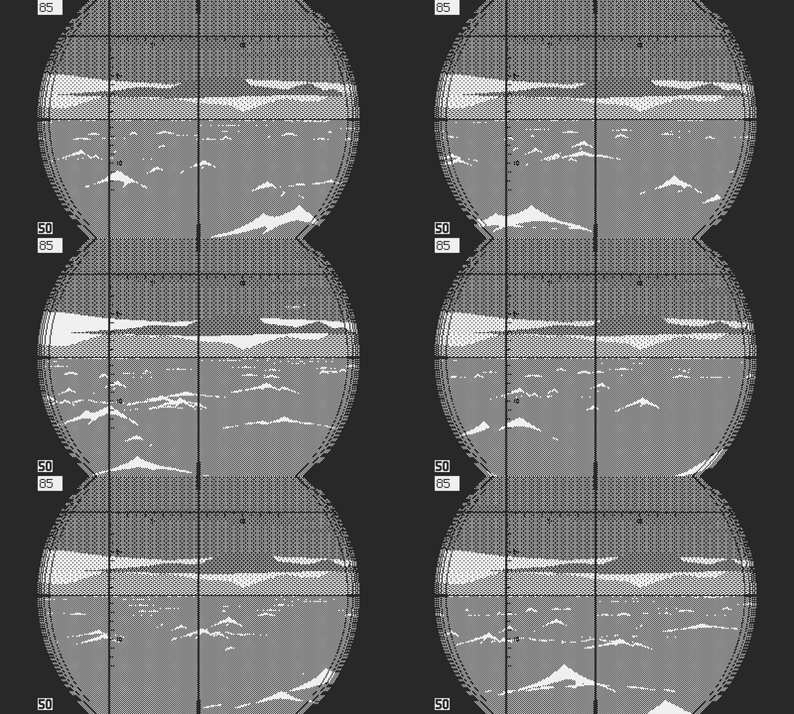
It took a while to get there
Second, for a long time I was unsure about game design. How I wanted the game to feel, what would be the game loop, the meta…these are essential questions, which should be at least in part resolved before diving into prototyping. I’m not saying that I’m at this point yet, but working on the exterior views gave me time to think. I’m now in a better position to start building the foundations of the gameplay.
Third, getting to see the ocean and the sky through the periscope, being able to watch the clouds drift over the horizon, all this fueled my imagination for the full potential of the game. I needed to feel immersed, and seeing all this running on platform is a source of inspiration. It increased my confidence in the game, and I hope that it will help fight off future doubt.
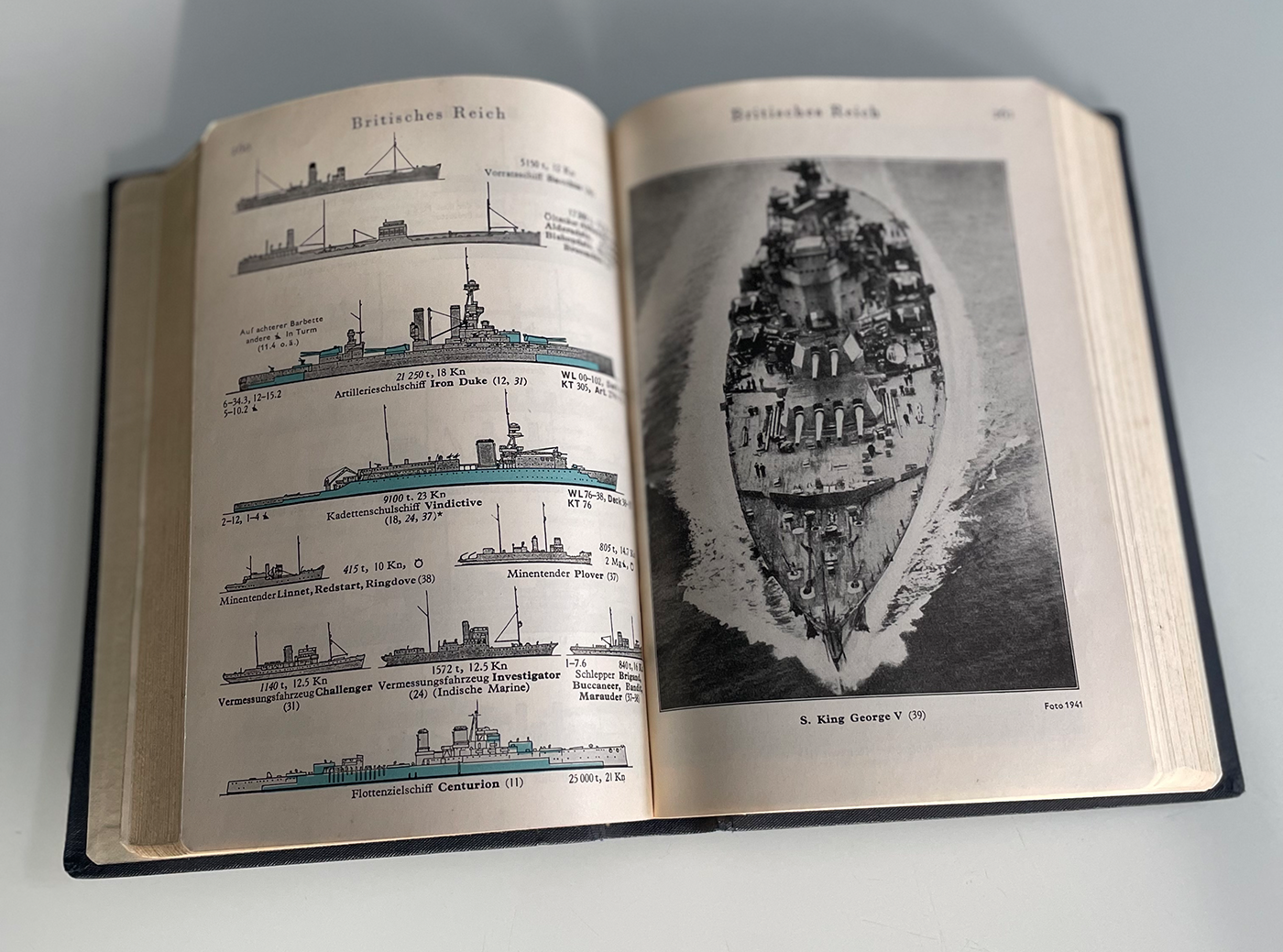
I'll pick ships for the game in this original edition from 1941
So what’s next? I think sound can wait. It may be something fun to do when I get tired of gameplay, or in between boring tasks. For now the best might be to make the first gameplay building block. Throw the U-boat and a surface ship in a sector, code the first basic controls to sail around and dive, and give crude AI to the enemy. Then make a self contained vertical slice in which the ship tries to leave the sector, while the U-boat must sink it without being detected.
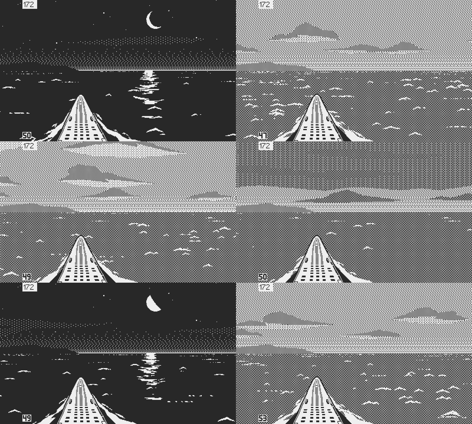
Hopefully enough variety of situations to support a full game
From there I could layer in additional U-boat controls and systems, more complex enemy AI and ship types. Then add morale, crew management, damage, events, up to get a feature complete slice in one sector. And then finally expand the game to multiple sectors, full patrols, refit between patrols, career progression, and other high level features. I get overwhelmed just writing this.
Lots of work ahead, so as usual, more soon.
Atlantic '41
A WW2 U-boat Simulation for the Playdate
| Status | In development |
| Author | StephanRewind |
| Genre | Simulation |
| Tags | 1-bit, Pixel Art, Playdate, Turn-based Strategy, World War II |
More posts
- The Enemy (Part 1)3 days ago
- Los!50 days ago
- Preparing the FutureApr 07, 2025
- Project ResetApr 01, 2025
- Small BeginningsFeb 24, 2025
- Death by a Thousand ShellsDec 17, 2024
- Next devlog a bit delayedOct 13, 2024
- First BloodAug 28, 2024
- Peril or SalvationJul 12, 2024
- An Important MilestoneMay 23, 2024

Comments
Log in with itch.io to leave a comment.
Great labour of love. I love reading your updates!
Thank you!
Stunning. Love reading your process and how far you follow your gut in getting the details right -- inspirational.
Thank you for the kind words.
Very impressive work. I never imagined the Playdate would be able to handle graphics like this. But it's an artistic accomplishment as much as a technical one. Can't wait to learn more about the gameplay.
Incidentally, Obra Dinn, World of Horror, Into the Breach... 3 for 3, amazing games.
Thank you! Yes it’s easy to be deceived by the Playdate’s size, color, and crank. It looks like a toy but it’s a very capable little console. Lua is the bottleneck though, even if I can understand Panic’s choice of an easy language to make development accessible to beginners. Better programmers than me, using C or even Assembly. Squeezed a lot more out of the Playdate. But so far I was able to get the game to run and look close to what I was hoping for, so it’s an encouraging start.
Now I’m about to get into the first building blocks of gameplay, which is very exciting but also scary because game design is a lot more difficult than art.
Excellent work.
Thank you!
An Amazing update as usual Stephen. The night lighting and the weather visualizing are outstanding and also, as usual, your level of dedication to getting a historically based and game on Playdate is inspiring :)
Thank you very much. As a wargames and simulations aficionado myself, I know how important it is for fans to get as much of the history and technical details right, so I enjoy putting the time in the research.
That slideshow of all the different situations is incredible. Especially the star field.
Don't leave the sound design to the very end though! A good soundtrack can elevate a good game to an awesome game, or a mediocre game to a good game. One game that might inspire you is Radar Mission for the original Game Boy. It's a basic battleship game, but the soundtrack is incredible, and I would often play it on autopilot at the end of a rough day to unwind. (It was available on the 3DS eShop as a Virtual Console title, but since the eShop is shut down now the only way to get it on the 3DS is by installing custom firmware that allows you to sideload stuff).
Here is the original soundtrack to Radar Mission on YouTube: https://youtube.com/playlist?list=PLd_GcSlmM7zaLV3oxkUjZ9rJdYsdt8EU8
100% with you on this. I hope to be able to put sound in as soon as I have the bare bones of gameplay. I think, given the limitations of the Playdate, and the genre of the game, that Atlantic ‘41 will rely more on atmospheric sound FX than music. But I have this crazy idea of creating a few short (hopefully) iconic musical in game themes and put out an extended soundtrack as part of a limited edition or something.
Fascinating as always. I think nighttime looks better than daytime.
Thank you. The positive feedback is a relief because I was dreading it.
Nighttime looks amazing! I don't know much about 1-bit graphics, but it's pretty impressive what you're able to do with basically 2 colors.
What's the book referenced above with the caption that says "original edition from 1941"?
Thank you! It’s called Taschenbuch der Kriegsflotte 1941/42. It was a book used on all warships and U-boats that summed up all the known ships from the main naval forces of both Allies and Axis. It contained detailed data about measurements , displacement, speed, armament, depth of keel, and silhouettes under various angles on bow. Captains used them to identify their targets and estimate speed, bearing, and other information required to come up with a torpedo solution.