Ups and Downs
These past few months health issues have impacted development and a long time has passed since the last update. Thankfully my situation has recently improved. I’m now back on track, and committed as ever.
It’s not just bad news. I finally received my Playdate! I dreaded launching the game on the console. To my surprise, I got impressive frame rates, averaging 45 fps, and that’s without altering the code in any form. It simply worked. No crashes or performance issues came as a shock. I owe it in part to careful planning, but the credit mainly goes to the team at Panic. It’s a testament to both the hardware and the SDK.
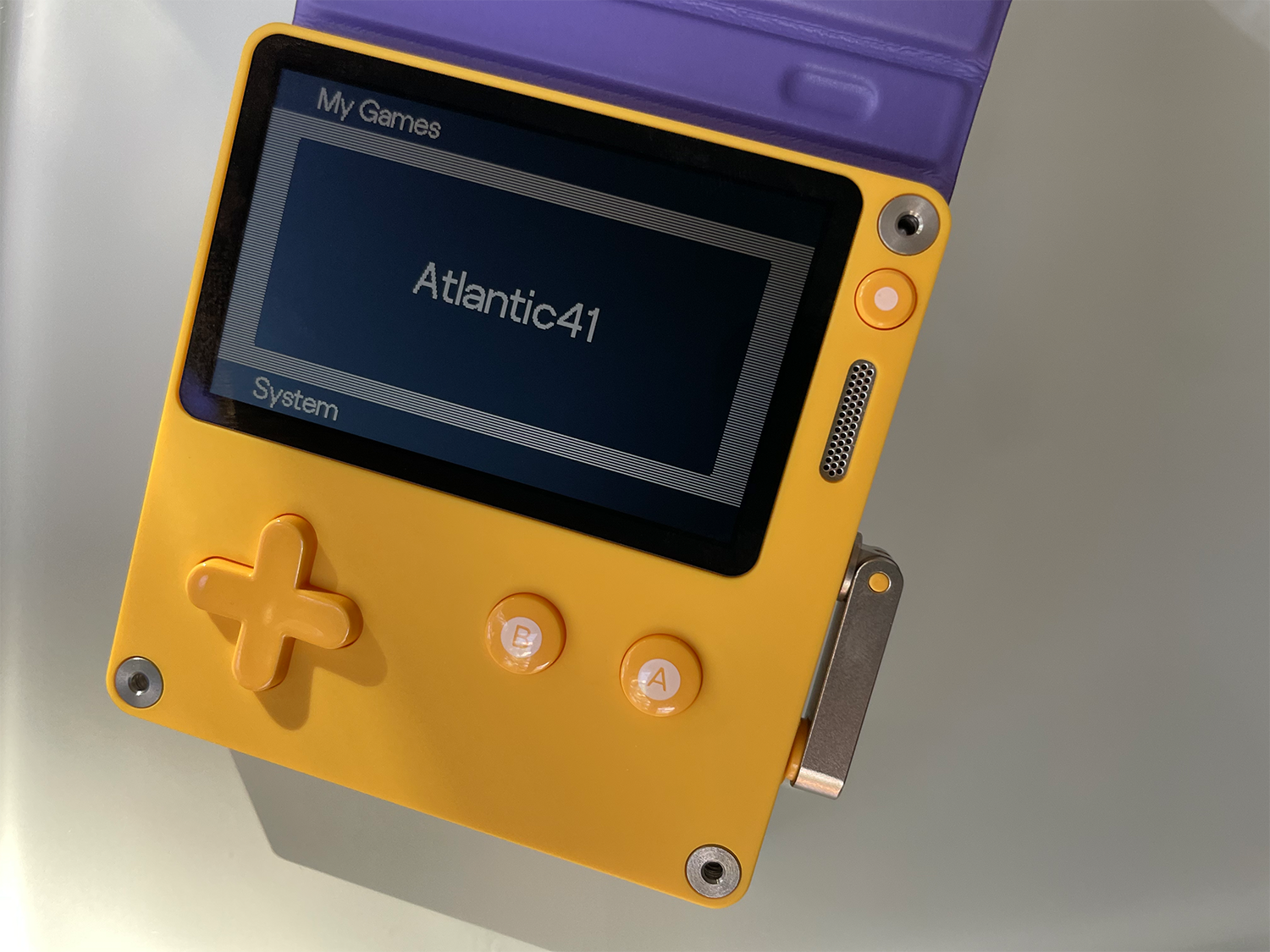
It 's here!
Ships, aircrafts, UI, game logic, and sound will decrease the final frame rate, but based on the current state, I’m optimistic for a locked 40 fps. That’s 10 more than what I originally hoped for. Not having to worry about performance lifts a weight off my shoulders, and testing the game on platform should prevent any bad surprises.
One Step Back. Two Steps Forward
I always keep daily screenshots, videos, and versions of assets and source code. Upon completing a milestone I review the previous version. With enough time I get to see the work from a more detached, objective perspective. I may come out comforted with the progress made, but not always.
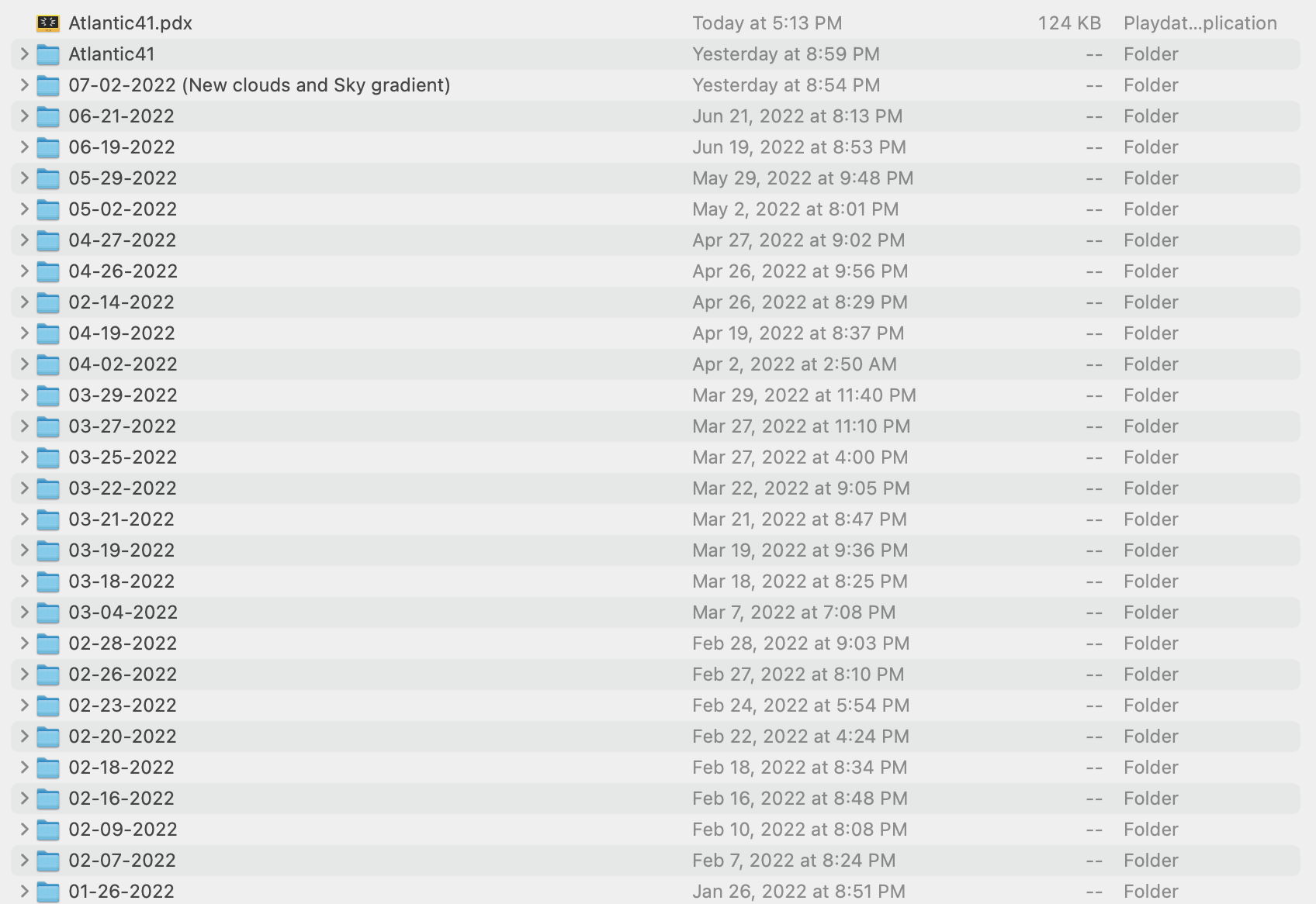
Versions saved almost daily
I went through this routine right before publishing the previous log and came out disappointed, but I decided to publish it regardless. I mentioned before the value of sharing my mistakes, since I learn from them. This is a journal, not a tutorial. Making an inappropriate analogy, would we have a faithful account of the battle of the Atlantic if U-boat captains had redacted bad decisions in their logs? (which, let’s be honest, some of them might have, but you get the idea.)
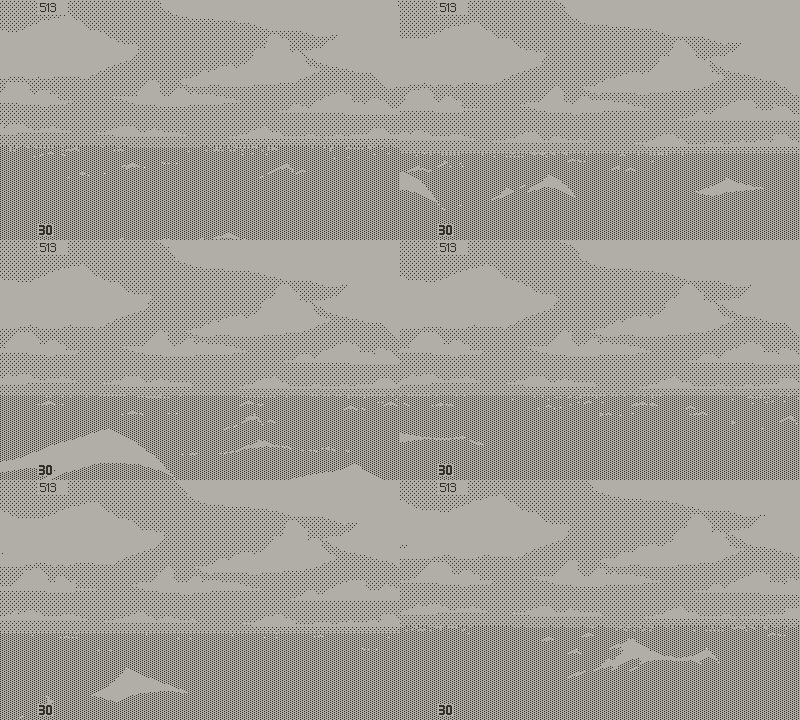
The problematic version
Point is, I found the ocean disjointed and abstract. Two problems:
First, I was mistaken about visual diversity. Fluid dynamics carry a strong visual DNA, as I understood when reviewing footage taken off the coast of Laguna Beach. Trying to vary a lot the shapes of the waves was counter productive. I needed to embrace the homogeneity, not fight it. The environment shouldn’t be distracting; it’s a mere canvas to support more important things, like the ships.
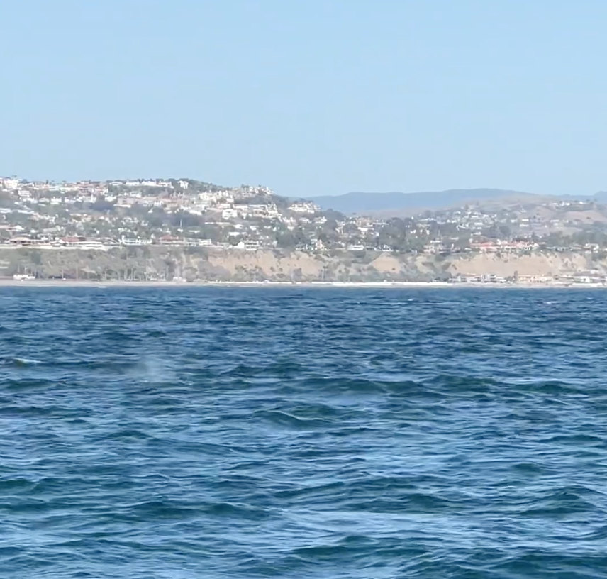
Whale watching trip turned U-boat reference footage
Second, I realize now that the periscope’s point of view, close to the surface, made me exaggerate scale on the foreground waves. It’s the right idea with a flawed execution and I need to rethink this. In the meantime I decided to focus on the tower view. A few more rounds in Aseprite and better code yielded a smoother, more homogeneous animation. It’s now more balanced: active but not distracting, at a proper scale.
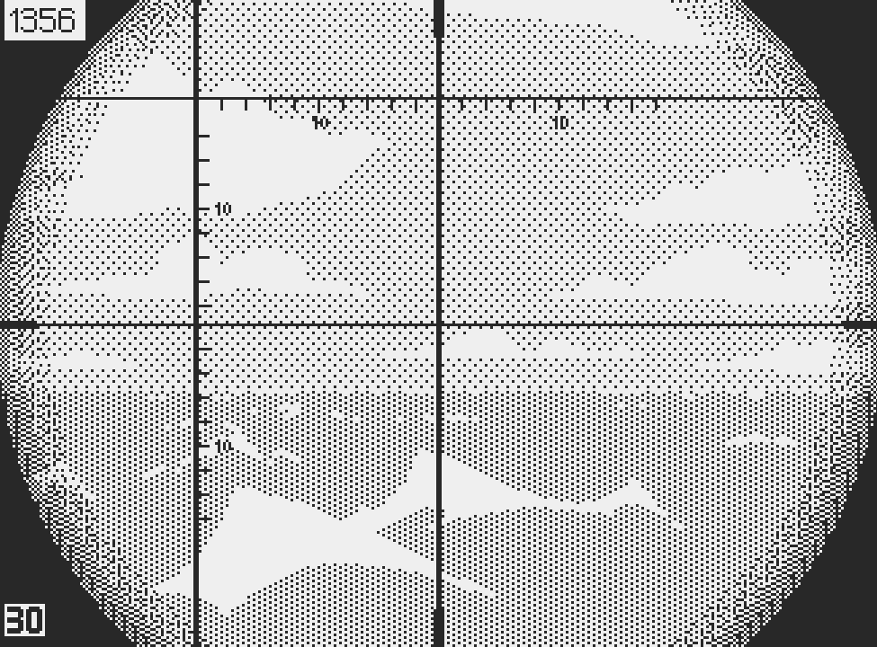
These big shark fin waves don't work
It’s also worth pointing out the value of feedback; a good friend, whose opinion I hold in high regard, told me that the large waves were distracting. Additionally, in the comments section someone mentioned that the waves looked like shark fins, which was relevant and helpful.
The Domino Effect
Improving one thing makes you reconsider the ensemble, creating an urge to level up weaker areas. The concern was that the sky felt needlessly busy next to the ocean. I cleaned up the outline of every cloud. These geometric shapes are lighter in vertices, allowing a second polygon to act as the underlying side of the cloud. I mentioned in the past the iconic structure of a cloud; flat bottom and round top. These new assets convey form, emphasize perspective, and add much needed contrast.
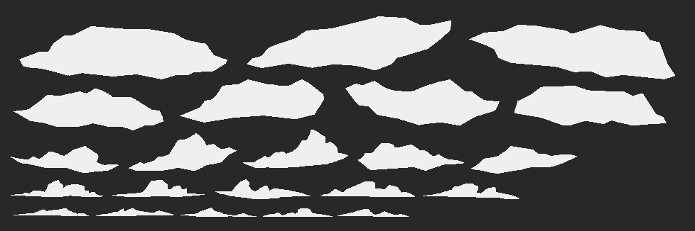
Cloud shapes before the change
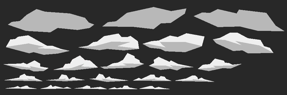
Simplification of shapes. These need more work, as they feel too angular.

Final new shapes. Some amount of stylization remains
The downside of this system is that the new clouds sometimes produced odd combination of shapes. I wrote a more sophisticated algorithm to generate the sky. It’s a decent system for now, but not good enough for final. The brain makes a staggering amount of high quality decisions to arrange clouds in a pleasing way. In truth, simulating this would require complex algorithms, which the Playdate couldn’t run even if I had the time and skill to write them.
When I can’t solve a problem head front, I work around it. One trivial method could work in this case. Skies are simple tables storing the position and type of every cloud. I could manually arrange cloud compositions in Photoshop and write down the data. This would be easy but time consuming, with a finite amount of variations. However this would guarantee total control over the art direction.

This is what a complete cloud table looks like
In my view quality should always prevail over quantity. Billions of potential different skies don’t benefit the game, but art direction does. All I need is enough variety to feel natural and I doubt that it requires more than 20 variants. But I want to move on with development. I think it would be wise to let this all rest for a while before making any final decision.
It may be useful to explain why I made polygon clouds, as opposed to waves, for which I used sprites. First, storing a few vertices instead of hundreds of pixels saves memory. Second, polygons are more flexible in this case; I can change their pattern on the fly; every shade variant comes for free. Finally, and this is the most important, polygons on Playdate work as masks; they reveal a fixed pattern. Sprites however, displace the pattern. This can create a number of issues, from flickering, to artefacts when clouds merge and their patterns overlap. Polygons alleviate all these issues.

Example of vertices constituting a cloud polygon
I drew the clouds in Photoshop and took note of the coordinates of each vertex, which is the most tedious and stupid thing to do. But writing a script to export data from Photoshop isn’t trivial for my limited programming skills, and I don’t expect many changes to the clouds at this point, if any. Something tells me that I’ll regret this later.
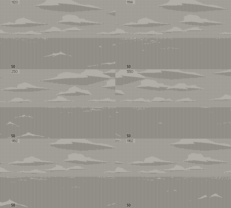
Updated waves and work in progress new clouds
Night and Day
I had the late idea of adding a light gradient above the horizon. In 1-bit, dithering simulates shades of grey. The playdate SDK handles this in the form of tiling patterns, eight by eight pixels in size. These tiny matrixes can produce a mad number of patterns. The right combination for a soft and even gradient wasn’t obvious. Often, the tiling was noticeable, or the value appeared too dark, or too light. Sometimes the pattern felt too geometrical. In the end the gradient adds visual interest and brightens the sky above the horizon, which should make the dark ships read better.
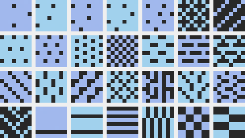
A few examples among the thousands of possible dithering patterns
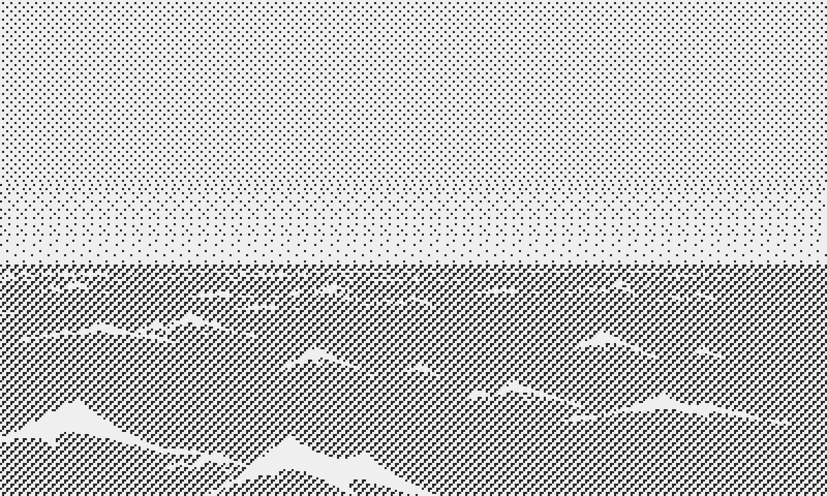
Sky gradient
Another idea emerged as a byproduct of the new clouds: Twilight lighting. In daylight, clouds are brighter than the sky. Twilight inverses values: Clouds appear darker than the sky. They also lose part of their volume, showing almost flat values, since the sky is the only remaining light source. In drawing the clouds with one unique shade and inverting the sky and cloud values, I can now make twilight skies. I have more ideas for sunset scenarios, where you could see the sun above the horizon. Night may prove more challenging to do, but moon phases and ships with their windows lit could make for an interesting look. It’s a bit early to show progress in that area. I hope to be able to do this in the next log.

Different values from day time to sunset
Visibility was a critical issue for submariners, both as hunters and hunted. That’s why the Kriegsmarine U-boat captain guide recommended night attacks, preferably on new moon (early sonars, called ASDIC, couldn’t detect surfaced U-boats, but I’ll come back to this in the future). This means that time was an important strategic factor, and I always favor environment feedback over UI to inform the player. At one glance they will know if it’s high (day), medium (twilight), or low (night) visibility.
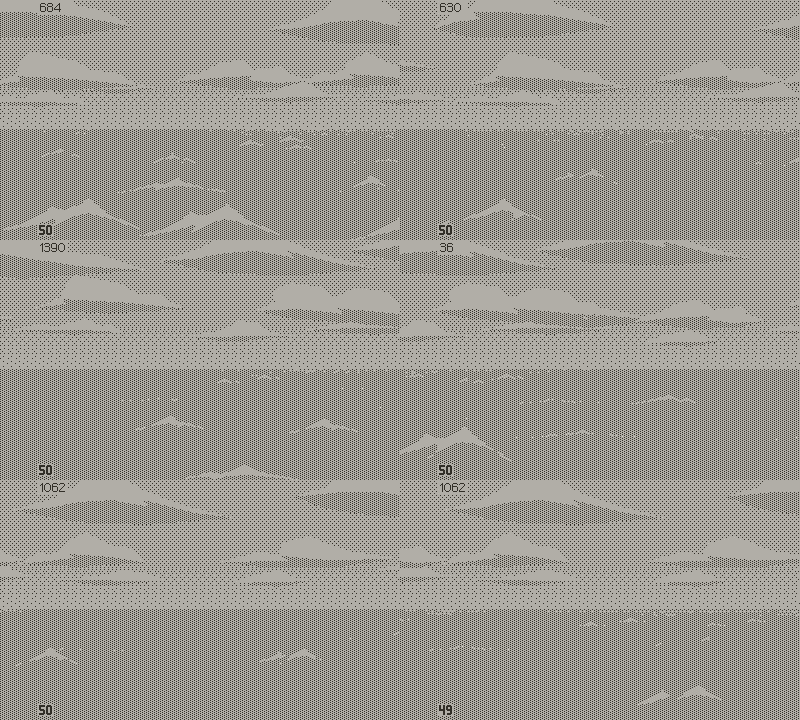
"Final" daytime environment
Next Steps
As I was wrapping up the environment I fell ill, which stopped work on the game. The little strength I had left was put into research and reading, and into reflecting on game design. I learned about many fascinating things that can be turned into gameplay; oxygen candles, potassium cartridges, evasive maneuvers, welded pressure hull vs bolted superstructure, emergency ballasts, chlorine gas, FAT torpedoes (I know…), B-24 Liberators, and many more. You could say that in a way, 10 weeks of forced hiatus came as a blessing, but I must resist the temptation of adding too many features, at the risk of diluting the core experience. It’s a fine line between deep gameplay and incomprehensible mechanics. Layers of complexity are great, but the loop must remain clear and snappy.
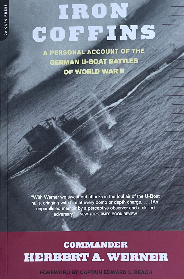
Accounts of service men offer a human perspective absent from historical archives and technical documents
I also used the long pause to stay away from development, so I was able to judge the latest changes with fresh eyes. I’m happy at this point, and confident that the environment won’t change much.
However the lack of contrast in the image bothers me. The eye wanders around in search for a focal point. In a sense, that feeling of open sea is part of the experience; the reward of finding a target by contrast with the vast emptiness. But being on a boat is not like floating above the ocean. You are grounded on the deck. Pictures taken from the top of the conning tower show that there’s always something in your field of view: The railing, the bow or the stern, depending which direction you are facing.
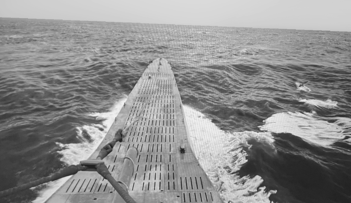
Showing the deck should be an interesting challenge
I can’t help but to think that adding foreground sprites would make stepping outside the submarine more believable and enjoyable. The added stress on the microprocessor could be an issue, but until I can test on platform, there is no way to know. One certainty is that it’s not a small job, either from an artistic or a technical standpoint, but that shouldn’t stop me from trying.
This log is getting long though, so I will save this task for next time. I don’t want to postpone this update any longer, as I’ve been silent for months. I’m also eager to tackle my next main objective. In short it’s about torpedo attack gameplay. During WW2, launching a torpedo was a rather complicated and uncertain affair. If you need proof, look up the U.S torpedo mark 14. Targeting required a number of calculations at a time where computers existed merely in primitive form. The captain had to identify which type of ship he was targeting. That gave him essential information about mast height, which in turn he used for calculating the distance to the objective. Then he needed to estimate the heading of his target and measure its speed with a timer. Furthermore, he had to decide about surface or submerged attack, torpedo type (steam or electric), depth settings, bow or stern tubes, and the list goes on. That’s ground for interesting gameplay, and the idea is worth mock-up screens, which I hope to present next time.
Atlantic '41
A WW2 U-boat Simulation for the Playdate
| Status | In development |
| Author | StephanRewind |
| Genre | Simulation |
| Tags | 1-bit, Pixel Art, Playdate, Turn-based Strategy, World War II |
More posts
- Visual Upgrades40 days ago
- The Enemy (Part 2)94 days ago
- The Enemy (Part 1)Jul 15, 2025
- Los!May 29, 2025
- Preparing the FutureApr 07, 2025
- Project ResetApr 01, 2025
- Small BeginningsFeb 24, 2025
- Death by a Thousand ShellsDec 17, 2024
- Next devlog a bit delayedOct 13, 2024
- First BloodAug 28, 2024

Comments
Log in with itch.io to leave a comment.
The new waves, sky and clouds look great! Those polygon clouds especially worked out nicely.
For the torpedoes, I think your best bet would be to find that middle ground between arcade-style simplicity and simulation-style reality. Depth, range and direction should be fine, but torpedo type (steam or electric) could also be cool, especially if there is a noticeable difference between them.
I can see how rendering foreground images of the bow and stern could be problematic. If you did just the railing though that alone might provide that "grounding" effect you're looking for.
Glad to see you're still working on this! I wish my own devlogs were half as detailed.
Thank you for the positive feedback! It’s comforting that you share the sentiment that I got from friends. I was always commited to doing in depth devlogs, but it’s demanding. I hope to create an intimate bond with the players; a long journey we embark on together. It also helps me to making sense of my ideas.
On the subject, I recommend Jordan Mechner’s making of journals: Fascinating accounts of the joys and struggles of creation, but also a touching window into another era that I remember fondly.
In fact, I’ve been thinking about making a small number of boxed copies of the game with printed manual and feelies, in the tradition of the eighties. And then maybe compiling all the logs into a book as part of that crowdfunding campaign, as a higher tier reward, or a stretch goal.