The Right Amount of Trouble
Since last time, I’ve progressed on the submarine overview. Doing so, I stumbled on a bizarre overlook on my part, but what I imagined to be a quick fix took a life of its own. I even decided to dedicate this whole post to it, as a prime example of the nasty habit creative projects have of becoming their own masters.

Photoshop mock-up of the submarine overview
The submarine overview isn’t as far along as I had hoped it would be at this point. But there’s an upside, as this new feature I made for it will make its way into other parts of the game, improving the art all around, and saving me development time down the line. If you wonder what it is, you’re about to find out.
Sky is The Limit
It started with my obsession with references. As I was combing the net in search of genuine U-boat periscopes POVs, it occurred to me that there was never a whole lot to see: two big blue (or grey as they appeared on vintage film) expanses meeting on the horizon. At best the occasional sandwiched ship.

View from a WW2 submarine periscope
I was struck by the obvious: ocean and sky accounting for the bigger part of what the game will show, I should give it proper attention. Until now I hadn’t given much thought about rendering the world, as I was focused on gameplay. Still, It’s baffling that until a month ago I had barely given any thought to how I would render the sky.
Since I was getting to a point where I was ready to display the submarine cross section, I needed a background and a simple water plane as in the Photoshop mock-up. Up to that point, sky in the submarine overview was a fixed bitmap background, made of a few wispy high altitude clouds. Nothing spectacular but they did the job. However when importing the backdrop image I faced three problems:
. It’s wasteful: every sky needs a large 1200 x 240 image.
. It’s static: the sky can’t change over time, apart from a basic side scrolling.
. It’s not scalable: every new sky requires a new painting.
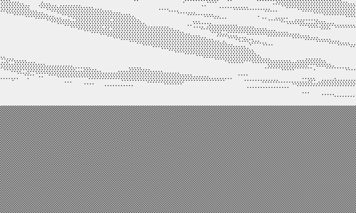
The sky as I drew it in the mock-up
I knew I had to make changes, but I could think of at least a few positive points about the sky I had:
. It’s balanced, not too complex nor too simple.
. It’s comprised of interesting shapes.
. It has a basic sense of perspective (more on this later).
. It’s easy to paint.
While I was ruminating about skies, I started educating myself about the graphical capabilities of the Playdate, and how to code for the graphics engine. Combining the two might be a good opportunity to apply my newly acquired theoretical knowledge onto a practical problem. And that’s how I came with the idea of focusing on programming a simple system to generate and animate skies, as an exercise to learn the graphics engine of the Playdate.
Into The Rabbit Hole
Now is a good time to mention a syndrome documented ad nauseam in post mortems small and large: I don’t know if people have a name for it, but you could call it uncontrolled scope expansion, even though I prefer the colloquial “going down the f**** rabbit hole.” And it’s when the developer starts adding, or expanding features outside the original blueprint of the project. I will say that I blame this phenomenon for the majority of abandoned or disappointing projects, from many of my own modest endeavors to legendary AAA implosions, “Cyberpunk 2077”, ”Duke Nukem Forever” being a few illustrious victims.

Duke Nukem Forever. Announced April 1997. Released June 2011. So yeah...
I think the few weeks that I’ve spent developing an increasingly complex system for my sky fall under that infamous umbrella (ah ah), because about a month ago I was expecting to spend no more than a few days on coding a primitive system that would load up and at best scroll a simple bitmap. Even that shouldn’t take more than an hour to someone who knows what they’re doing, but I must account for my lack of experience and the fact that this is a side project to my regular day job. But I digress.
I am familiar with painting skies, having done it for many years as part of said day job, but I believe that you always know less than you think, so as usual I started looking for reference photographs and examples of ways artists stylize skies. Research on 1-bit sky yielded poor results. In many cases people chose to ignore the problem. You’d end up with a tiny blob of pixels as suggestion of a cloud, or nothing at all.
I narrowed it down to three main options:
. The 1-bit sampled photograph of a realistic sky.
. Hand drawn stylized clouds.
. Dithered shapes.
The first option is impractical on the Playdate. In order to get a decent photographic sample, you need either lots of colors (or shades of grey), or high sampling resolution. Both is ideal. The Playdate has neither. But even beyond the technical limitation, I’ve never been a fan of photorealistic game art. For “Atlantic ‘41”, I envision a look grounded in reality, in terms of proportions and detail, but graphic and sharp. I don’t think photos are a good fit. Besides, photos are static and don't lend themselves well to animation, and they consume lots of memory.

Photo sampled at the resolution of the Playdate, in 1-bit diffusion dithering
Option 2 sits on the other side of the spectrum. I don’t want graphics that look childish or cute. Outlines confer that hand drawn feel to the art that is associated with comic books and cartoons. This isn’t a good stylistic match for the game either. The upside is that this type of art is suited to the Playdate, with its toy like appearance. I’m not writing this in a derogatory way. I love cute cartoon games, but I wouldn’t be surprised if they’re going to represent the majority of what’s available for the console. Plenty of other people are going to make these much better than I could, so I’ll stick to what I feel (marginally) more competent at.

Cute, but not very good for Atlantic '41
The last option could work. Dithered shapes can live within a modest resolution, they don’t look like mere photographs, yet they don’t feel like they belong to a cartoon either. Technically and artistically, that option fits both the project and the platform. I felt reassured that the research confirmed my instinctual approach in the Photoshop mock-up.
Deeper and Deeper He Goes
First order of business was to try and break down the sky into small chunks: clouds, or cloud groups. That would give me both flexibility and the economy that comes with cloning and repetition. Nothing fancy there.
Inexperienced artists may think of skies as a flat backdrop, onto which 2D clouds are pasted. It’s worth stating the obvious: Sky is a collection of 3D clouds populating a space that sits above us. Knowing this, there’s two key components to a convincing sky: volume and perspective.
Volume
For reasons going beyond the scope of this post, a cloud, at least the common cumulus type, resembles a bunch of cotton balls sitting on a flat plane. That plane is your ceiling, below which the sky is clear. This helps to visualize the shape of a cloud from different viewpoints. Scatter thousands of these at a given altitude, as far as the eye can see, and you have a sky.
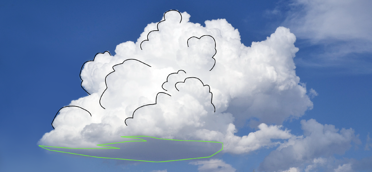
The structure of a cloud, with flat bottom and repeating shapes
Perspective
One of the most important aspects of perspective is that the way things look depends on their distance from us. To keep it simple, the further away, the smaller they appear and the closer they get to the horizon. It’s all an illusion but nonetheless it’s how the artist must draw them.
Combine these notions and you can draw a few essential visual cues:
. Clouds overlap: the ones close to us hide the ones further away.
. The closest clouds are right above us; we see them from underneath, aiming at the flat bottom. They appear simpler in shape and larger. They are the further away from the horizon.
. Far away clouds are small. They sit close to the horizon. Because they are far, we see them from the side, with their flat base and rounded top.

The effect of perspective on sky
Following these principles I drew a number of clouds, divided in five levels of distance from the camera, and proximity to the horizon. Notice how with each line, clouds grow, and their shapes simplify. Their outline also becomes more even, instead of having a distinct top and bottom.

All the cloud shapes the code can pick from to compose the sky
Then I programmed a system that picks and places the shapes at random, following the structural rules I just mentioned. Clouds must remain within their pre programmed altitude, with a little room for variation. Then they are scattered horizontally, with random spacing within specified boundaries. Later on I'll add subtleties to the code, but for now the system is good enough.
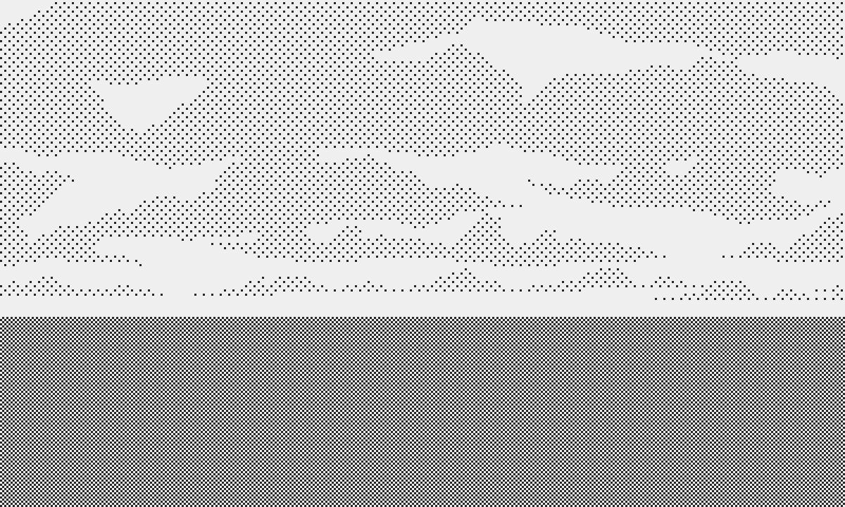
First randomly generated test
I liked the result, but it needed life. Motion at the least, for which I programmed a rudimentary routine. Again, taking perspective into account, the far away clouds appear the slowest, with the large clouds the fastest, in good old parallax fashion. It’s easy to overdo this. Too fast, and it looks like the camera is moving at high speed, instead of rotating around its axis. A high speed test looked so fun that now I want to make a side scrolling shmup. Must. Resist.
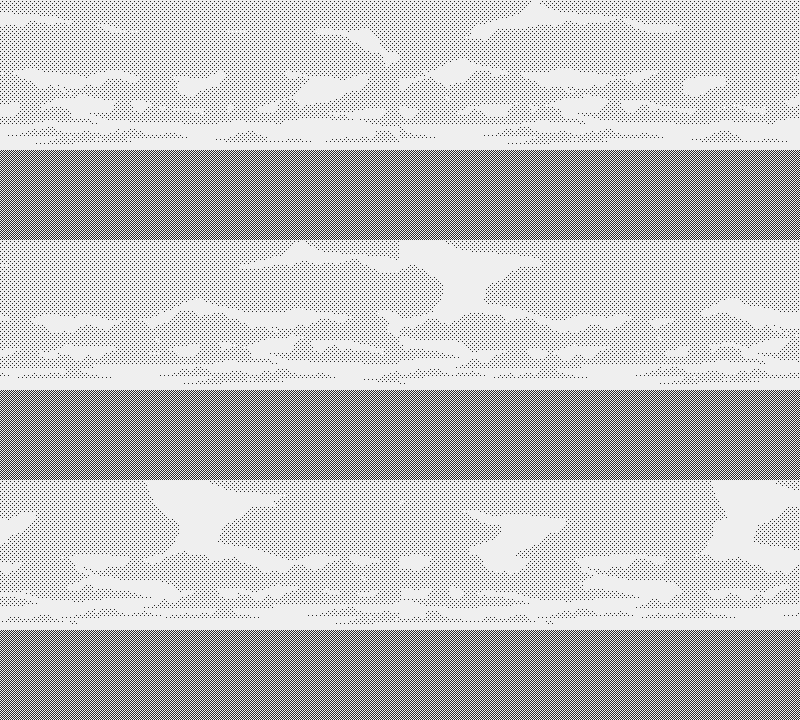
I want to add a little ship and neat waves of aliens on this...
After some trial and error, I found decent parameters.
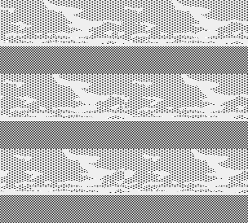
Better...even if that’s still hurricane force wind.
Off With Their Heads!
Then I got another idea. Since I’m using polygons and not bitmaps, I’m able to change the shape of clouds over time. Back to internet for research. As I’m sitting there studying fluid dynamics and weather systems, all the alarm bells go off in my head: this is getting out of hand.
There’s no need for such complexity. I brought this as far as it’s worth. Even if I could code a morphing system for my clouds, no player is going to sit there staring at the sky long enough to ever notice it (Or it means that the game is terrible). Creation comes down to making smart choices, and the ability to trim the fat. I can’t allow the scope to grow unchecked with every fun idea that comes to mind, even the smart ones, and this isn’t one of them. Having independent control over the speed of each cloud though, I added a small randomization, insuring that the distribution of clouds within one line wouldn’t remain constant over time, even if their shapes do. It’s much easier to code than a morphing system for a fairly similar result.
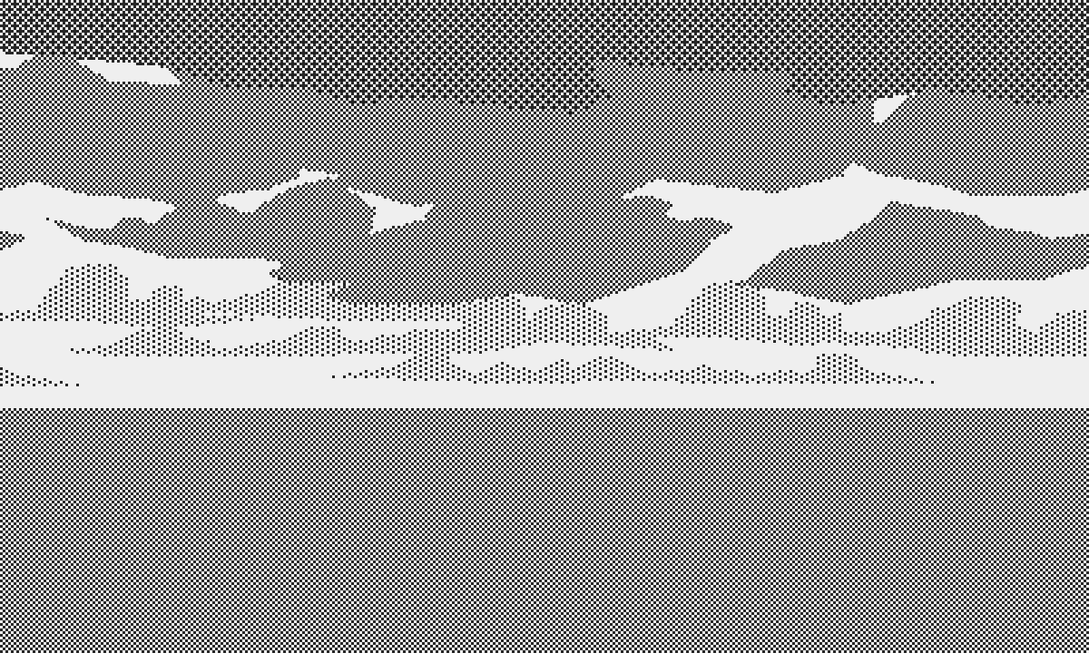
Varying filling patterns can yield interesting results
I have control over the distribution of clouds, their density per distance, their dither pattern. I can have dark clouds and high wind, clear skies broken up by a few immobile clouds, and many other variants. Later on I’ll have to think about night skies and the moon, but for now I’m covered.
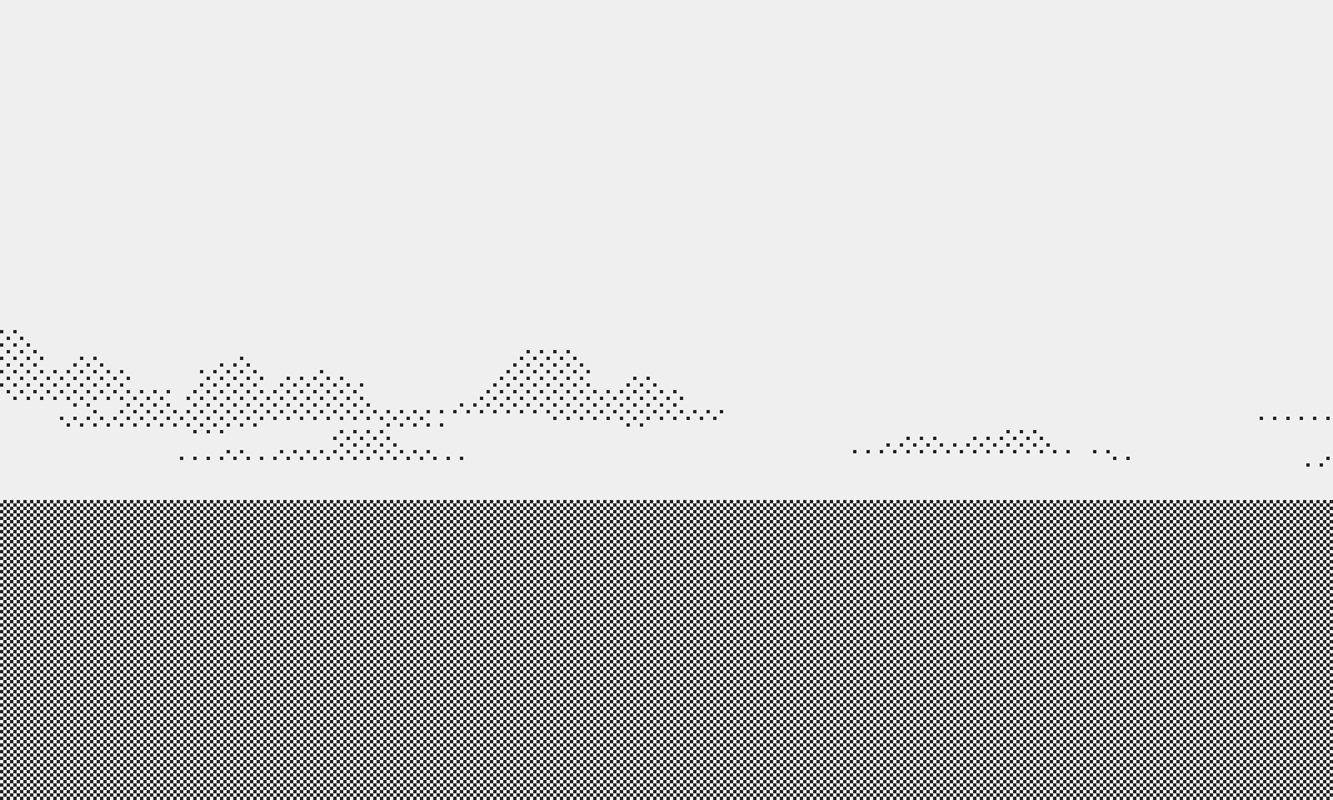
Clear skies
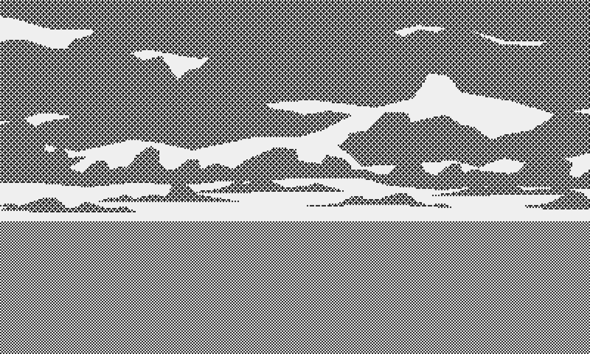
A storm builds
In hindsight, I’m happy that I have a decent looking, flexible system. It’s comforting to know that I can reuse it in future projects. I think the time was well spent but I admit it’s too early to know if it was worth it. The other unknown is how it will perform on the console. I’m afraid it may end up too taxing for the little processor, but I have many opportunities for optimization if that’s the case. I can’t wait to get the Playdate because all that development in the void makes me nervous. As soon as I get my mits on it, I’ll go back to the sky and implement a simple system to generate skies based on a few parameters like daytime/nighttime, cloud density, wind force, cloud distribution, all taking into account the amount of computing resource I can allocate.
More next time.
Atlantic '41
A WW2 U-boat Simulation for the Playdate
| Status | In development |
| Author | StephanRewind |
| Genre | Simulation |
| Tags | 1-bit, Pixel Art, Playdate, Turn-based Strategy, World War II |
More posts
- Upcoming log and Cranko! interview4 days ago
- Visual Upgrades48 days ago
- The Enemy (Part 2)Aug 31, 2025
- The Enemy (Part 1)Jul 15, 2025
- Los!May 29, 2025
- Preparing the FutureApr 07, 2025
- Project ResetApr 01, 2025
- Small BeginningsFeb 24, 2025
- Death by a Thousand ShellsDec 17, 2024
- Next devlog a bit delayedOct 13, 2024

Comments
Log in with itch.io to leave a comment.
Very interesting to hear how you solved your cloud problem!
Thank you! Still some adjustments to make but hopefully some version of this will work. Now I must put in place a similar system for the ocean. eventually I’d like to have a simple setup that generates cohesive ocean/sky systems based on a few variables, like weather, time of day etc.
The more I read about this game, the more I respect the development of it.
Very nice of you to say :) Thank you.
Great read! This seemed like a fun problem to solve, and I think the end result you came up with is top notch.
Thank you! Putting together this kind of little system is what makes programming videogames so fun.
😍
Thanks ;)