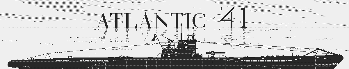
Atlantic '41
Mocking Up The U-Boat Overview
Learning by Doing
Recently, I’ve been thinking about the best way of making the game, maybe more than about the game itself. I could jump straight into prototyping something, anything, but that sounds reckless. Or I could fill a design bible with every gameplay mechanic, which sounds boring.
I remember my first games (back in 1989 oh boy) when implementing even basic features involved days of low level machine code. But things are different today; modern game engines allow for fast prototyping, which is invaluable because there’s a world of difference between imagination and experience. This is even more true for action games, which rely a lot on motion and timing. You could for instance prototype a turn based game with tokens and dice, but there’s no practical way of simulating a fps.
 How it looks on a real Playdate. No tricks!
Regardless of the genre though, a game is more than the sum of its parts. It’s a weird chemistry achieved through iteration. In the case of “Atlantic ’41”, I document various building blocks, but only a proof of concept will tell me how they mesh together. A few weeks ago, the guys at Playdate were kind enough to offer me access to their SDK, which tells me that now would be a good time to let go of theory. I don’t believe much in reading manuals in a vacuum, so I’ll just start making the game and learn as I go.
But where to start? For most games it comes down to the basic game loop. For a platformer or a shmup I would implement the character (or ship) movement, controls, then add enemies, and I would build up until I get a playable level. Then I would keep expanding, up to a feature complete section of the game. At least that’s what many developers used to do well before people gave it a name: the vertical slice.
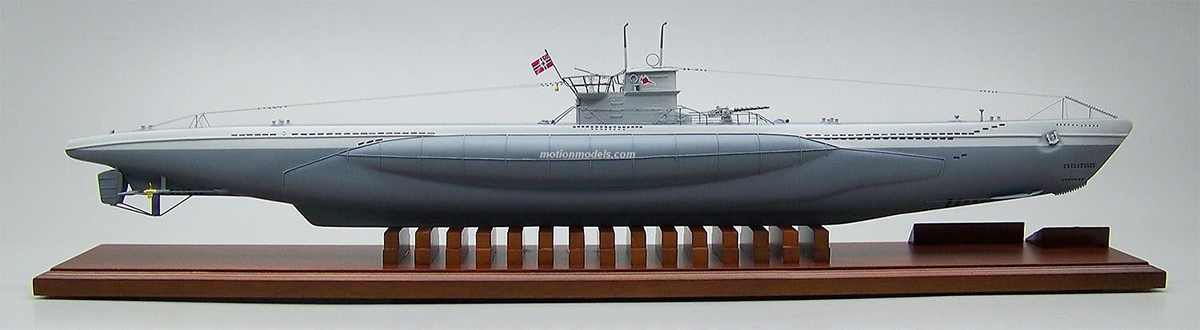
The U-boat Overview Mockup
But vertical slices don’t always apply. What’s the vertical slice of “Tetris”, if not the game itself? It doesn’t work for content based games either. The fun builds over time, as your character levels up, or it’s based on one up situations. I would bet that the vertical slice of “The Secret of Monkey Island” wouldn’t amount to much, let alone give a faithful impression of the final experience.
That goes for “Atlantic ’41”; even if I could describe the game loop with reasonable accuracy (which I can’t), it’s the dynamic between all the mechanics that makes the game, and that will remain a mystery until I’ve built most of it. And then there’s the question of how much the gameplay can grow, run after run, before it stretches too thin. I guess that’s inherent to turn based strategy games, or content heavy games; much like their gameplay, the development takes time to mature. Well, my head hurts so let’s table this for now.
The U-boat Overview
So again: where to start? Maybe the best way is to chop up the game into manageable chunks and prioritize them: the most likely to make it into the final game first, and the ones with essential features. The best candidates need to stand on their own two feet, and later merge into the game. From a technical standpoint, I need to learn the most useful aspects of the SDK first: how to make a scrolling, how to display text, how to trigger a sound, how to access the crank…
 The Overview is Part Model...
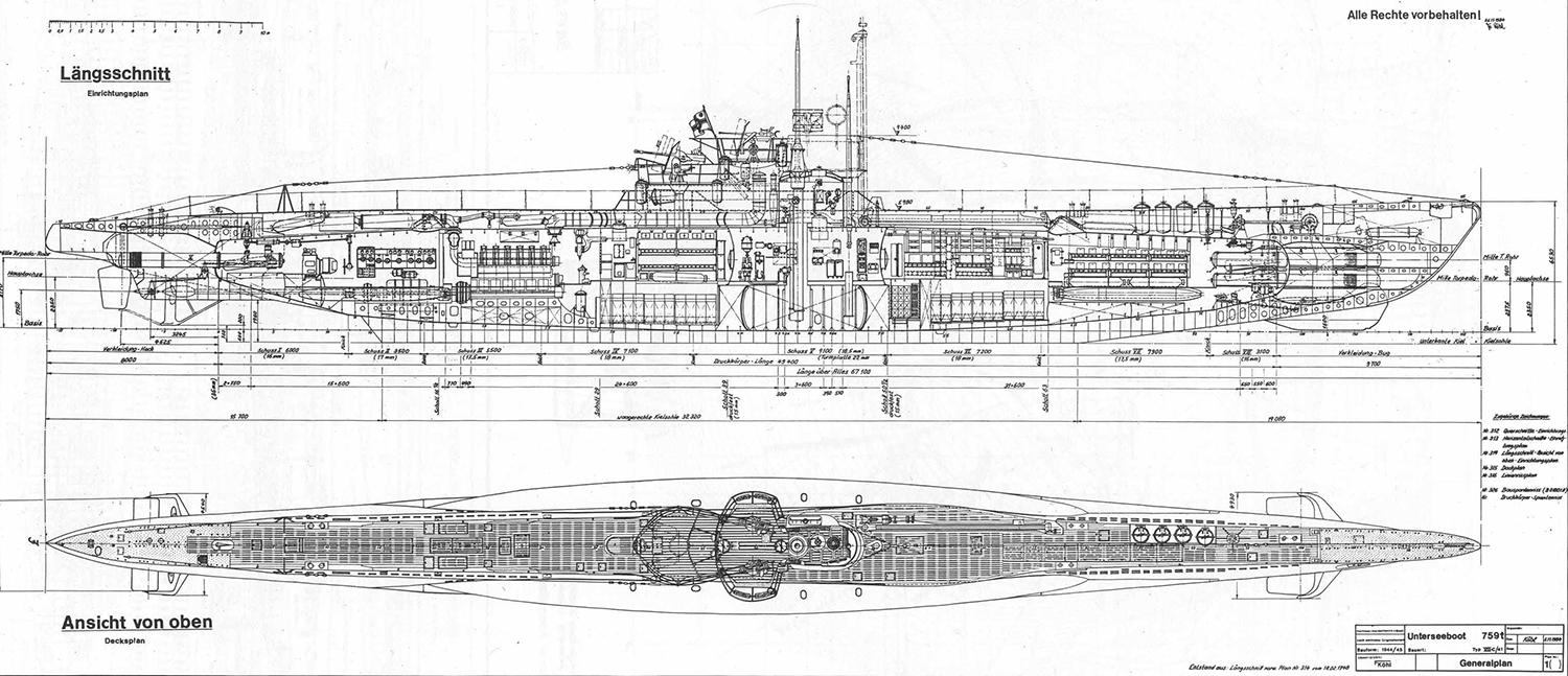
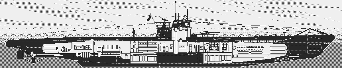
For “Atlantic ’41”, I’ve always envisioned an overview of the U-boat; part schematics, part beauty shot. As a simulation nerd, I want to marvel at my boat, tiny hydrophone and cables and diesel engines and all. It’s the model maker joy. But it must have a utilitarian value, which it has: a complete status of the boat at a glance, and a centralized access to the various stations.
 ...Part Schematics
I wonder if this remote perspective may lessen immersion, but I hope that the benefits outweigh the drawbacks, particularly in the context of the graphical limitations of the Playdate. I see the game as a mix of war-game tiled maps, status screens, and first person views (if I can make them convincing on the tiny screen, but that’s a challenge for another time.)
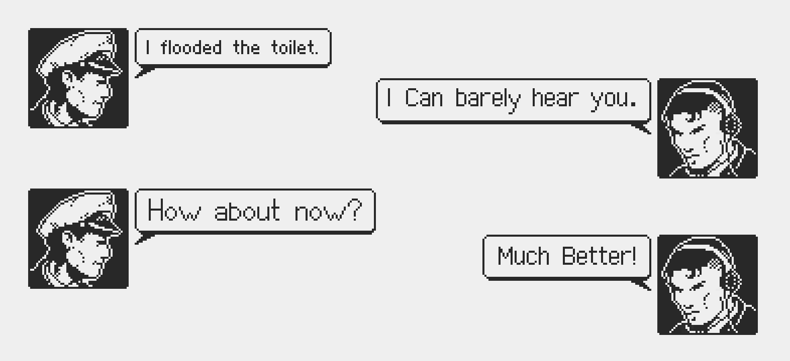
In the last devlog, I mentioned the importance of human interaction, and the U-boat overview shouldn’t escape that rule. Since it’s where you’ll inspect the boat and give instructions to crew members, I need to show these guys. The little talking portraits of old times mean too much to me for not making that nod. And it’s the opportunity to implement the dialogue system that will permeate through the game.
Then comes the UI, the link between player and game. It must be able to display text, windows, and receive input, buttons to click, options to select, and all the usual suspects.
Knowing all this, I think the U-boat overview checks all the boxes for a prototype in engine: it’s likely to make the cut, it’s independent, yet it’s part of the experience, and it’s comprised of several essential low level features, like 2D scrolling, animated sprites, UI, pad and buttons input, data structures, and even sound. I prepared a mockup in Photoshop to get a sense of what I was getting into before trying to implement it into the engine. In the following I’ll go over what went into that.
22 Meters Per Screen
67 meters is the length of a U-boat Type VIIC, the workhorse of the German Navy during WW2. That’s a lot of boat to cram into 400 pixels. I tried, and it didn’t go well. It would be fine for a boat selection screen, but not for showing detailed information about the stations of the boat, let alone when covered with text.
 1200 Pixels of Boat
My idea was to only reveal the selected station. You scroll through the various stations with left and right on the pad. The section you just left closes and the new one opens, with its name displayed in the top left corner. Since there’s no alpha in 1-bit, I had to simulate a fade in and out of the station with animated dithering. It took me a while to find the right pattern animation and timing. This is where Photoshop comes in handy. I assume that iterating this directly in engine would take longer, but there’s something to say about seeing your stuff running on target. I’m quite aware that what I do in Photoshop may need some adjustment once I get the Playdate.
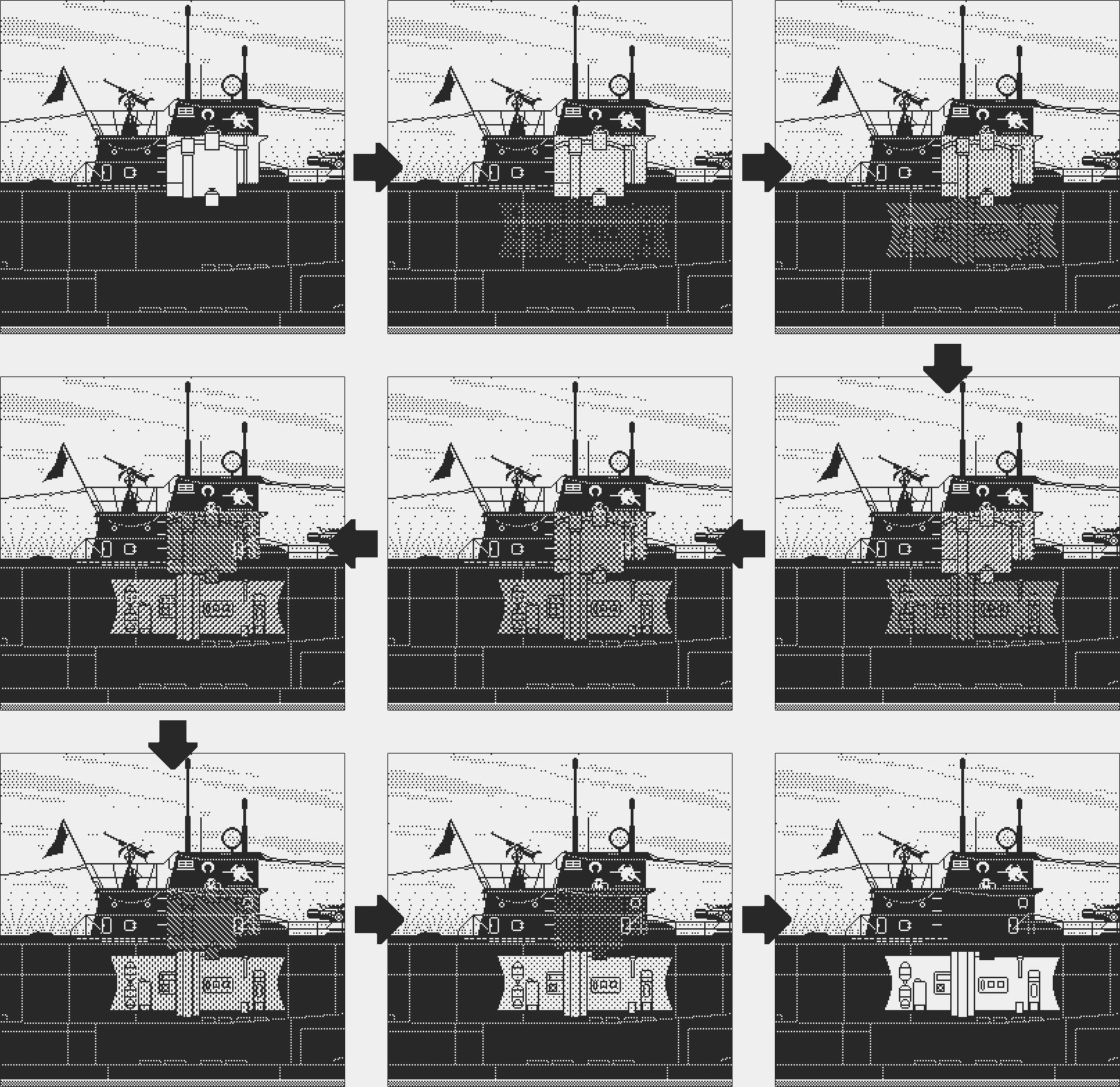 Dithering Animation to Simulate Opacity
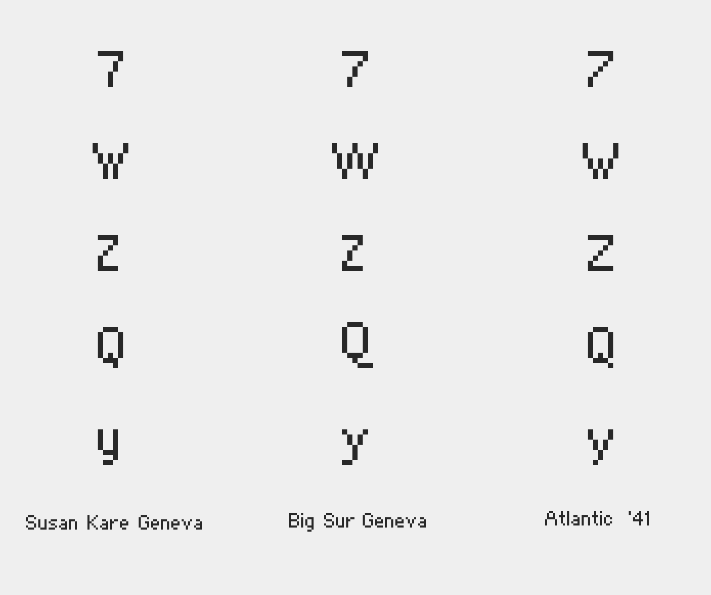
Pixel Perfect Prose
I must confess an unnatural love for pixel fonts. It started with regular typeface and got weird when I discovered the work of Susan Kare. She was the main interface designer on the first Macintosh computers in the early eighties. She designed legendary fonts like Monaco and Geneva and was responsible for the look of the original Macintosh operating system in 1984: to me the most iconic pixel art work ever made, and my favorite.
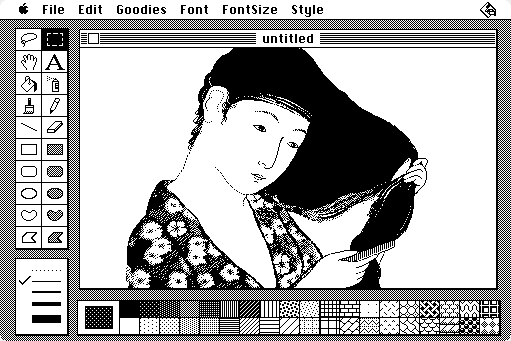
Image Drawn by Susan Kare in Macpaint
Last time I mentioned the 1-bit aesthetic of the old Macintosh as a driving factor to develop for the Playdate: no doubt that “Atlantic ‘41” UI will owe a lot to Susan Kare. I always knew I wanted to pay homage to the early System. That’s what people say when they intend to rip something off, and I make no excuses. If you’re designing a 1-bit UI for a 400 x 200 pixels screen, you can’t afford to ignore what Apple did in the early eighties.
But I don’t want to copy the Macintosh System. There’s no fun in that. I don’t pretend to improve on it, let’s be realistic. But I think I can tailor it to my needs. The Macintosh iconography always had a classic but playful vibe, which isn’t appropriate for my theme. For instance, I reduced widows to a simple white square with a one pixel border, to which I added just 1 pixel at the bottom to ground it. I turned the cheerful striped title bar of the Macintosh system to solid black. It may not seem much but I think it gives a more sober identity to the game.
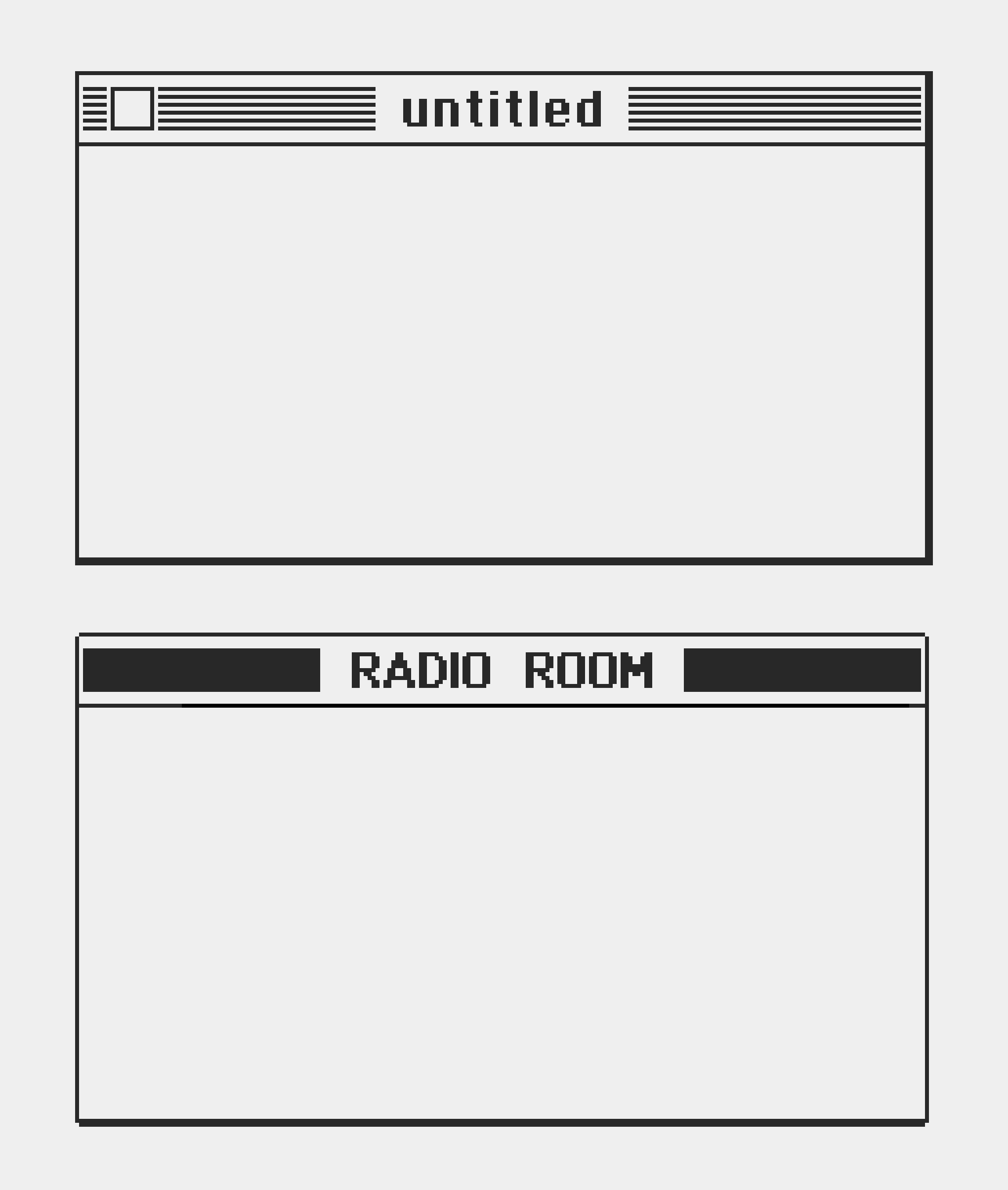 A Window From Macintosh to Atlantic '41
I try not to overlook anything, or underestimate the importance of any aspect of the game. I think the successful games craft an experience through rigorous discipline: everything, from graphics to mechanics to writing to sound to the smallest icon take part in a cohesive world.
Fonts are also a major vector for art direction. I knew I wouldn’t get away with using a freeware pixel font and be done with it. Still, the study of Monaco and Geneva in 10 pt and 12 pt opened my eyes to how much artistry Susan Kare crammed into these cute letters.
 Fonts Come In All Forms And Sizes
I doubt anyone wants to read an essay about this, but know that I had bizarre fun turning these classic fonts into so called “Atlantic ‘41” typefaces. I made 3 typefaces at various sizes, but I may not use them all. I hear that the Playdate screen has a very high contrast ratio, but it’s a mere 2.5 inches across, so only by running the game on the console will I know how well the fonts read.
 If Someone Doubts That A Few Pixels Change Everything
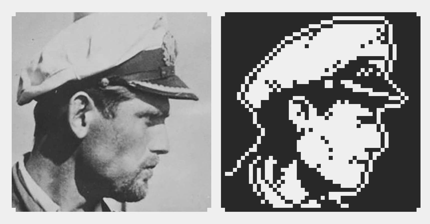
Meet The Captain
I started drawing the portraits while I was still looking for references for the boat. But I said “people first” last time, right? Frankly, they’re just too much fun to do. 48 pixels is a good size. Combing through references, I learned one essential fact: beards and hats are unavoidable. White hats for captains, dark hats for officers. It’s a cool trick to differentiate them, but it takes a huge chunk of precious pixels. I couldn’t see how I would be able to create enough variety within 32x32, but 48x48 worked well. It’s too early to tell how many I’ll need. Hell I don’t even know what I’m going to do with them. But just from the mockup I can sense that they bring a lot of life to the game. I love “Into the Breach” (it’s one of the rare games I 100% completed, with my beloved “Return of the Obra Dinn”). Unlocking a new pilot was a joy. I want the same thing for “Atlantic ‘41”.
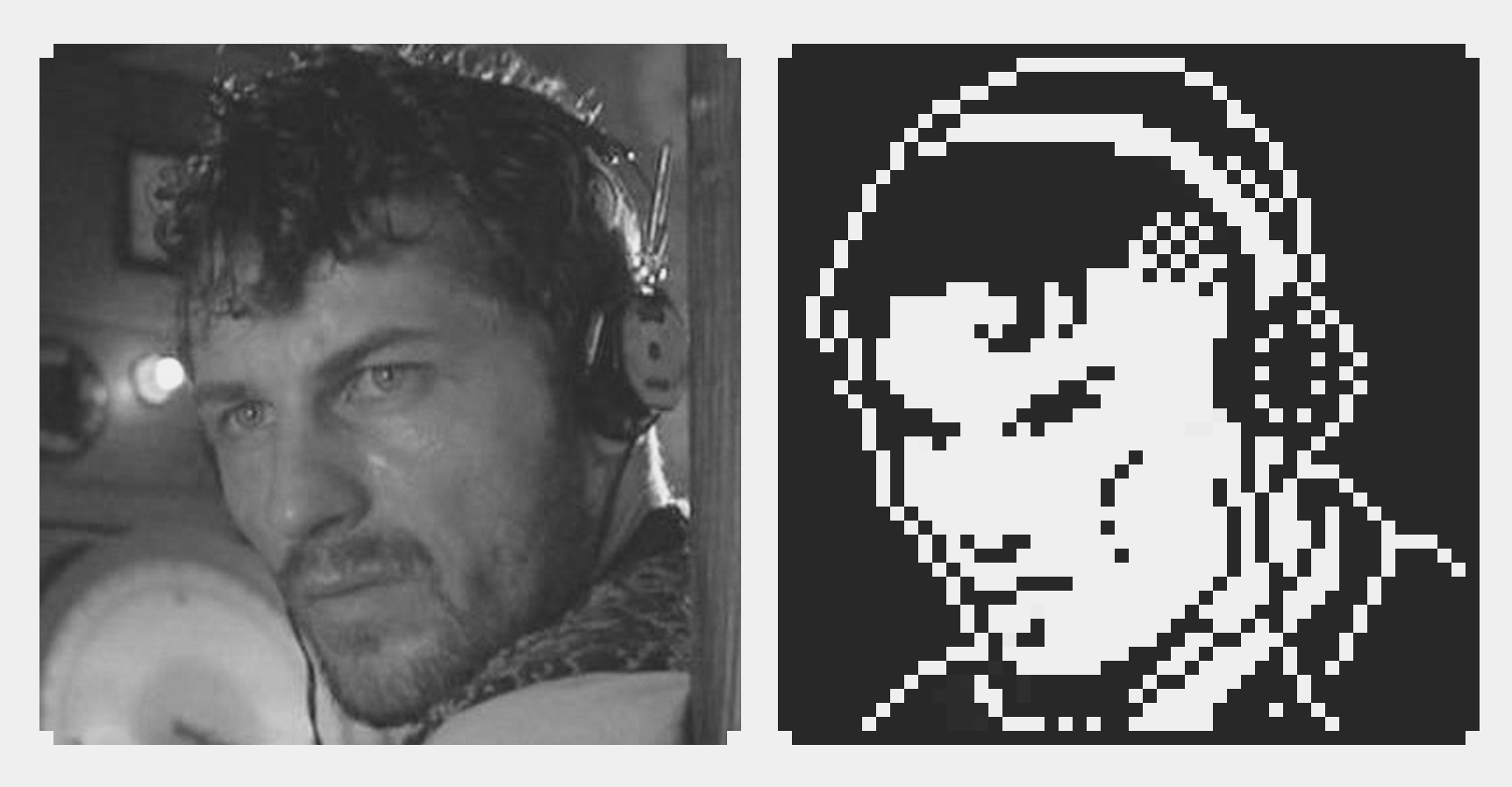
 Sometimes I Stayed Close to The Reference...
To be honest, the few I did took me some time. I’ve always done pixel art, but 1-bit is new to me, and I feel naked without my sneaky color tricks. I guess I will be changing tricks. I considered putting in place a smart workflow, where I could make portraits combining parts of faces, like Lucas Pope did for “Papers, Please”, but that seems overkill. I also looked at resampling photos, but it didn’t save any time, as I ended redrawing it all every time. It’s fascinating how realistic proportions poorly translate at that size, but also how what separates realistic from stylized is a scary one or 2 pixels.
 ...Sometimes Not so Much
These portraits may deserve a full devlog at some point but I should conclude now. I’m happy enough with how the experiment turned out, but the real work is ahead. Now that I have the SDK, I think I’ll divide my time between implementing the overview on the Playdate and designing/mocking up the rest of the game.
More next time.
Comments
Log in with itch.io to leave a comment.
Hey! Love the detail and the format. Your project is one of the ones I'm eagerly looking forward to when I receive my playdate (hopefully) next year.
I gotta ask though - why the extra-wide spacing between words? I'd imagine if you're going through the trouble of crafting fonts based on spatial economy, standard spacing would be the way to go.
hello!
Thank you for the kind support :) The game is really early (I just got the SDK!) and I have a lot to learn, so I bet it will take me at least a year to complete it. And then there’s the question of how it will be released. I haven’t had any discussions yet with Playdate regarding their publishing options.
Anyway you’re absolutely right for the spacing. I sort of eyeballed it and found that adding an extra couple pixels helped for reading on a very small screen but now that you mention it I realize that I overdid it.
That’s why I need eagle eyed people looking at the game while it’s being made! Also the problem with game fonts is that they have fixed spacing, which makes them look a bit weird sometimes. At least that was the case in Game Maker Studio 2. I haven’t looked into the Playdate SDK but it’s most likely the case too.
Anyway thank you for the note. I will fix this in the first prototype running in the Playdate. It will be much more flexible than rerendering in after effects.
Honestly you should be proud of being able to create such a compelling and novel aesthetic so early on in the development process. Thanks for taking the time to respond to my feedback. I'll admit that part of my motivation is a personal fixation on this particular issue.
I've always been annoyed at how the 8-16bit handheld generations established this expectation that because you can only fit so many words on a screen, you shouldn't expect anything resembling quality writing. The pokemon games are perhaps the most egregious example of this (to this point where the hypersimplified, zero-subtext dialogue is now part of the brand). Any games with the potential to buck this trend are always going to be on my radar, and with the playdate I think the juxtaposition between 1-bit graphics and modernized writing standards would be that much more pleasing.
But that's just me - I fully understand that writing might not even be something that you're prioritizing for your game and that's totally okay (I'll still be following it with great anticipation). Just wanted to share my perspective.
You’re welcome. I’m always happy to get feedback, and yours was useful. And I wouldn’t write this devlog if I didn’t want to answer questions. Believe me I’m very aware of how bad text looks in games, since I used to work in press for a while, and my wife was doing printing layout. I think at the end of the day you can have decent writing with very few words. Like I mentioned in one previous devlog, I hate lore and walls of text. I think they often hide the lack of a real game and context underneath. But the game medium can still make use of good writing, as long as it’s done with style and economy. With all that said, I don’t pretend to be a writer, nor a game designer for that matter! I’m just learning as I go.
Awesome work. May I ask if as a player you can choose your crew and if the crew is going to have some "sanity" bar that you have to check out? In your previous post, you said that the life on this machines was very harsh, and even the little things make some difference for this men. And I recently read an adaptation of Lovecraft's the Temple by Gou Tanabe. This adaptation takes place in a U-boat. Here is the link of the book
https://www.amazon.com/gp/product/B07K5ZGKYP?notRedirectToSDP=1&ref_=dbs_mng_cal...
Thank you! It's a really cool suggestion. I've read just about everything Lovecraft ever wrote, so I'll check out this book. Seems like it's been made for me.
Yes, there's absolutely going to be some kind of sanity, or morale stat in the game. I think It'll have a global Crew Morale, and an individual stat for the main officers, namely the Captain, Chief, 1st Officer, and maybe beyond that 2nd officer and Radio operator, but I'm not sure. Morale will affect the crew and officers ability to perform their tasks.
As to choosing your crew, it's a bit more complicated. Historically, captains were not the ones picking their crew members. Crews were assigned more or less at random, and they had to make the best of it. However, from a gameplay standpoint, It's fun to be able to select your people, and there is stories of captains who had enough influence in the navy to handpick some people, or pull strings as to whom they would get, and even what boats or missions they would command.
The way I see it, as the game progresses, and the more experienced and decorated your captain becomes, you'll get more political influence and the opportunity to pick your main officers from a constantly changing pool of available officers, a bit like you select your new party members from the caravan in Darkest Dungeon. This makes sense from a historical standpoint, and it's a fun gameplay feature.
I think your system would be cool, the more medals, the more leverage. The question: how are you going to tackle the Nazi stuff?
Historically the U-boat personnel was part of the Kriegsmarine, the German Navy. They did not have a direct connection with the National Socialist party. In fact, because the U-boat men were isolated, the Nazis wanted to make sure that they were still properly indoctrinated and sometimes sent Nazi agents on missions to rat people who talked badly about the party. If anything, the Nazis were a menace to their own military too, which could be an interesting gameplay twist, having to deal with the stress added on the crew by the presence of a Nazi agent on board.
It’s an interesting historical aspect of the war and I don’t plan to shy on it. I believe that the only legal restriction is the display of the swastika in certain countries, but I have no reason to show any so I don’t think this will be an issue.
Very cool approach indeed. Maybe show a little of that struggle can make the game a superb way to understand the war and the different factions in Germany (like with de Afrika Corps and Rommel). I think that an implementation of that stress or maybe a way to shown that in the game is going to be awesome and a challenge. And that got me thinking of another game, the same premise but within a US bomber. I was watching a documentary about WWII and how being part of a bomber was a suicide mission because almost no plane made a full tour (25 flights), the average was 14 missions. The swastika topic is tricky,
Yes I think I was the one telling you about the US bomber variant idea in a reply to a question you asked about why just German subs in the previous devlog. Thanks for all the input :)
I love this idea! But I will war. You-Nintendo actually has a patent on sanity bars - https://patents.google.com/patent/US6935954B2/en
The developed it for eternal darkness on the GameCube.
although other devs have worked around it
https://amp.reddit.com/r/gaming/comments/46auzd/eternal_darkness_nintendos_sanity_patent_and_how/
I just wanted to make sure you didn’t run afoul.
Psyched about your game though! And I love this idea.