Atlantic '41
Visual Upgrades
This log was supposed to conclude the work on enemy AI, but I decided to squeeze in a shorter report about visual improvements and optimizations. It’s not as random as it seems.

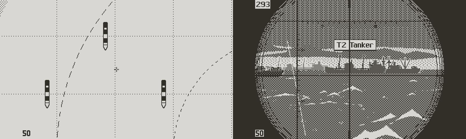
Recently I was able to see a properly structured convoy for the first time in the exterior views (from the conning tower or through the periscope). Early on into the project I had decided to display ships as pre scaled sprites, to avoid cpu intensive scaling calculations, and the messy look of real time 1-bit resampling.
This was a compromise born out of necessity, due to the Playdate technical limitations. The chart being where tactical planning is made, there was never a need for an accurate depiction of ships in the exterior views, from a gameplay standpoint. I merely needed a nice, immersive view, somewhat consistent with the tactical chart.
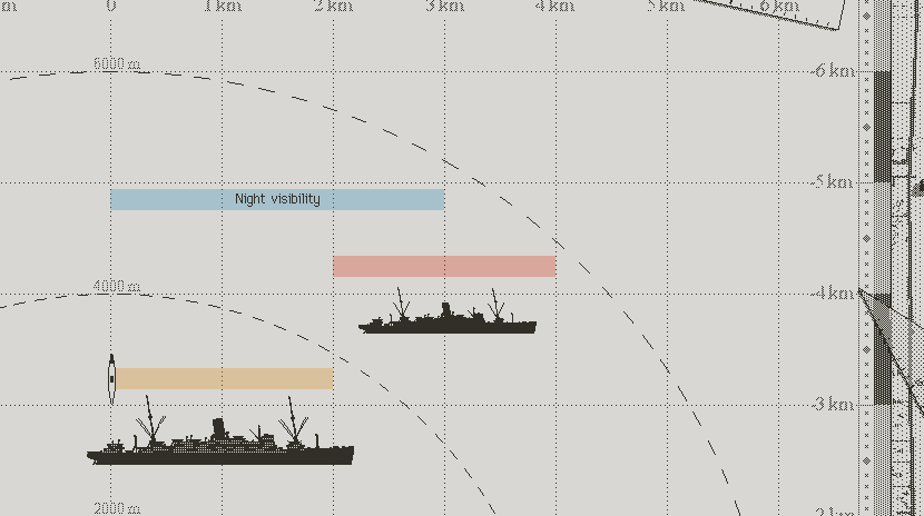
In some cases, the old system lacked visual depth
Until recently it felt like the system was going to work, but with large convoys, I ran into a few edge cases where ships appeared too much stacked on top of one another. The problem came from too few pre scaled sprites, resulting in a lack of depth. Reluctantly I decided to add one set of pre scaled sprites, and reshuffle the distance brackets, in order to get more mileage out of the closest, most detailed sprites.
Previously I had:
Range 1 sprites: 0 to 2000 m
Range 2 sprites: 2001 m to 4000 m
Range 3 sprites: 4001 m to 6000 m
Anything beyond 6000 m wouldn’t be visible.
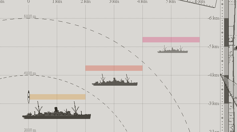
Old distribution of sprites
It turned into:
Range 1 sprites: 0 to 1000 m
Range 2 sprites: 1001 m to 2000 m
Range 3 sprites: 2001 m to 3000 m
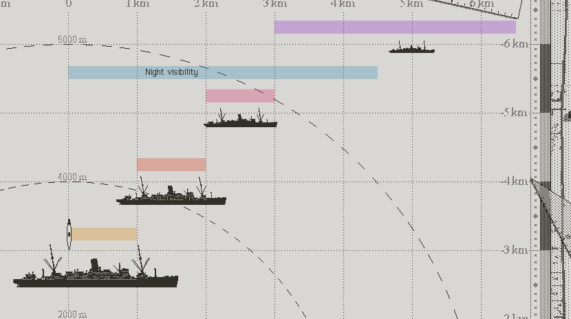
Range 4 sprites: 3501 to 6500 m
Adding one bracket allowed me to enhance the atmospheric perspective as well, ships fading more progressively into the haze. But more importantly, smaller distance brackets reduce the chances that several ships share the same bracket. Originally my idea was to try and be consistent with real perspective. When the distance to an object doubles, it appears twice as small in frame. But this would have required a lot more granularity in pre scaling.
I realized that it was better to ignore real world perspective and organize the brackets in a way that would help the player make tactical decisions, and also enhance readability. In convoys, ships follow each other 1000 m apart. With 1000 m brackets, ships are more often neatly distributed among brackets.
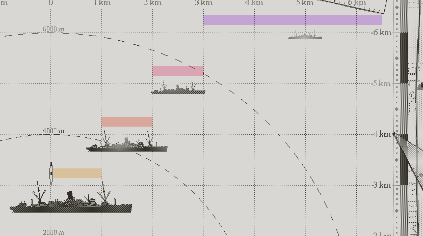
New distribution of sprites
I can also use the pre scaled sprites to visually communicate the odds of torpedo to hit. Under 1000 m is the best attack range, so it makes sense to limit the large detailed sprites to under 1000 m. Up to 2000 m is a decent position, and ships still appear fairly clearly at that range. From 2000 m to 3000 m, ships become flat silhouettes, suggesting that they’re already too far for an effective attack. Past 3000 m the odds of a torpedo hit plummet, so ships look like tiny shapes breaking the horizon.

The average convoy spacing looks better in exterior view
I’m happy with the change. It gives a lot more depth and clarity to the image, and it serves a gameplay purpose. I was concerned about the readability of the smallest sprites on Playdate, but the screen is remarkably sharp. Even the tiniest details come out, given that you’re blessed a decent vision or wear good reading glasses (and if you don’t, chances are that the Playdate isn’t the console for you anyway). It doesn’t matter whether ships are recognizable at this distance, as long as the player can spot them and tag them. The new distribution of pre scaled sprites encourages the player to close the distance before launching an attack, which is consistent with real life U-boat warfare.

The new system offers better depth and clarity in large convoys
But that’s not all. Initially, I wanted night to offer a much more limited visibility. The reduced distance at which ships were visible was compensated by the fact that the boat could get much closer to targets before being spotted. The principle is consistent with reality, since U-boats liked to attack under the cover of darkness. The night surface attack saw U-boats getting as close as 1000 meters from convoys on the surface, which was out of the question in daylight (or in full moon, which captains hated, and you will too if I did my job right).
Old night range bracket system
If reduced visibility at night is sound in theory, I realized that cutting the distance at which targets appeared in the periscope view created a paradox; not being able to see the enemy until it was very close took away the tactical advantage offered by night. So now that I had reshuffled the distance brackets, I had cornered myself into needing to add night sprites too.
New night range brackets
Long story short, each ship saw its sprite count rise from 40 to 64 (that’s for facing one direction, the sprites being flipped at runtime when needed). Updating the six classes already in the game meant drawing 144 additional sprites, which I would have gladly avoided. But it had to be done, and better now than in a few months, with even more ships to update. Granted most of it was copying/filling with dithered patterns, which isn’t as bad as it sounds. A smarter man who likes efficient work (someone like Lucas Pope), would have coded a neat automated export in Python, which I may resort to do at one point.
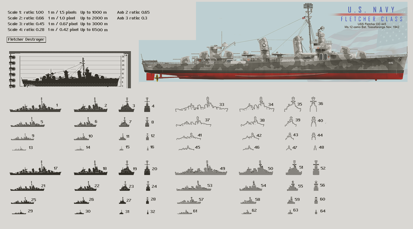
All the sprites needed for one ship class
Outside Influence
I don’t play many games. At least not nearly as many as I’d like to. Work occupies most of my time. It’s for the best; working in isolation helps my focus, which is important on long projects.
On the other hand, playing games helps staying current on the evolution of game design and technology. And it’s a nice break from the daily routine. But I’ve seen my share of projects constantly derailed to chase the latest trend. Sometimes, the game designer was too influenceable, or lacked a solid vision. Sometimes a studio executive stepped in to steer the project in the direction of the latest big money maker.
Return of the Obra Dinn makes with Shadow of the Colossus and Trinity my top 3 favorite games ever
From this came my self imposed rule of blocking the outside noise. However on this game I try to remain open to ideas, whether they’re suggestions from friends, something I read, or any random event. And of course from playing games. Because the flip side of putting on blinkers is the risk of losing perspective on the project.
Hopefully with experience you develop an ability to filter out input that isn’t compatible with the project, and that limits the risk of pollution. In other words, the more confident you are about your own vision, the safer it is to embrace outside influence. That’s my suspicion at least. Not sure if I’ll ever be able to do that.
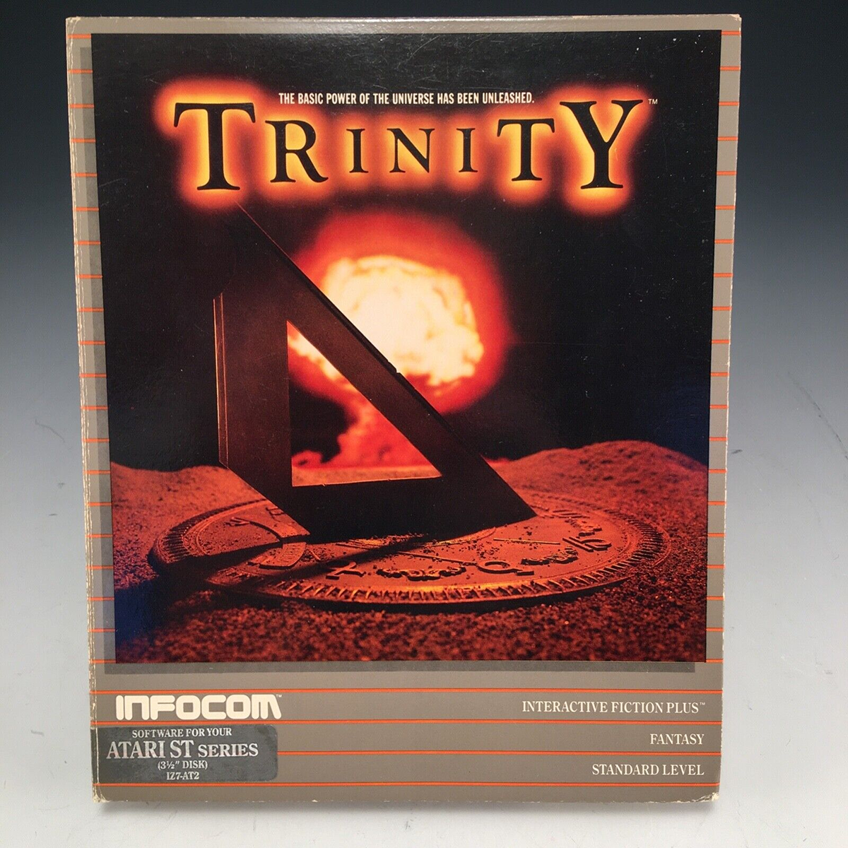
I can still remember the nostalgia of finishing Trinity
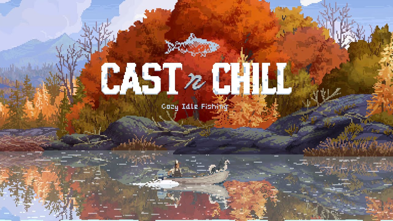
In this case, the beautiful little fishing game “Cast n Chill set in motion something I had meant to try for a while. The environment is represented as a 2D side scrolling, with multiple levels of parallax, in a similar way as Atlantic ‘41. The difference being that it has way more levels of depth, and beautiful, color pixel art.
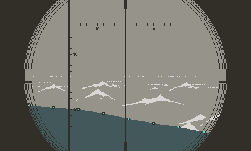
I’ve never been entirely happy with the outside views in my game, in particular the lack of clear contrast between the periscope and the conning tower views. In spite of one view having the obvious black circle overlay, and the other showing the bow or the stern of the U-boat, they never felt distinctive enough at first glance.
When standing on the conning tower, you see the water from an elevated vantage point, at least three meters high. The attack periscope, depending how raised, could be skimming the surface. In fact, that was the recommended elevation, despite the waves washing over the glass and periodically obscuring the vision. As small as it was, a periscope poking above the surface put the boat at risk of being spotted, even as far as a kilometer away.
I was aware that this difference in perspective is the most important aspect to capture. I tried my best, having larger white caps in the periscope view, suggesting how much closer the eye is from the waves. I was happy enough to move on, but these past few month I kept thinking about a way to improve it.

Periscope waves used to be vertically locked
Cast n’ Chill uses multiple levels of parallax to represent the surface of the lake. Horizontal strips of animated pixels, distributed vertically, move at different speeds, faking a large surface. I remember how Shadow of the Beast wowed Amiga fans back in the days with a similar technique. It’s an easy and effective trick, which I also used in Atlantic ‘41.
Where Cast n Chill differs is with the vertical motion as the camera pans down to reveal what’s under the surface. That movement is too extreme for the periscope view, but it made me wonder how a slight vertical parallax would simulate the swell of the ocean. The motion was quick to implement, and it gave a much better sense of perspective; the illusion of the water being an horizontal surface. But more importantly it made the camera feel close to the surface. Points go to Cast n Chill for inspiring this change.

Ocean swell in periscope view
I could (should?) have stopped there but once I’m onto something, my mind tends to race and a small improvement triggers a cascade of ideas. I’ve discussed in the past the importance of refraining yourself from chasing every lead, even though I myself lack that discipline. Unless I can predict a long and difficult implementation with limited chances of success, I have to give it a shot.
Here I wondered if I could push the illusion further by having waves intermittently wash over the periscope. 3D games get the effect right, but it’s a lot more difficult in 2D, let alone in 1-bit, as the console already struggles to maintain the frame rate.

An early version of the ocean, with an attempt at close up waves
I had made an unsuccessful attempt early in the project. In hindsight, it was the wrong approach. Close up waves had the wrong scale. If you think of it, water close enough to wash over the periscope would appear as a soft curve, not an angular white cap. Not only that but hand animated bitmaps didn’t yield the smooth animation required for a large asset at 50 fps.
Many months have passed since then and I’ve learned to take advantage of the SDK polygon functions. Polygon points can be mathematically modulated each frame, which ensures smooth high frame rate animations. And the pixels inside polygons remain fixed on screen regardless of the polygon’s motion, which prevents flickering. They’re also much lighter in memory, as you only need to store the position of the points constituting the polygon outline, rather than every pixel inside of it. But they’re only good for simple flat shaded shapes.
The close up wave polygon
That made them the perfect candidate for close up waves. It took some trial and error to find the right shape and motion, but the effect came out nicely, in particular after I added an additional animated white edge. Unfortunately the performance took a much worse hit than my most pessimistic forecast. On average, I observed a seven fps drop every time a wave was triggered.
Over the course of development, I’ve added all kinds of visual effects and graphical improvements, which affected the average frame rate within acceptable limits. It’s a constant trade off, but I’ve noticed that as long as the game doesn’t drop below 45 fps, the occasional dips remain barely noticeable. Plus that floor is only touched on rare occasions, during the busiest circumstances in periscope view. Any other time the game oscillates between 49 fps and 52 fps.

Animated polygon wave
But with the new waves, the fps now sank as low as 38 fps, which is unacceptable. I hate being torn between a feature I want and the idea that it may not make the cut for technical reasons. Three options then: one, devise an optimized way to achieve the same effect. Two, find at least five frames elsewhere. Or three, ditch it altogether.
Visual development has dragged on for way too long now, and I’m at a point where I really want to get into the meat of game design. But save for the fact that it tanked the frame rate, this new periscope wave was essentially done. So I decided to give myself a hard deadline; two days to find an optimization, or move on.

Adding a white edge to the wave
Fortunately it didn’t take that long. Looking at the frame rate count, I noticed that the fps started to drop even before the wave was on screen, which seemed to point at the SDK animator functions. Ten points form the top edge of the wave. Each one rides along a sinusoid, using an animator. Each animator is offset in time, which creates that swelling effect. It’s quite basic. But somehow in this case the animators are very cpu heavy. I suspect that the easing function makes use of math.sin and math.cos.
I didn’t feel like looking at the function, so I wrote my own system, where the speed at which a point moves is function of the distance to the peak amplitude. I guess I could have stored the values in a lookup table, but I wanted the waves to randomly vary in amplitude. With the speed a fraction of distance, the point starts fast, then decelerates as it approaches the destination, with a forced minimum speed. On the way down, it accelerates as distance increases. It’s trivial but does a great job at simulating a smooth curve, with just three arithmetic operations.

Wave at night
Dark Skies
That alone almost game me the frames I needed, which was a pleasant surprise. But with the additional drawing, the game still ran a bit slow in the busiest moments. The clouds are mostly to blame; even though polygons draw rather quickly, I sometimes populated the sky with two many clouds. The game has four types of cloud cover.
. Scattered clouds for good weather.
. Average cover.
. Storm buildup.
. Overcast.
Storm buildup is the most demanding and causes the slowdowns. This sky foreshadows bad weather, either overcast or full storm. The idea is to give the player an opportunity to anticipate on bad weather and use that information in their decision making. So I added long dark horizon clouds on top of the normal puffy white clouds.

The dark clouds don’t stand out enough to make the sky look threatening
But that never quite worked, on two levels. First it’s simply too many clouds to draw. Second, even if I like the look, it’s too close from scattered clouds, and not immediately recognizable as a threat. I figured it would best to change it altogether and kill two birds with one stone; make something more useful for the player, and much quicker to draw.
Fortunately at this point I have enough building blocks to play with, without the need of developing new visual features. I tried various options but the simplest is often the best. Here what matters is the contrast with the scattered clouds weather. Removing the white clouds altogether was the first step.
![]()
Without the white clouds
That felt too empty, so I brought back the white clouds, in lesser numbers, and darkened them. That felt in line with the overcast look, and solved the frame rate issues. I was tempted to darken the sky, but it’s already a few shades darker at dusk and dawn. The idea implied a lot more noodling and potential new issues to get a consistent look from dusk until dawn would
I could have mess around with this forever but at this point I’m anxious to move on with development. I can sense that I’m getting to the point of diminishing returns with that stuff.
However...

¡Viene la tormenta!
...Just One Last Thing
With all that done, I felt comfortable with the almost final exterior views, which immediately triggered the urge of pushing one more domino.
I often get ideas in the shower, like many people it seems. But in this case I got inspired by the shower itself; by the water dripping on the glass door. I thought “Wouldn’t that be fun to see water sticking to the periscope glass after a swell?” You may ask “Isn’t that difficult to achieve for something most players may not even notice?”.

Droplets reference
I wondered about that too, but that didn’t stop me though because I’m convinced that players enjoy experiences more than gameplay mechanics. A game is more than the sum of its parts”. Water sticking to the glass for a short moment after a wave washed over the periscope isn’t going to blow anyone’s mind. But added to the clouds drifting in front of the moon, the sound of the boat creaking under the pressure, the subtle smoothing on the camera’s motion, and every other small detail, it contributes to the experience.
Slots and Daggers, by Friedemann Allmenröder. Beautiful demonstration that a high level of polish elevates the experience.
Again, I know that I must the draw the line somewhere, but it’s not just about the game. I learn from every feature I implement. I’ve heard people saying “you only learn from your failures”. I’m not sure I agree with that. I think you learn from everything. But the fact that you also learn from failing means that nothing is ever a total loss.

First attempt felt stylistically off
In any case, I tried. Three times. In the first attempt, little droplets slide down the periscope. The look doesn’t fit the style of the game. The droplets look like they come from a cartoon. And there’s two few of them. I tried to correct these issues in the second attempt, by making them look like streaks, and adding many more. That didn’t quite work either; the streaks don’t read as water; they’re too squared and even.
Then I realized something I should have picked up much earlier: the scale was wrong. Given the size of the periscope glass, the droplets should appear bigger. Also, water doesn’t flow down glass like this. It tends to form little droplets that stick to the surface. I was afraid this would be too distracting though, so I came up with a compromise.

Second attempt doesn’t read like water to me
The droplets are now bigger, more rounded, and they shrink down, like evaporating. The vertical motion is still there, but significantly slowed down. I like this version. I’m not sure if I love it. I think that to really read like water, the droplets should refract what’s behind them. But I have no idea how to make something like this in 1-bit and without tanking the frame rate. So it’ll have to do. Too much work and variants have blurred my judgment. I’m confused about it. It’ll stay in for now, and hopefully with enough time I’ll see it more objectively. Feed-back from other people may bring some clarity.

I like this version, but the highlights give it a cartoon feel
Regardless, I think the wave effect was worth doing, and it pushed me to optimize the game. Saving a few frames may help down the line. But now it’s time to go back to enemy’s AI, and wrap this combat sequence. I can’t wait to finally torpedo something that can fire back.

Final version. I’d love to find a way to simulate refraction, but it seems hardly doable in 1-bit at this resolution
I’m sure that control and balance issues will rear their ugly heads, but I’ll deal with them one at a time. After that, damage management and the hydrophone will complete the combat sequence. I’m painfully aware that I’ve procrastinated on visuals for too long. It’s time to face gameplay and turn Atlantic ‘41 into a real game, not just a periscope simulator.
More soon.
Comments
Log in with itch.io to leave a comment.
Games get better and better with your every update. Reference to Cast N Chill is also great! One of my favourite titles for steam deck. Keep up great work! Ps, you have somewhere more activity like on X or any social media?
Thanks :) I have a few of the required social accounts but I’m not very active. Only posting the occasional progress report. Posts are redundant. Pick your poison.
X
Mastodon
Blue sky
Instagram
I also have a bunch of my past unedited pixel art streams on YouTube, if you’re into this sort of stuff. Not directly related to Atlantic ‘41 though.
YouTube
What a wonderful read. I believe you could bundle all your devlogs in a book and sell it as a genuinely riveting account on the thoughts, decisions, leaps of faith, setbacks and happy surprises that go into making an indie game. Anyone involved in creating something would love it.
Oh and on top of that, the visuals for this game are going from great to platform-defining :)
Thank you for the very kind words about the art. Someone else mentioned the book on social media. Maybe it was you. I really like that idea. It’s a significant additional workload because you can’t just copy and paste the web posts into a book. There’s a big job of editing and proof reading, and the question of image rights will be an issue. It’s not like a non profit website.
Interestingly my devlog was inspired by the wonderful journals Jordan Mechner wrote for Karateka and Prince of Persia so a book would be full circle.
"I’ve heard people saying “you only learn from your failures”. I’m not sure I agree with that. I think you learn from everything. But the fact that you also learn from failing means that nothing is ever a total loss."
Came here to read about the dev progress and left with some insight I am planning to share why my clients (I'm a therapist).
The game is looking amazing, but your DevLogs for this have become something I always look forward to reading. I do not work in the tech world in any way professionally; I am learning some coding as a hobby with the hopes of building a simple program to implement into my clinical practice to optimize my workflow (tracking client progress, benefits, etc., things that are generally scattered across multiple sites and difficult to centralize on anything other than a spreadsheet, and then the upkeep is tedious). To get to peer into your creative and technical process is both interesting and insightful, especially to someone on the outside such as myself.
While I am very much in the early stages of learning how to code, I already find myself getting bogged down by what is possible and what is actually needed to be efficient and just get the job done right. I appreciate your transparency about the struggles and weighing of certain features and diminishing returns. Its makes the game design process (and the technical process of building any software) feel very human.
Sorry for all the verbosity of this post, I just wanted to share some sincere appreciation for being able to see the progress of a game that I am very excited about, but also share that the DevLog itself has been an enjoyable and insightful experience in many ways as well.
Please don’t apologize! I keep up with the devlogs in great part because of messages like yours. Many devlogs turn into tutorials, and strip out all the clumsiness. But I’m never in total control of the work. It’s a messy and sometimes frustrating process, and I just want to share it for what it is. Let the reader take what they want from it.
I don’t claim the paternity of that approach though. It was inspired by Jordan Mechner and his journals for Katateka and Prince of Persia. I highly recommend them, since you seem to enjoy this kind of report. They’re highly detailed development accounts of legendary games, but also more personal and intimate views into the daily life of a kid in the U.S in the 80’s.
Here’s a link:
Jordan Mechner Journal Series
Amazing, keep up the good work!
Can't wait for the game to come out but at the same time I'm enjoying your dev logs too much that I'll be sad to see them go.
Thank you! 😀
Awesome!!! I was already blown away by the parallax effect and even adding the wave lapping against the periscope, but also adding the water sticking to the lens was mind boggling. Godspeed!
Nice! I wasn’t sure it was worth it, so thank you.
My god, I cant wait for this game to release!
At this point, not gonna lie, me too!
This is such a gorgeous game. Absolutely incredible level of detail, historical authenticity, and animation quality. Really amazing work all around!
Thank you so much :)